typicalplan = penning |
||
about: THE WARM EMBRACE OF OBSOLESCENCE. |
||
(A paranoid exploration of the port of Antwerp, where you are no longer needed) |
||
On a rare clear day just after Christmas I found myself cycling deep into the furthest reaches of the Antwerp harbour. In those last weeks of the year the days had been scarcely a few tonal shifts lighter than the nights, mustering not more than a few hours of sludgy grey slumber before collapsing back into nocturnal darkness. The year had run out of steam. So when the leaden skies finally split open to reveal a sliver of blue I took my chance, and — squinting against the sudden white light of the low winter sun — I navigated freshly laid roads in pursuit of a rare ibis that had been sighted.
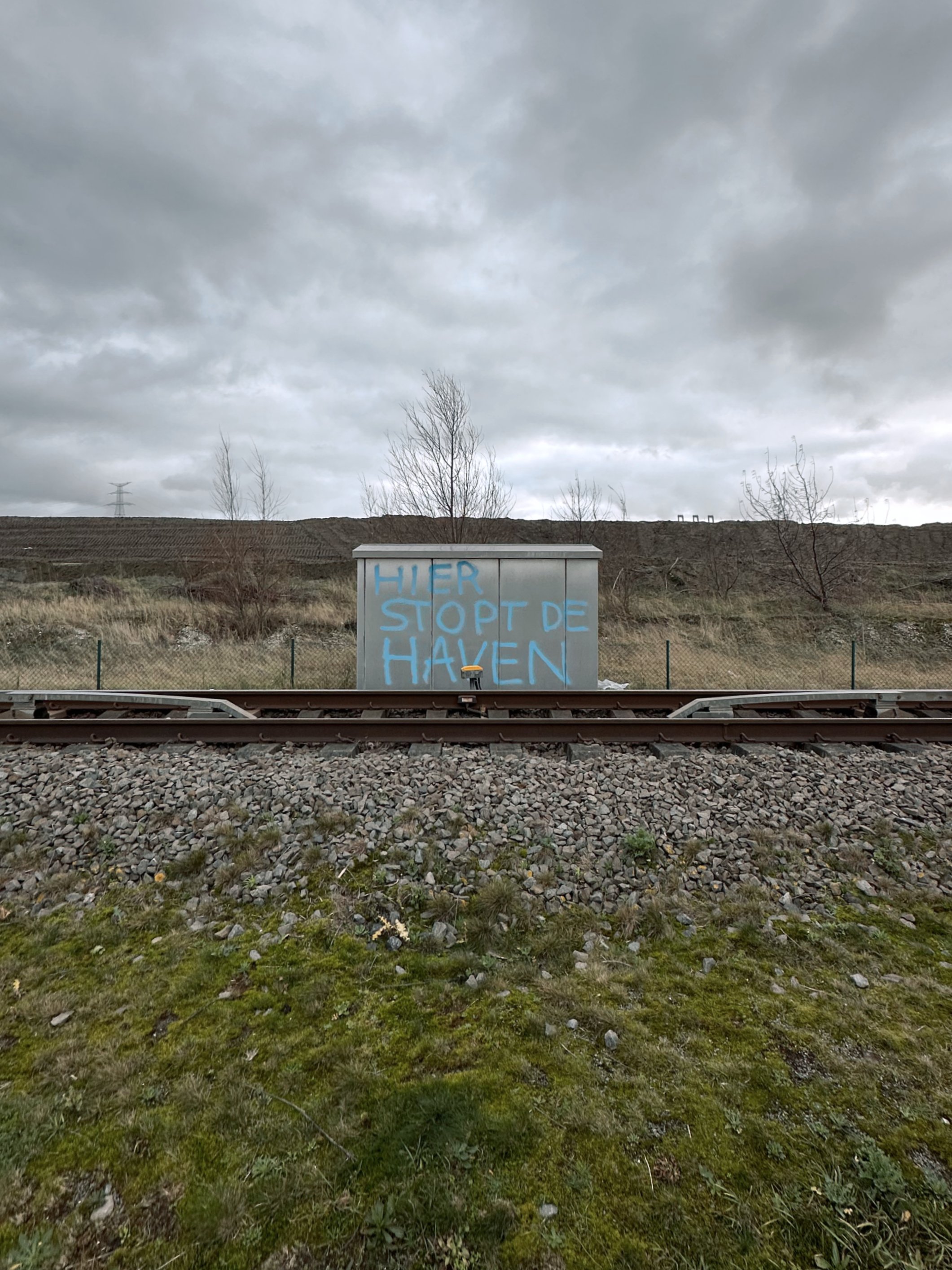
The port of Antwerp is a vast, under-explored territory. An ever-widening vector of docks, locks and container terminals that is only held back by the hard stop of the Dutch border, it has geographically reduced the city itself to a static afterthought, a diminutive punctuation mark on the map. Yet, unlike the city, it hardly figures in the public imagination. It remains abstract, barely cohering into existence beyond newspaper articles about shipping volumes and trade imbalances. It is a foggy matrix of data that lacks narrative, its history buried under metres of dredging sludge.
This no-space of ruthless logic and searing efficiency has consistently exerted a strange pull on me. Since my teenage years I venture here to go birdwatching, seeking out the pockets of nature squeezed between the city’s last tower blocks and the harbour’s first petrochemical plants. My architectural master’s thesis project investigated the port expansion and the villages left ravaged in its wake. And years later, it was here that my passion for photography was sparked by the formal interplay of empty warehouses, gleaming refineries and scruffy wastelands.
Back when I visited in the nineties this was all scrubland and mud, where the low-lying agricultural lands had been recently covered with metres of sludge. Now I made my way past vast new infrastructures and factories, geometric mounds of landfill and fenced-off emptiness, barely a human in sight. As low dark clouds rolled in from Holland and I started to worry about where to shelter in this uninhabited flatness, I could not help but wonder what drew me to this inhospitable landscape time and again. What exactly was it within me that resonated so deeply with this outlandish desolation?
Not picturesque.
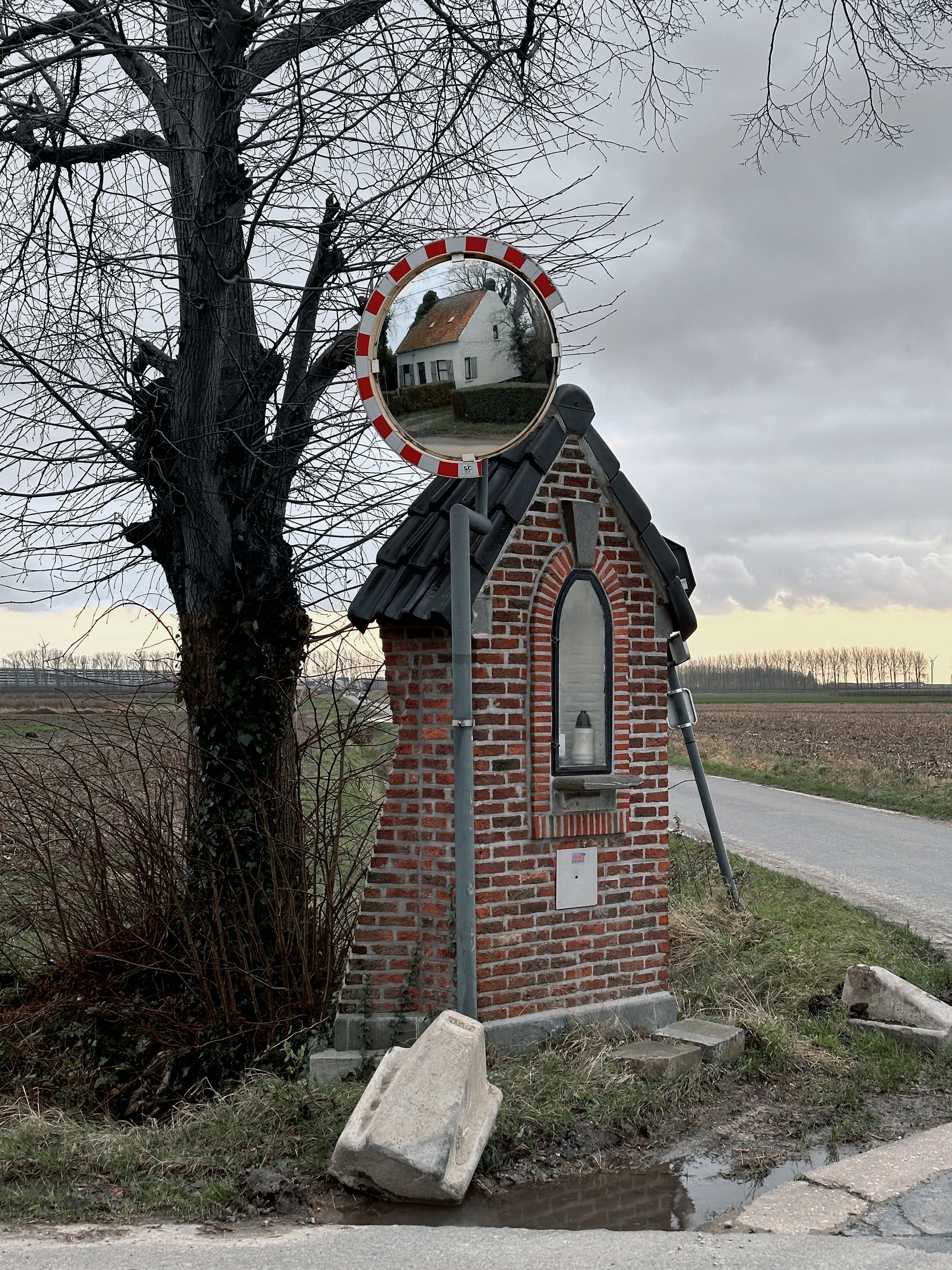
A conventional sense of the picturesque (whether beautiful or — more commonly in Belgium — ugly) may be found in the typical fragmented Flemish landscape: in the small scale of the parcelled up lots; the messy mosaic of houses, farms and factories; the medieval city centres with their cobbled streets and quaint facades; the suburbs with their ridiculous villas. It lies in the crooked detail and the uneasy juxtaposition.
The harbour environment appeals to a different aesthetic sensibility. It is a landscape we Belgians are rarely exposed to, generally lacking the grand gesture in both nature and city. Belgium does not contain soaring mountains and roaring waterfalls, we are denied the intoxicating sights of skyscraper districts or glitzy waterfronts. Our panoramas are patchworks of humane cosiness, comforting yet suffocating.
Although the port of Antwerp is undeniably conceived and built by people, the resulting environment has seemingly lifted the human figure out of the equation. This is a technocratic territory, shaped by industrial processes and logistical requirements on the one hand and an EU-decreed manufacturing of new, “wild” nature on the other hand. As a landscape that is geared towards animals and machines, it is both regressive and futuristic. Humanity has been squeezed out from both sides, by its evolutionary predecessors and successors. And oddly enough, rather than being the victims of some grand conspiracy, we humans have designed ourselves out of the picture.
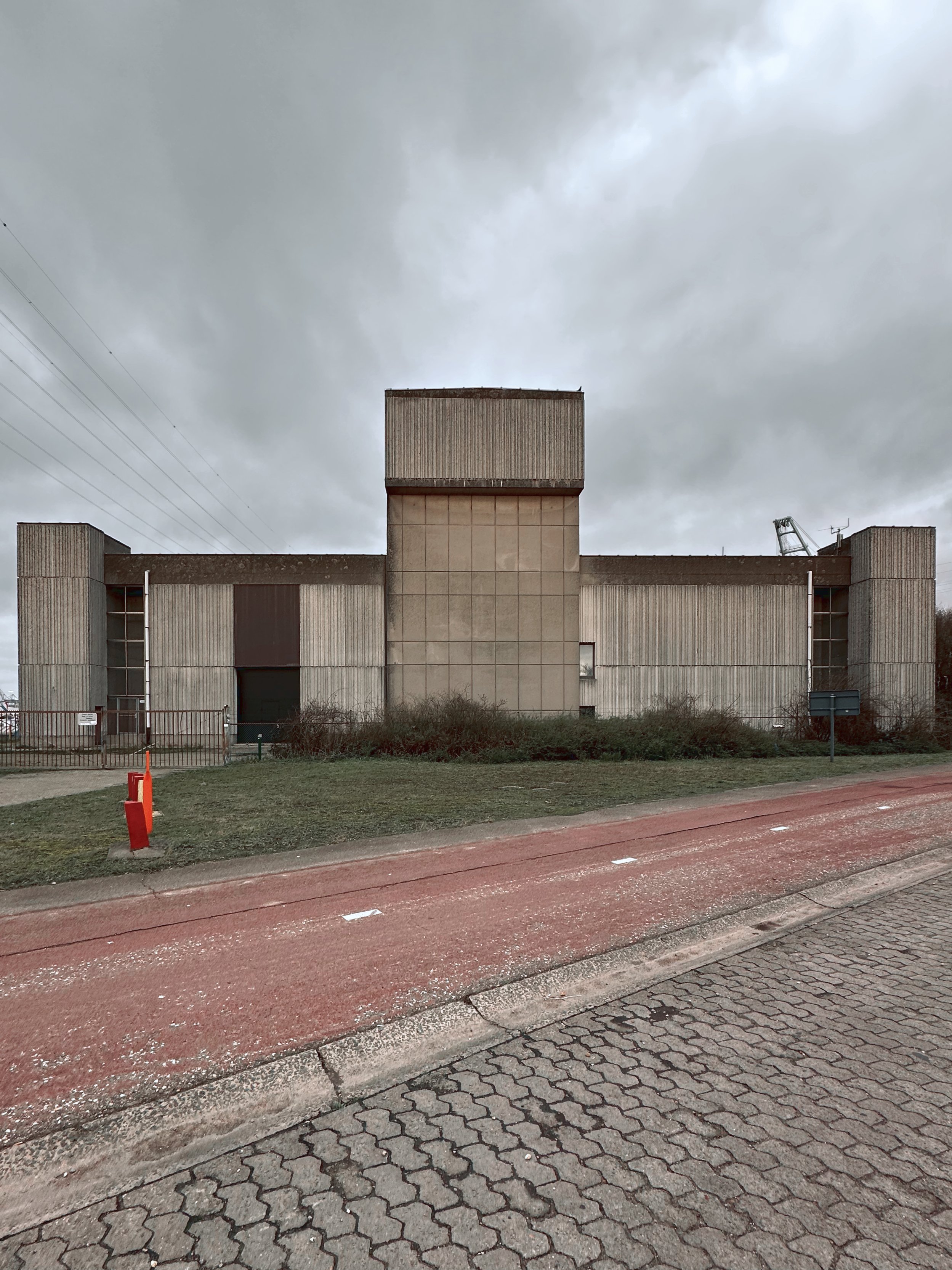
Modernism going through the mechanical motions.
Fittingly this fresh bond between nature and machines is established on top of the erstwhile polder landscape. In an artificially accelerated process of sedimentation, the latter has been buried under metres of dredging sludge so as to make the absorbent land dry and ready for machine colonisation. Simultaneously some zones have been excavated, reflooded and transformed into nature reserves — as EU rules impose the creation of new nature as a compensation for the expanding harbour infrastructure.
The polders were a direct result of a rare equilibrium, a sort of armistice — or more, a symbiosis? — between nature and man. Through the use of ever more sophisticated tools, man moulded the landscape into a novel shape and created a previously non-existent environment, generating new conditions for nature to take hold. Now this intricate relationship has been upended, with technology increasingly taking the lead. The emergent paradigm of the harbour abandons the concept of landscape as an arranged form of cohabitation. The moderating sponge of the polder landscape has been replaced by wet-lands and dry-lands; a happy medium that had grown organically has been replaced by a blunt, drawing board–driven juxtaposition of extremes, a globalised logic imprinting itself on a singular locale.
This rigid segmentation reminds us of the more fundamentalist strains of modernist urbanism and makes us wonder: is this where modernism retreated to after it was chased out of the cities and the battlefields of post-war housing estates? Is it now nursing its wounds here in the former countryside, living out its unfulfilled fantasies: a landscape of geometric precision, unbothered by the quaint messiness of human lives?
The flat event horizon of the human death drive.
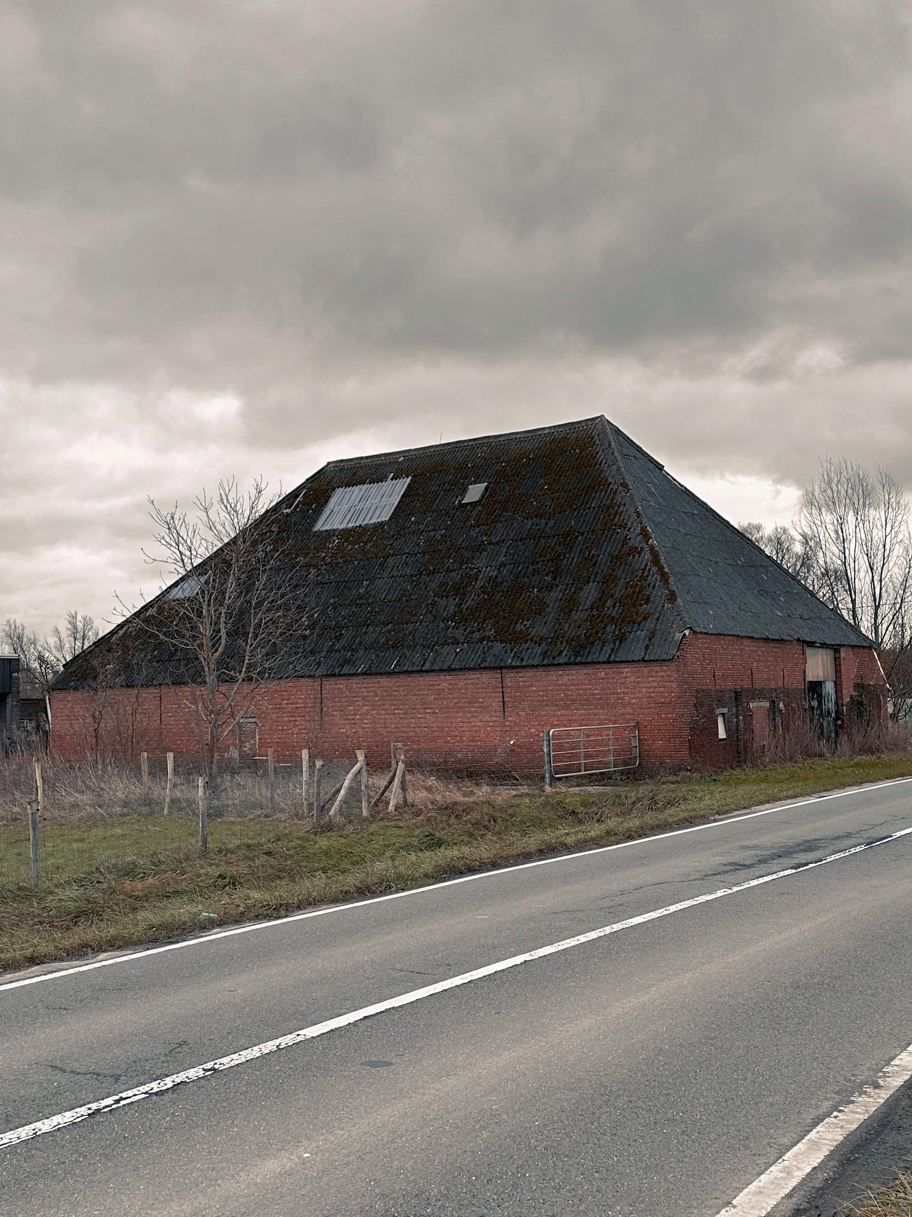
Along the edges of this new landscape, we find a post-apocalyptic condition that is not unlike the ones evoked in movies and other catastrophe-driven fantasies. Here are the doomed last fragments of polders, the scenic ruins of farmhouses overgrown with a nature taking back control, a picturesque wasteland full of melancholic references to a vanishing human race.
So far so familiar. Yet when we dive into the harbour zone itself we are presented with a post-post-apocalyptic environment that is not as readily decipherable. The world may be a stage, but here all actors have long left: there is no dramatic arc, no more story to tell. This is the scene of a clean cataclysm that was initiated by humans but is now unfolding in mechanical slow-motion following the clinical laws of ecosystems and algorithms, of nature and machines.
Instead of the picturesque beauty of the polders and their slow demise, the sterile precision of the harbour possesses a more sublime quality. It fills us with a certain dread — and a certain thrill. However, this is not the traditional version of the sublime that is caused by the confrontation with a formidable, incomprehensible otherness. We are not romantics overwhelmed by a nature unleashed, standing in awe of untamed wilderness. Nor is this sublime feeling generated by the theatrics of an alien invasion or robot uprising, an act of terrorism or climate change spinning out of control; in short, it also differs from the recurring (fictional or non-fictional) scenarios which represent the contemporary incarnations of the apocalyptic sublime as an external catastrophe visiting us.
This two-dimensional man-made landscape is sublime not because it is incomprehensibly opaque, but because it is terrifyingly transparent. The map and the territory have become indistinguishable. Our sublime paranoia about hidden machinations and unidentifiable threats has run out of steam, as if the fog in Caspar David Friedrich’s Wanderer painting has lifted and we finally see everything crystal clear. If the sublime effect always depended on smoke and mirrors, here it is just a window into a future we will not be part of; but occasionally we still catch a glimpse of our own ghostly reflection in the glass, as the creator who is now separated from his creation.
We cannot hide anymore behind the opaqueness of an inscrutable, possibly malign other. As it is we who have designed and created this inhuman landscape, we are forced to get to grips with a deliberately anti-human streak within ourselves, with our desire to self-exile, even self-annihilate.
This is our sublime realisation when we observe this landscape and catch our self-reflection. In our attempts to control our environment, to manage and exclude every external threat, we have created a landscape that also excludes any humanity. We have been chasing our own tail all along. And so finally here we are squaring off against our biggest, possibly only nemesis: ourselves.
Humanity as a bridge — or a purpose?
It was not long after my cycling trip that I was reminded of Nietzsche’s concept of “man as a bridge” while listening to a podcast discussing “Thus Spoke Zarathustra" — a book I had read (and scarcely understood) decades ago. We always see our surroundings through the prism of our own obsessions and preoccupations so, relentlessly over-interpreting this landscape like a fortuneteller poring at tealeaves, I convinced myself I had observed here the sure signs that man had been — or is about to be — overcome.
Pursuing this tenuous train of thought, we would have to conclude that man is not a bridge between animal and Übermensch (“overman”) as Nietzsche proposed, but between animal and machine. Because in our irrepressible Nietzschean desire to surpass ourselves, to not be bound by societal norms or ingrained habits and become a completely free agent, we may also have lost the essence of our humanity. Indeed this landscape posits the question, what if our greatest qualities as a human being are integral to our human (all too human) frailties?
Rather than man’s history being a linear, dialectic evolution from beast over man to overman (a slightly strange teleological flex for someone like Nietzsche in the first place?), there is no progression to be found here; just a return to a beastly machine logic. Humanity was only a brief interlude of complicated affections and affectations, a blip in the history of the universe.
Where futurologists and over-excited tech-bros dreamt of an exponential curve towards a singularity, we find our timeline to be more like a gaussian curve — and we have just begun the long slide down. Humanity will not end with a bang but a whimper. The only singularity that ever existed was our brain, a point of infinite creative density, that has now been scattered along the lines of worldwide neural networks in order to be harvested by machines and their mean intelligence of averages, statistics and common denominators.
We completed our role as a bridge and are retiring. Time is a loop and the future has fed back into the past. Technology has achieved the evidence of nature, nature has been exposed as just highly complicated technology and both will live out their senseless repetitive existences in eternal recurrence.
Be still my cold cold heart.
While I had determined in my mind (and probably in my mind only) that this harbour landscape prefigured the end of humanity (or at least signified a kind of abdication), I had not gotten much closer to explaining my fascination with it.
When relating to your surroundings you can look for your self, for a flicker of familiarity in the eyes of the other, for proof of your own existence as well as a shared humanity. This is the comfort of self-confirmation. But you can also seek out the eerie and unknown. You can scream into bottomless depths to hear the echoes fade away and rejoice in the inevitability of your own impending demise, the denial and loss of your ego.
The desire to transcend, to go beyond the limits of our own existence, beyond what makes us human, might paradoxically be what defines us as humans. And is not the ultimate consequence of this transgression the annihilation of the self and, by extension, the end of humanity? A human being unavoidably thinks about a human not-being.
Looking at humanity through the lens of our desire to survive and procreate delivers us no unique insights, as we share this in-built proclivity for proliferation with animals and machines. Feelings such as love are just the logical extensions of the irrational urge to propagate, a quantitative rather than a qualitative jump in evolution. (As such, it can be predicted that machines will at some point experience love — and animals already do, possibly.)
A specifically human trait on the other hand is the capacity (and inclination) to question this relentless drive for survival and reproduction. We are the only creatures rational enough to realise the nonsensical nature of being, to explore the outer fringes of existence and toy with the idea of non-existence. This is what makes us truly sentient and unique and sets us apart from other life forms, organic and inorganic.
So after I had peered for long enough at this unforgiving, depopulated landscape, what emerged was a justification ad absurdum for human existence. In the over-eager dark room of my head this sublime negative image was developed into an unlikely positive impression of the human condition — something that had always stayed tantalisingly out of reach when I tried to build up a logical argument in favour of life using ephemeral positive values such as community, love or creativity.
As I emerged from the harbour, I realised the paralysis in my face was not frostbite caused by the wind but sunburn — the numbness felt the same, but it was now impossible not to crack a smile.
Epilogue: the endgame.
Rushing to catch the boat back into town, cycling and sweating in the warm winter weather, I remembered the moment I rode into the harbour earlier that day. I had gotten off the river bus which was populated with darker-skinned people being ferried to the logistics centres and container terminals where they kept the wheels of the global markets grinding.
Riding past the ventilation shafts of the tunnel under the river, an extraordinarily loud bird sound stopped me in my tracks. I failed to locate the outsized bird producing this monstrous sound, until I realised it was emanating from a speaker. A little further two jackdaws picked through the grass, looking for food but also, I imagined, listening.
And I knew then: the machines and animals were now directly speaking to each other and, slowly but surely, the day was approaching when they would have absolutely no use for us anymore.
date: 12/2023-02/2024
author: Hans Leo Maes / TypicalPlan
photos & video: iPhone 14 Pro


