planning

Machine à rêver

typicalplan = planning

UNE MACHINE A REVER.

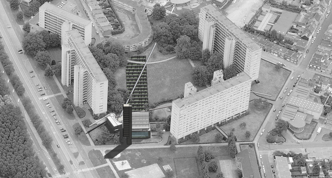
More than 50 years after its construction, the modernist architecture of the Kiel development has not lost any of its utopian power. But in light of today’s changing society, its original design principles must be re-considered in order for it to function optimally.

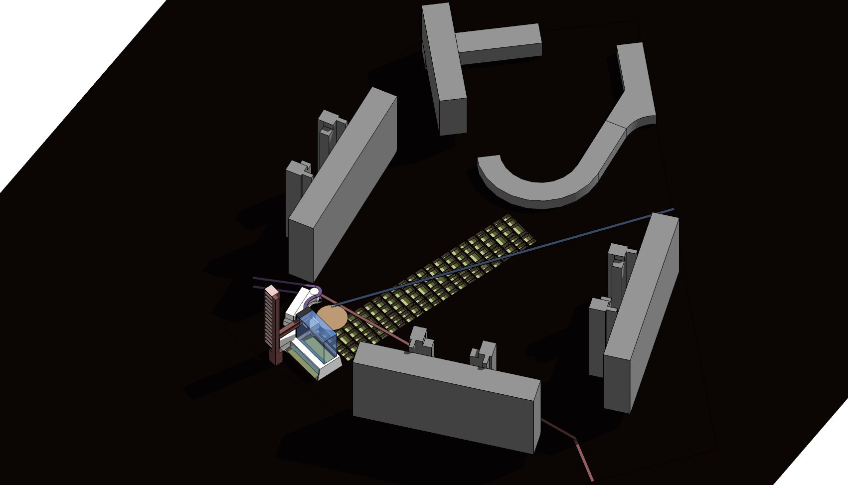
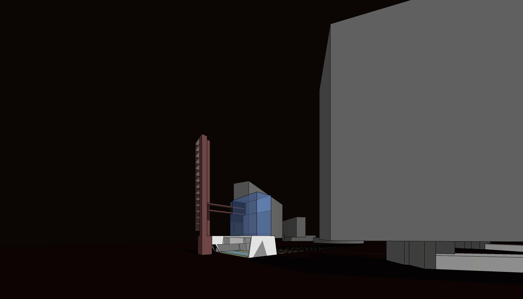
The proposed re-purposing of the former boiler room and director's residence is the perfect cause to provide an answer to the needs of contemporary residents. They could become the heart of a new hedonistic complex which both complements and safeguards the spartan purity of the neighbourhood.

The machine à habiter is enriched with a machine à rêver, where the creative desires and civic aspirations of the residents are realised. The rigorous socialist re-education vehicle conceived by architect Renaat Braem is complemented by a cheerful materialistic outgrowth.

A social condenser?

In the original modernist set-up the residents were to be socialised in the paternalistic educational way typical of the era. We propose a contemporary strategy to create a sense of community, based on a collective experiencing of the "petty-bourgeois sins". After all, in our fragmented consumer society, aren't we all increasingly connected by our exceedingly decadent material desires and ambitions, beyond all ideological divisions?

In the not so distant past the creation of pleasant shared space was deemed sufficient for like-minded people to meet and socialise in an evident, organic way. The residents now form a much more heterogeneous group and we propose that a sense of community can only arise as a by-product of shared experiences. The new complex focuses on the creation of these shared, but not necessarily collective, experiences.

As an ultimate tribute, this intervention hopes to be a contemporary interpretation of the "social center" which Braem always saw as an integral part of his public housing schemes but never saw realised.

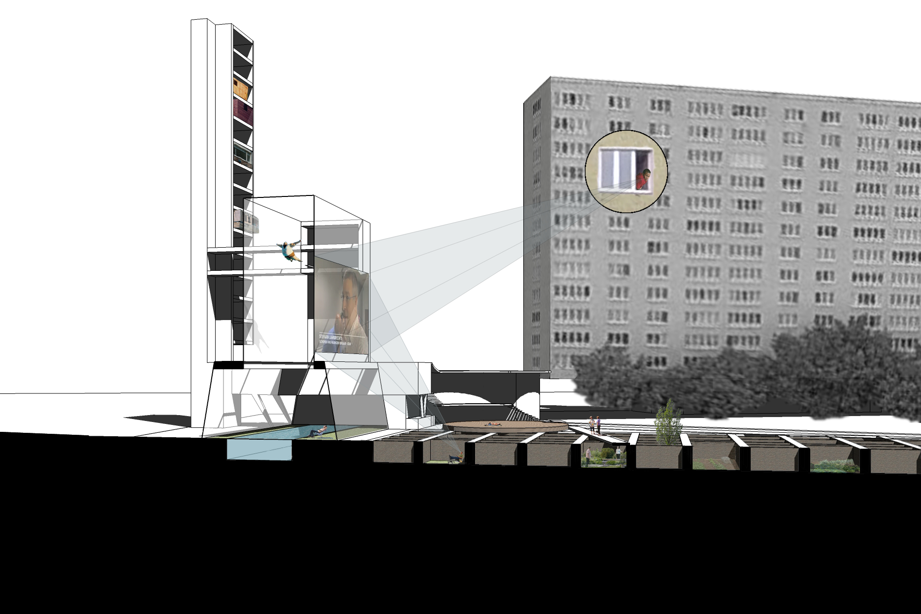
The unfulfilled material desires of the residents of the Kiel neighbourhood are realised inside and around the former boiler room. All activities that fall outside the remit of the efficient modernist plan find their expression here. The defining characteristics of the suburban Flemish dream house are reinterpreted as collective facilities of the public housing estate.

A house fostering a new idea of community

All facilities can be booked by the inhabitants for their private use.

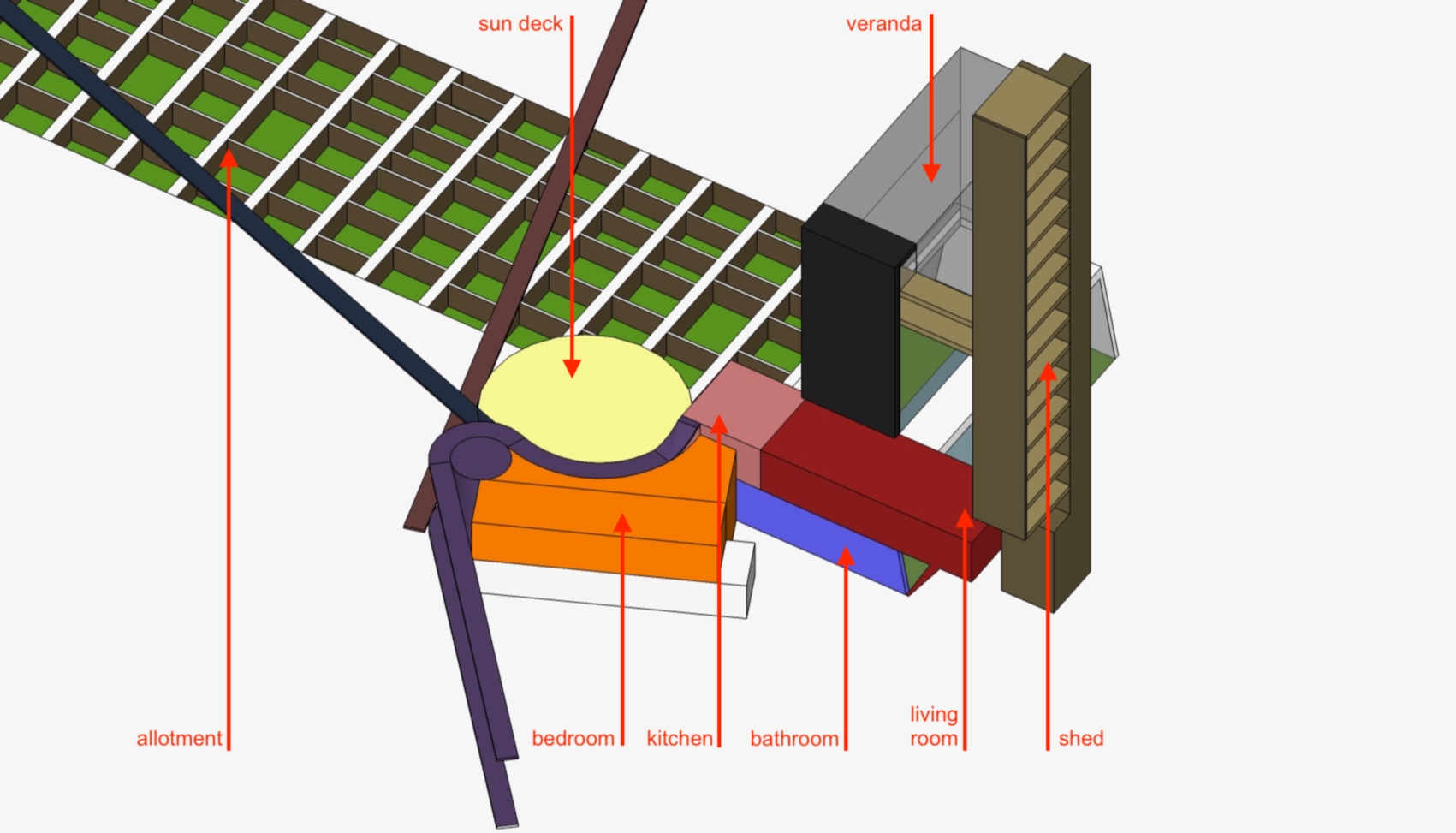
The living room: containing all the luxury essentials for the modern cocooner to entertain guests: a home cinema, design lounge, computer games room…

The kitchen: a fully equipped professional kitchen for cooking lessons and preparing elaborate meals for family feasts

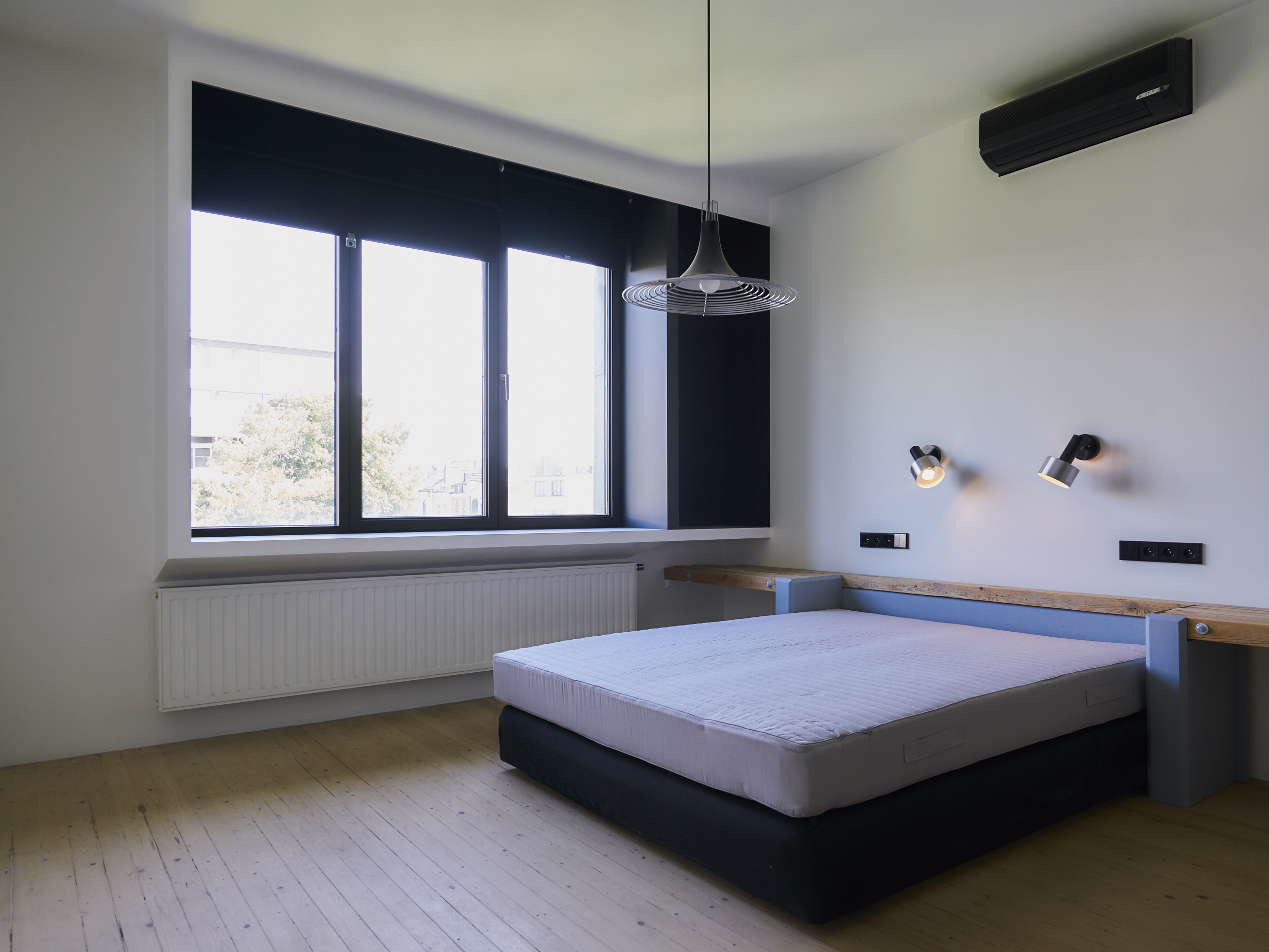
The bedroom: hostel rooms to be booked by residents for temporary stays of visitors who cannot be accommodated in the apartment

The bathroom: wellness center with jacuzzi, sauna, gym...

The veranda: a greenhouse with swimming pool, diving tower and year-round tropical planting

The shed: a thin high-rise of stacked hobby and craft rooms which can not be accommodated in the apartments for acoustic or space constraint reasons

The allotment: private outdoor spaces that compensate for the lack of balconies, to be used as ornamental garden or vegetable patch

The sun deck: a terrace available for the local residents and their guests, connected to the "kitchen" and "living room"


  • type: submission for ideas competition “Renaat Braem 1910-2010” organised by Flemish Architecture Institute (VAi) and others

  • location: Antwerp, Belgium

  • year: 2010

  • architect: Hans Leo Maes / TypicalPlan

VAC

typicalplan = planning

an office building: THE FLEMISH ADMINISTRATIVE CENTRE (VAC).

vacl.jpg

Although the VAC is functionally an office building, we felt from the beginning that the typology of office building design was an inadequate starting point for this building.

The office building is a commercial typology whose aims are completely different to that of a public building and in fact, opposite. Profit driven, built for the short term, they must project enough exclusivity and gloss to attract occupiers. We felt strongly that the VAC should not be held hostage to a typological exercise best suited to a European highway or business park,  contorted to fit this site.

In contrast, a public building reveals a government’s commitment to its people and their aspirations. Long term investments, these building need to be solid and durable but not extravagant. They should integrate well with their context and be perceived as environmentally responsible. Full of ‘not for profit’ public rooms, receptions and exhibition spaces, they should be welcoming, easily accessed by the handicapped, non intimidating and immediately identifiable.

We felt strongly that due to the prominence of its site; its final place in the station development sequence of Leuven; its great size and the request for durability and long life, that the real priority for this building is to become not only part of the enduring fabric of Leuven but both a regional and city landmark.

The design grew out of a sculptural elaboration of the BPA. It aims to achieve a formal, urban simplicity through its proportions relative to the context  and by the use of a single material throughout – brick – (instead of a collage of materials) so that the building assumes a monolithic presence and identity as both a city and regional landmark. And within its most immediate environs, the building generates its own context.

“The idea that architecture can and should speak for itself is clear in both internal planning and external expression. (...) The building mass, with its clearly expressed extremities and a recessed centre, are a remarkably inventive translation of the planning requirements.”

Jan Schreurs, Professor of Architecture, in article “Flemish House”, A+, Belgian Review of Architecture


  • type: winning design after two-stage open design competition

  • client: Flemish Government

  • GFA: 25 000 sqm

  • design architect: GZ-ZAvEM (Eleni Gigantes, Elia Zenghelis, Bart van Leeuw, Heidi van Eetvelt, Hans Maes), Belgium

  • landscape architect: An Voets Belgium

  • engineer: Ove Arup & Partners International Ltd. UK

  • quantity surveyor: Monk Dunstone Associates Belgium / UK

  • construction architect: Jaspers-Eyers Belgium

The Doorstep

typicalplan = planning

an inside-out hotel: THE DOORSTEP.


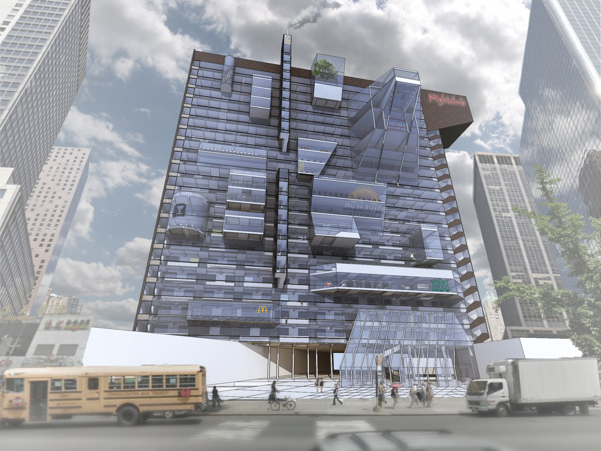
The Doorstep is a hotel turned inside out.

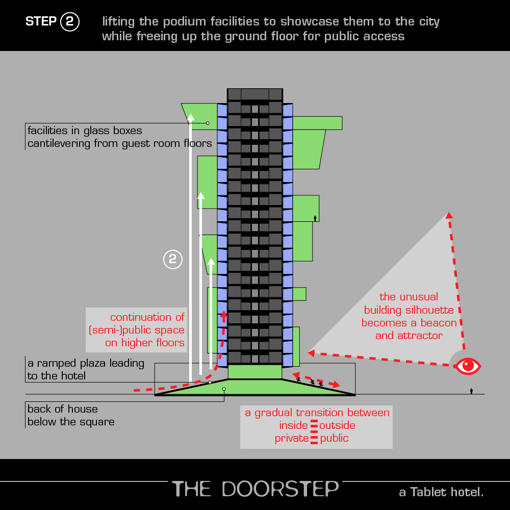
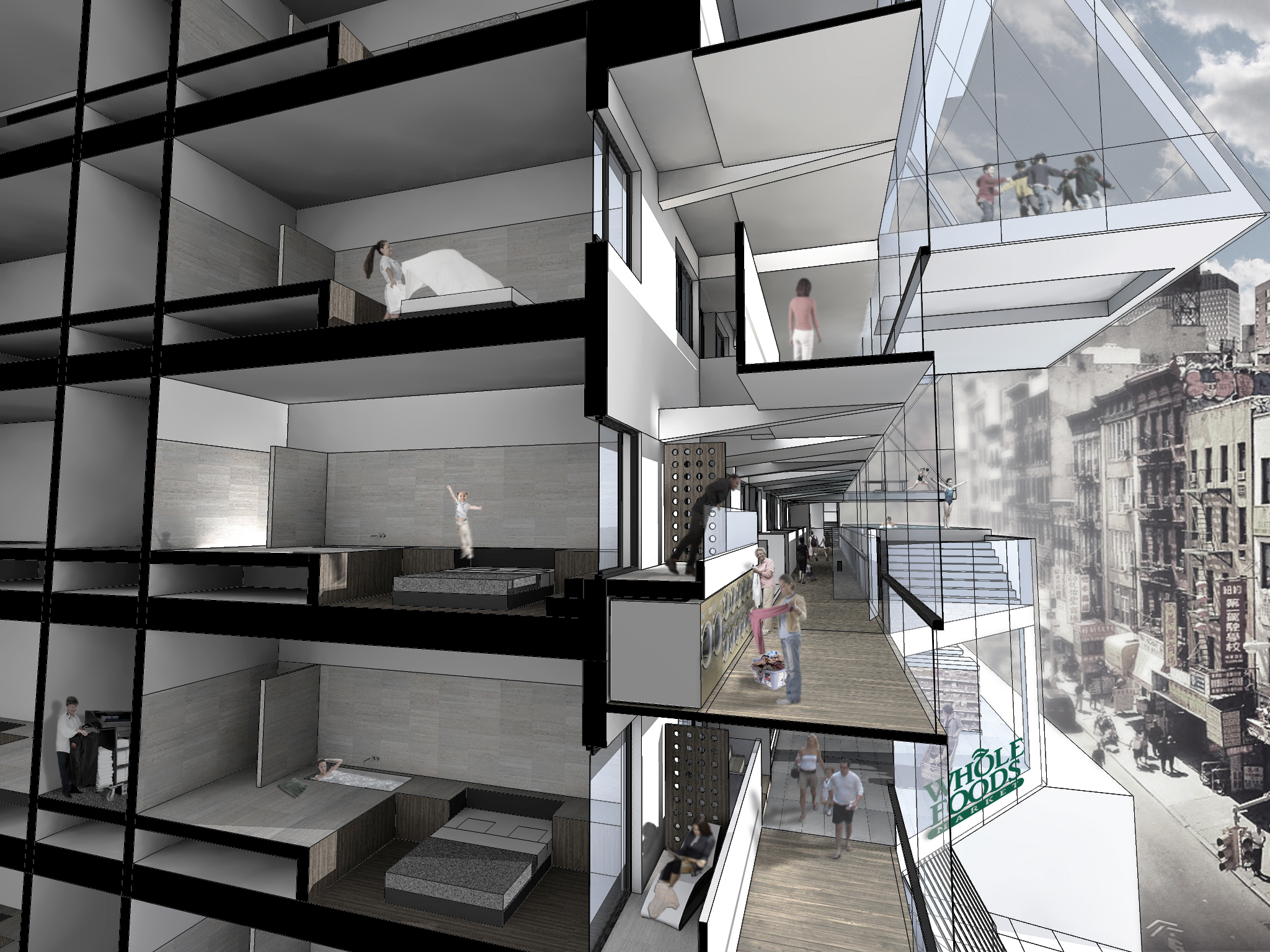
The workings and functions of the hotel -usually invisible to the city- are brought out into the open. Corridors and facilities are cantilevered from the hotel tower with guest rooms. 

The spectacle of the multifarious everyday activities and available services on display draw in a wide array of people -bringing the diversity of the city literally to the guest’s doorstep. 

The Premise.

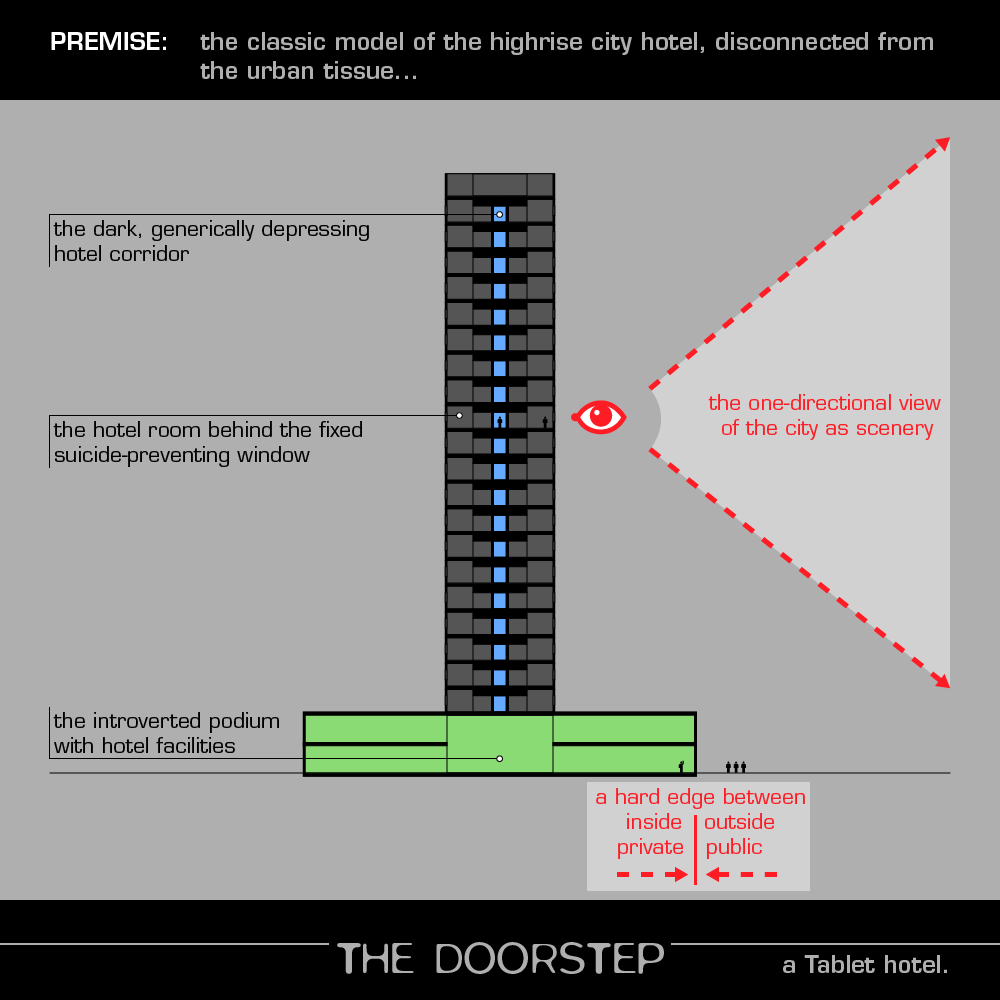
The typical highrise city hotel: a matrix of hermetically sealed, relentlessly repeated identical hotel rooms sitting on top of an inward-looking podium which hides a world of facilities. 

We accept the bigger city hotels are like small, dysfunctional villages in their own right. We put forward that these these ever-changing neighbourhoods have not been sufficiently integrated in the fabric of the city.

Think of all the facilities present in hotels. The meeting rooms, swimming pools, laundries; the restaurants, the gyms and squash courts; the convenience stores, concierge services and business centres. 

Think also of the dark, uninviting, generic hotel corridor. Think of the wasted opportunities, all these square metres for just circulation, the same depressing stationary conveyor belts all over the world, nightmarish and depressing.

What if we turn the hotel inside out, upside down?

Circulation on the outside of the building, galleries with abundant daylight and spectacular city views.

Facilities not on ground level but lifted up, scattered, part of the newly formed promenade architectural, livening up the walk to your room. Also acting as a living billboard for all the activities available in the hotel.

It’s not about inventing new functions or hybrid spaces where hotel guests and locals can meet. It is about injecting what is already present with new life, opening up the hotel to the city. Making a living, breathing spectacle of the hotel merely by opening it up to the city, visually as well as functionally.

The corridors with a variety of activities and stepped access to the raised hotel rooms call to mind another New York scene, the streetlife around the Stoops, typical of the old Brownstone buildings.

Injecting the diversity and excitement of the city into the hotel.

The typical city hotel room is only differentiated by its size, sometimes its view, sometimes by some extra services. However, the Doorstep is able to offer an endless array of room types, based on their proximity to facilities: the pool room, the smokers’ room, the booklovers’ room, the family with kids’ room, the gym nut’s room, the businessman’s room, the serious drinker’s room, the gambler’s room… And all the combinations thereof.


  • type: submission for Tablet hotel design competition

  • location: New York, USA

  • year: 2012

  • architect: Hans Leo Maes / TypicalPlan

Flemish Mountaineering Federation Headquarters

typicalplan = planning

an office interior: FLEMISH MOUNTAINEERING FEDERATION HEADQUARTERS.


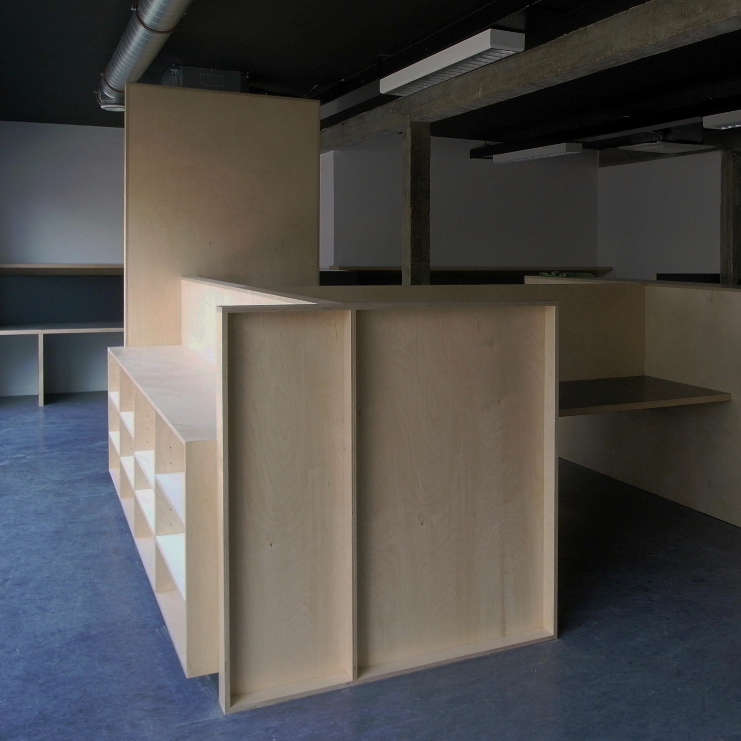
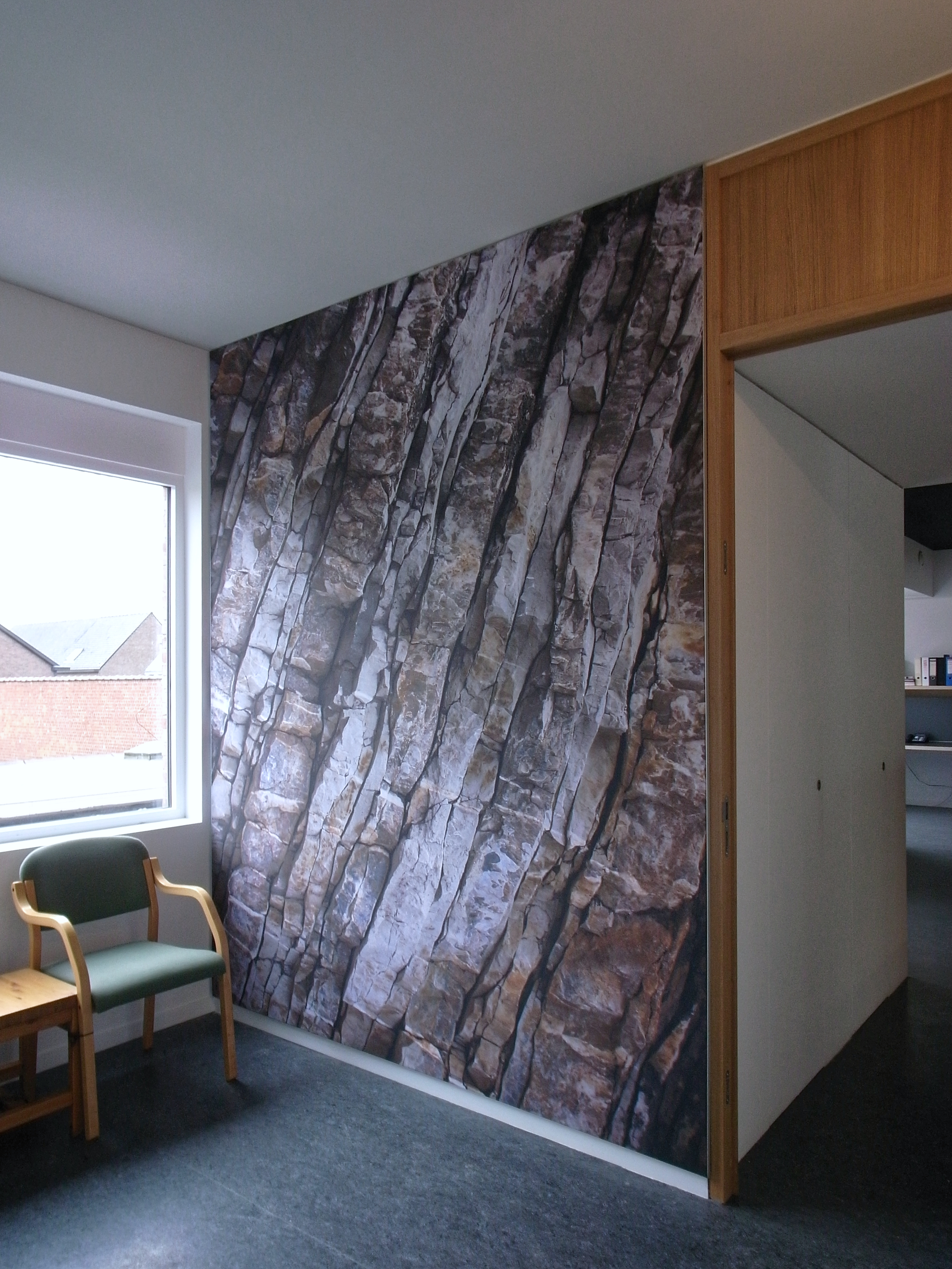
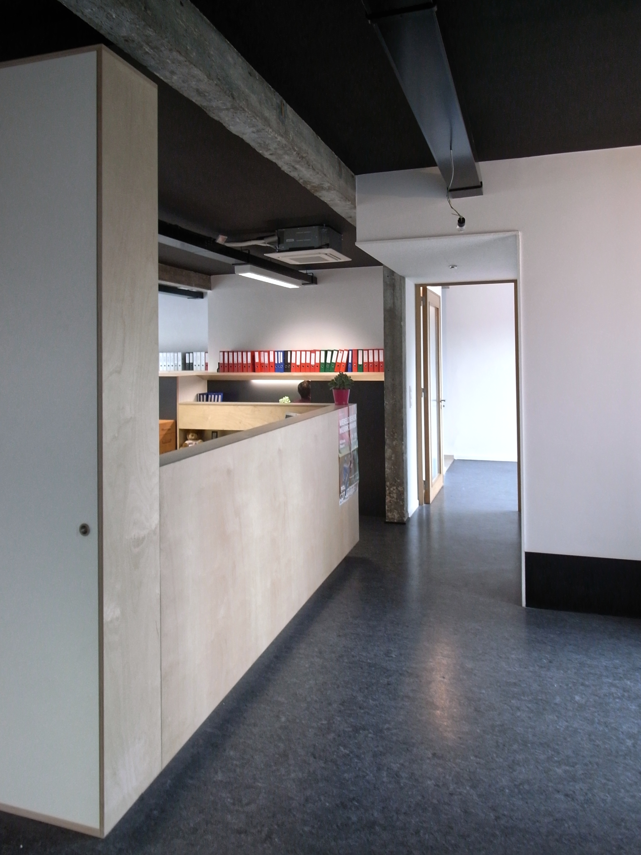
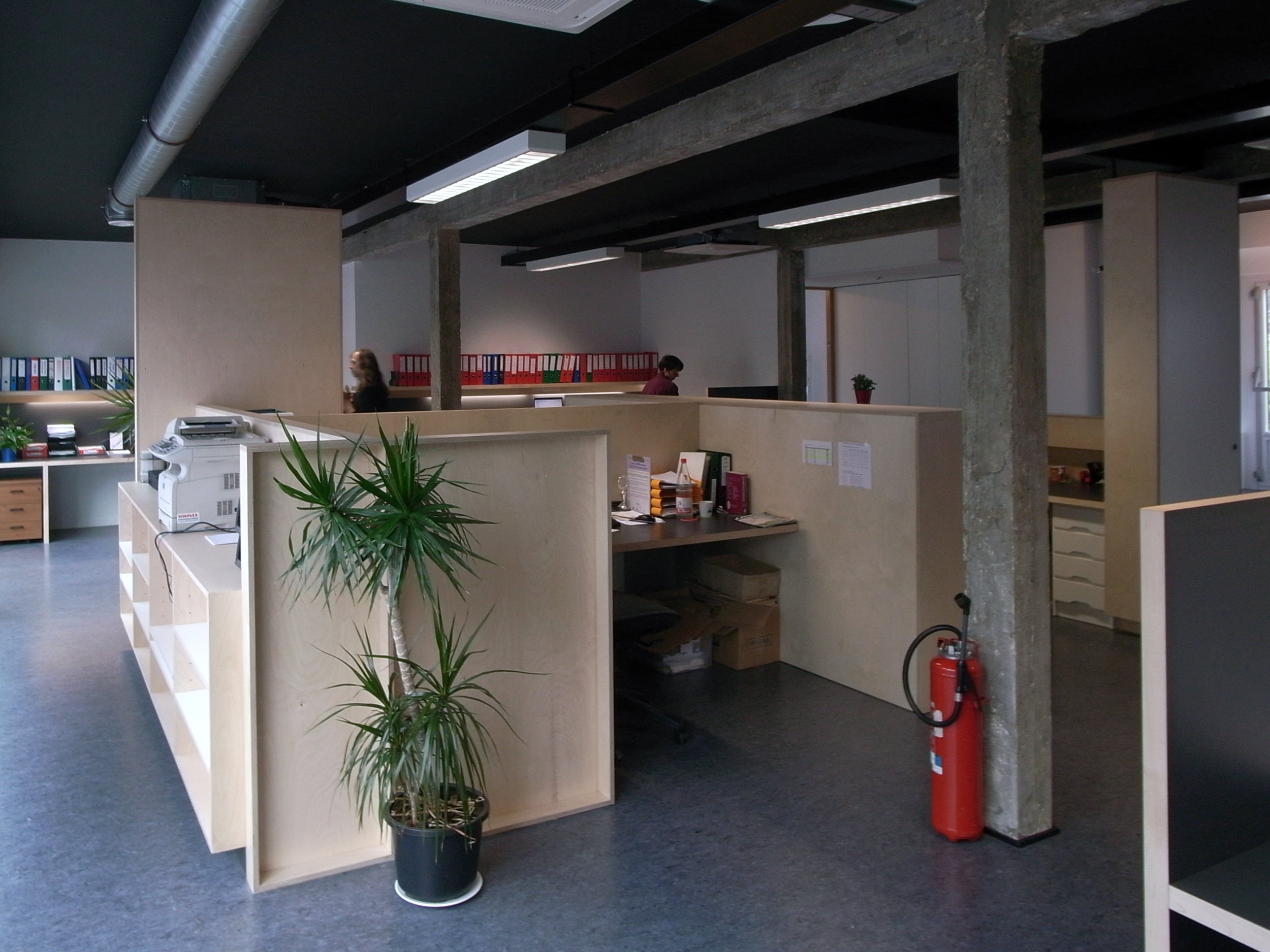
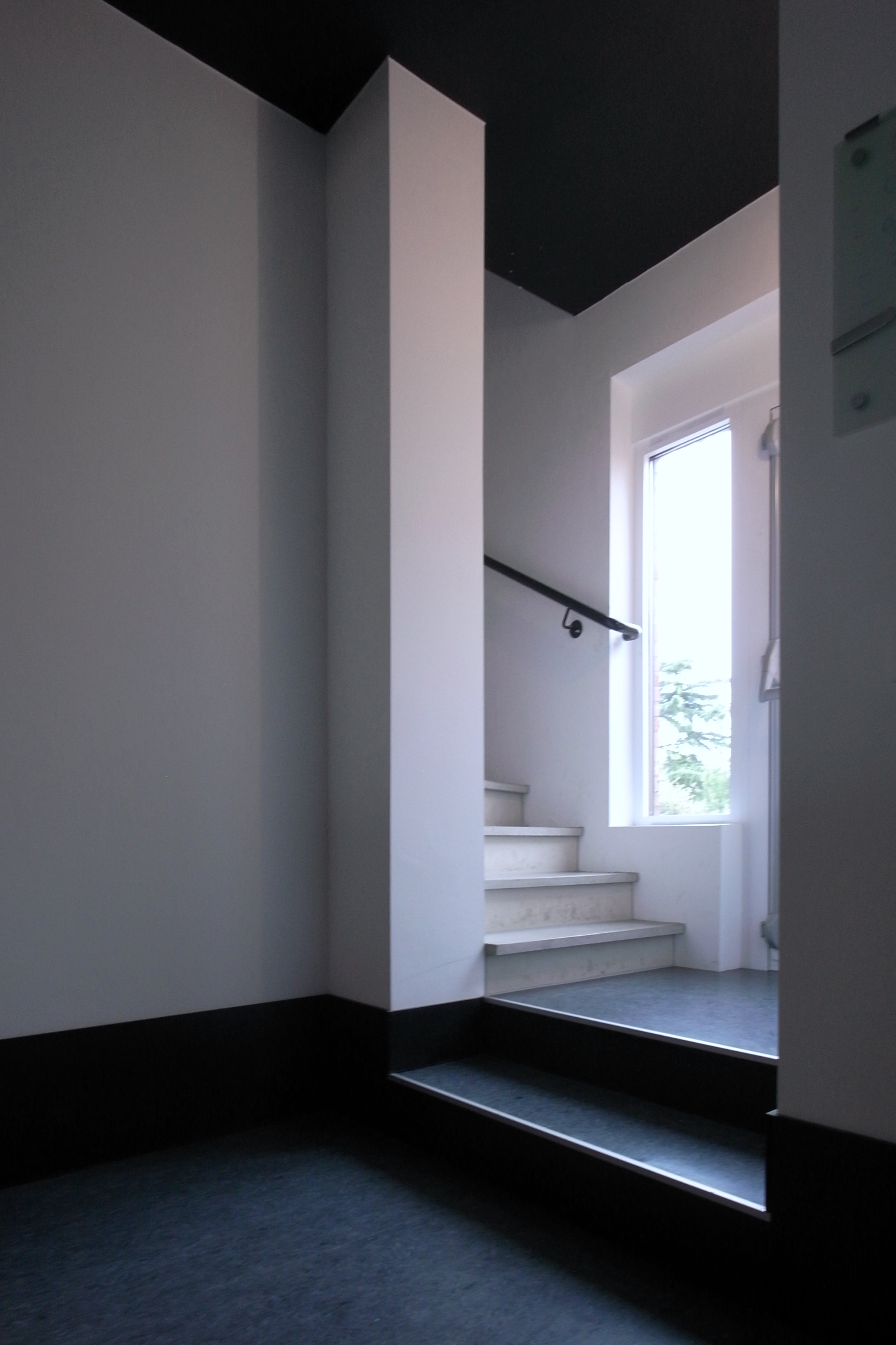
Conversion and sustainable upgrading of existing warehouse of 240 m² into open plan office with meeting spaces, library and kitchen. Integrated architecturural and interior design services including custom-made furniture. 


  • location: Zwijndrecht, Belgium

  • year: 2011

  • architect: Hans Leo Maes / TypicalPlan

  • contractor: Bouwbedrijf Van Der Kinderen NV

Vlaanderen 2002 no-space odyssey

typicalplan = planning

VLAANDEREN 2002 NO-SPACE ODYSSEY.

Doel-Vlaanderen_masterplanning-highrise-vertical-village

Due to a government decision the small Flemish polder village of Doel will finally yield to the expansion of the port of Antwerp. About a  thousand inhabitants will be forced out of their houses and distributed over new suburban developments. A village community with a rich history is destroyed.

By relocating to low-density neighbourhoods a bad thing begets worse: the space-consuming port expansion is multiplied by housing the former village dwellers in suburban villa’s.


Can this tragedy instead become an opportunity?

If destruction of the village is unavoidable for economic reasons, isn’t it our duty to offer the inhabitants a real alternative?


The port expansion is accompanied by the abandonment of the old small-scale port facilities near the centre of Antwerp. The gradual dissociation of city and port leaves a barren no man’s land in its wake. Would it not be self-evident to relocate a village destroyed by harbour expansion to the scorched earth left in the wake of this capitalist bulldozer?

Instead of being fragmented by the destructive powers of the port, the village would reappear densified, more concentrated in the eye of the storm.

Instead of causing fragmentation, the disappearance of the village becomes an opportunity for a research into new forms of high-density housing.

An investigation into high-rise dwellings:

+ Can an apartment building with a surplus of shared common spaces become a vertical village?

+ Is not the flaw of modernist high-rise planning to situate public space next to the building, thus minimizing the possibilities of interaction and interweaving between public and private space? (The so-called landscape on the untouched ground plane beneath the “pilotis” is just greenery as scenery.)

+ What if circulation spaces were inflated so they function as real transitory semi-public zones within the building?

+ What if corridors became streets?

The old village becomes a blueprint for the creation of multiple transitory levels of privacy. But whereas the structure of the old village meant that houses looked into each other in the front and at the back, here the inhabitants are offered an unhindered view of the river at one side and its hinterland to the other. Public streets are up- and downwards. A true vertical village.


  • type: graduation project Master of Architecture, St.-Lucas Institute of Architecture, WENK (Brussels, Belgium)

  • location: Antwerp, Belgium

  • year: 1999

  • architect: Hans Leo Maes / TypicalPlan

A Bridge as a Mirage

typicalplan = planning

A BRIDGE AS A MIRAGE.

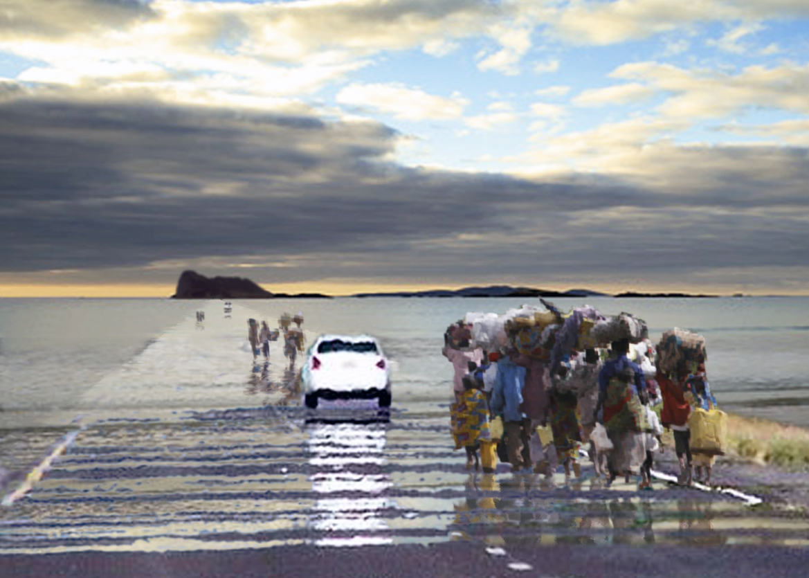
Where the mirage above the African desert road
–the optical illusion of water-
becomes the real seawater
over the submerged
bridge to the dream of Europe.

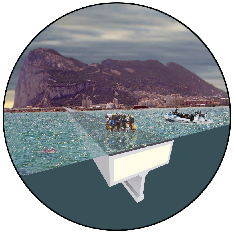
A breakwater, concrete with a polystyrene core,
floating a few centimeters under the water surface.

People walking on water.

The significance of the connection between two continents
matched by the magic of an apparently supernatural feat.

Not just the official link to the promised land,
the breakwater also protects the illegitimate crossings
by boat from rough seas.
(a hidden agenda?)

On the other side,
the fata morgana of the Gibraltar rock
a promise of prosperity,
as elusive as the mirage of water above Africa’s desert roads.

Where the perception of each other has always
been defined by myths, dreams and desires,
the link between the continents celebrates this
complex relationship in a magical act. 

“The high elegance of a fictional bridge which barely takes the trouble to exist. A mirage is a fantasy, but a mirage becomes more interesting when it actually does exist […]” - American science fiction author Bruce Sterling about “The Bridge as a Mirage”


  • type: submission for ideas competition “Project Heracles” organised by Domus magazine, shortlisted by jury member Bruce Sterling

  • location: Strait of Gibraltar

  • year: 2011

  • architect: Hans Leo Maes / TypicalPlan

Warm Heart

typicalplan = planning + producing

a children's dormitory: WARM HEART.

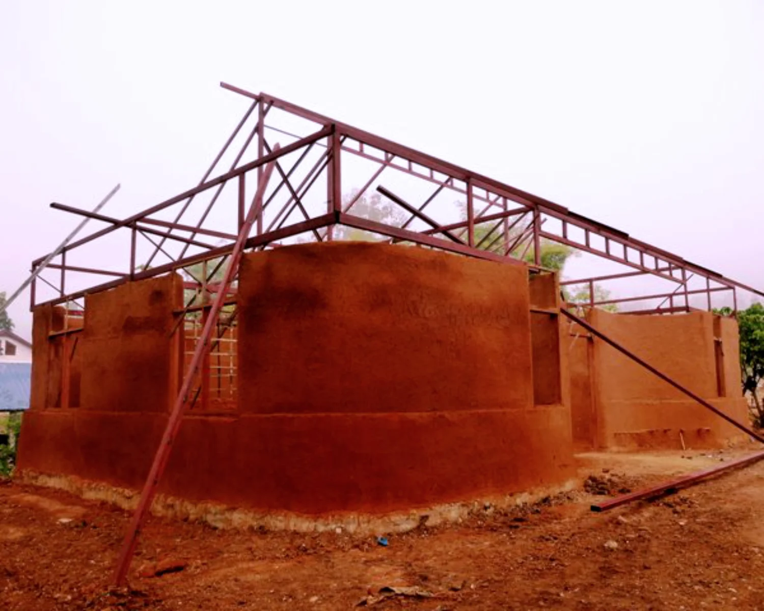
Design for a new type of dormitory building for Warm Heart Children’s Home housing kids from neighbouring hill tribes, using cob -locally available mud + straw.

Full design services devising a new type of dormitory encouraging social interaction and community building. Engaged in hands-on construction work, collaborating with a group of local and international volunteers and local paid workers. Co-responsible for on-site problem solving, managing very limited resources, tools and manpower.


  • location: Phrao, Thailand

  • year: 2011

  • client: Warm Heart Foundation Thailand

  • architect: Hans Leo Maes / TypicalPlan

  • site architects: Hans Leo Maes, Jonas Sayer

  • construction manager: Dan Lockwood (Dragonfly Community Foundation)

Eisenhower

typicalplan = planning + producing

an apartment interior: EISENHOWER.

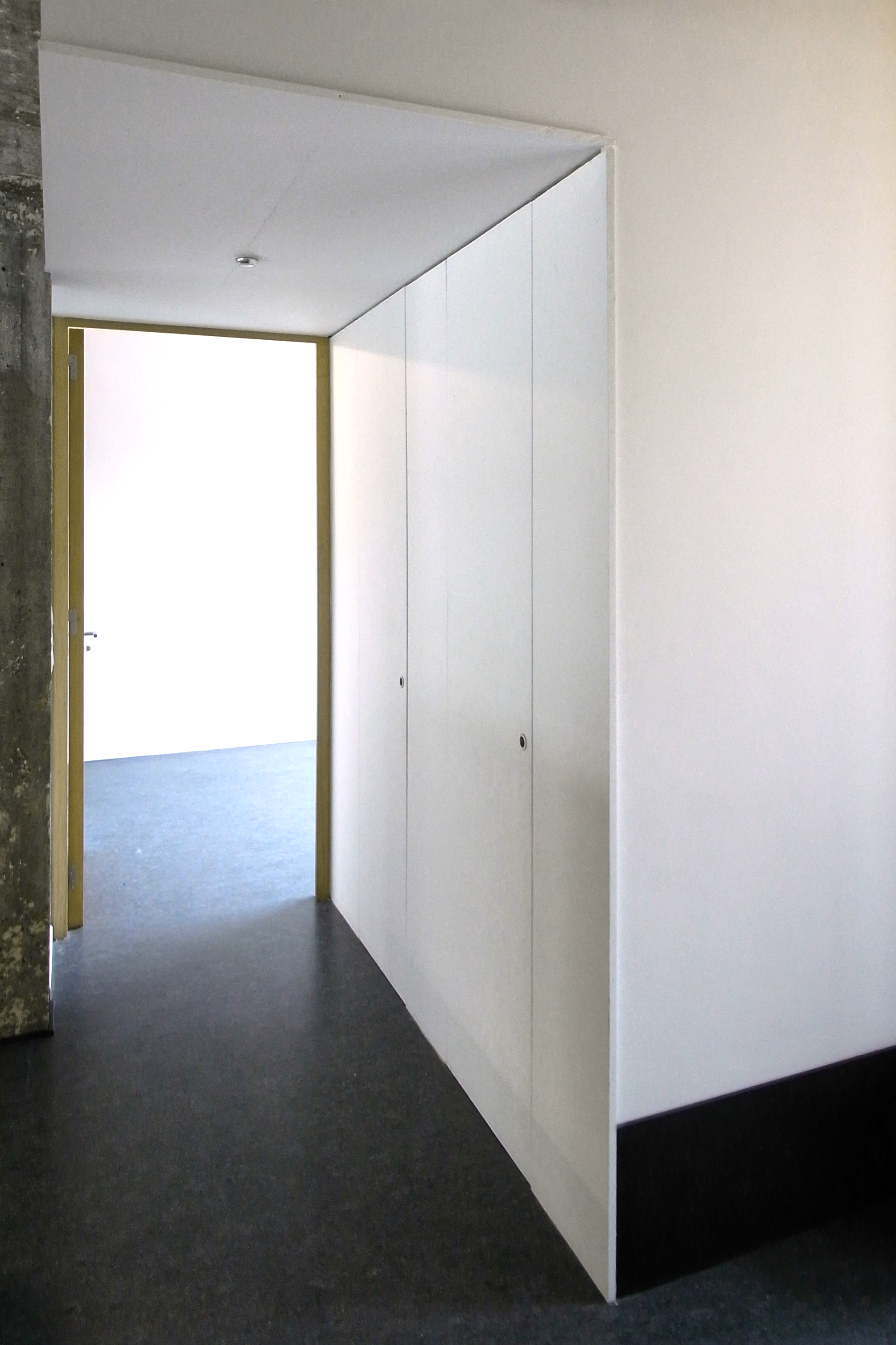
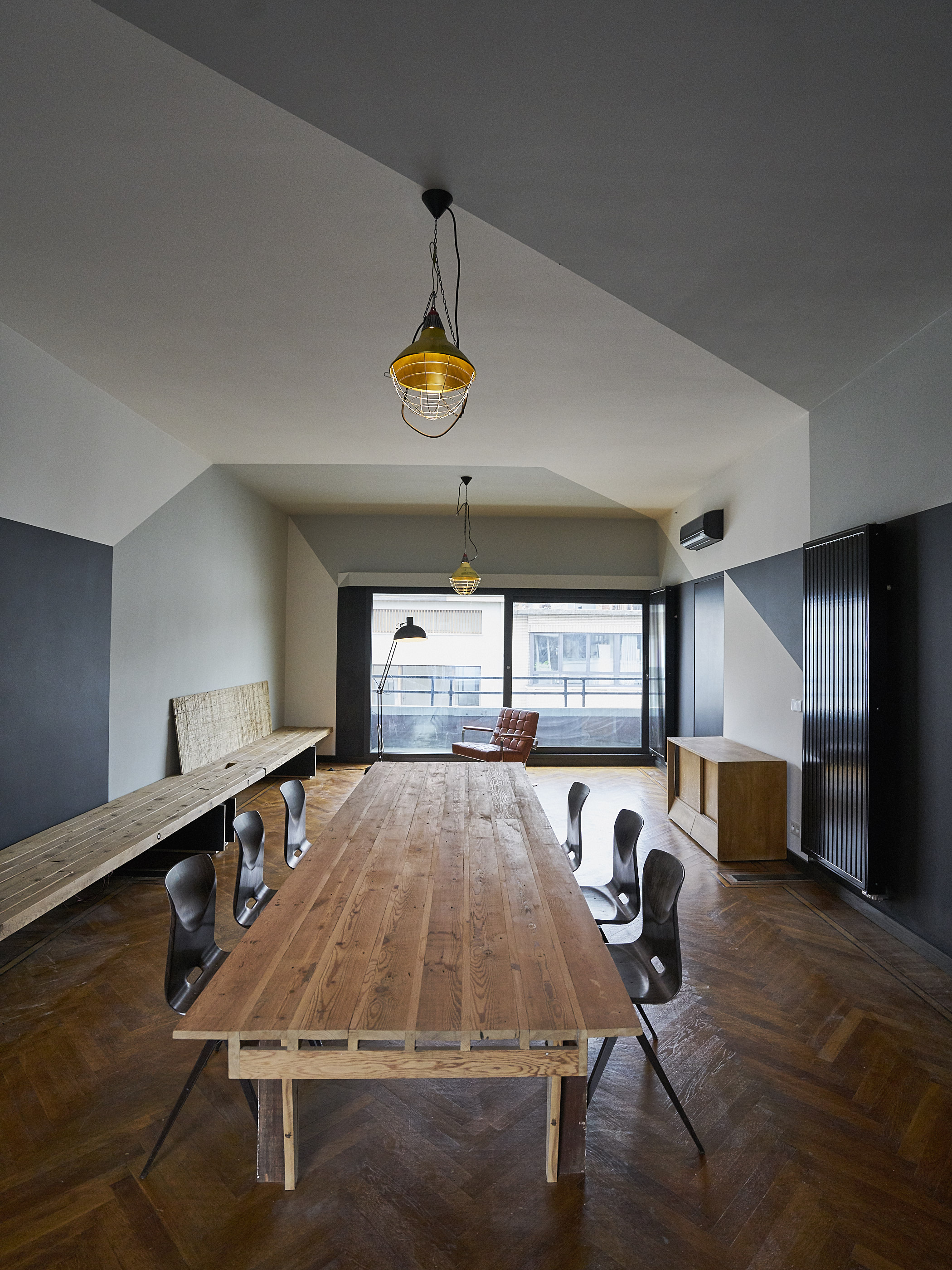
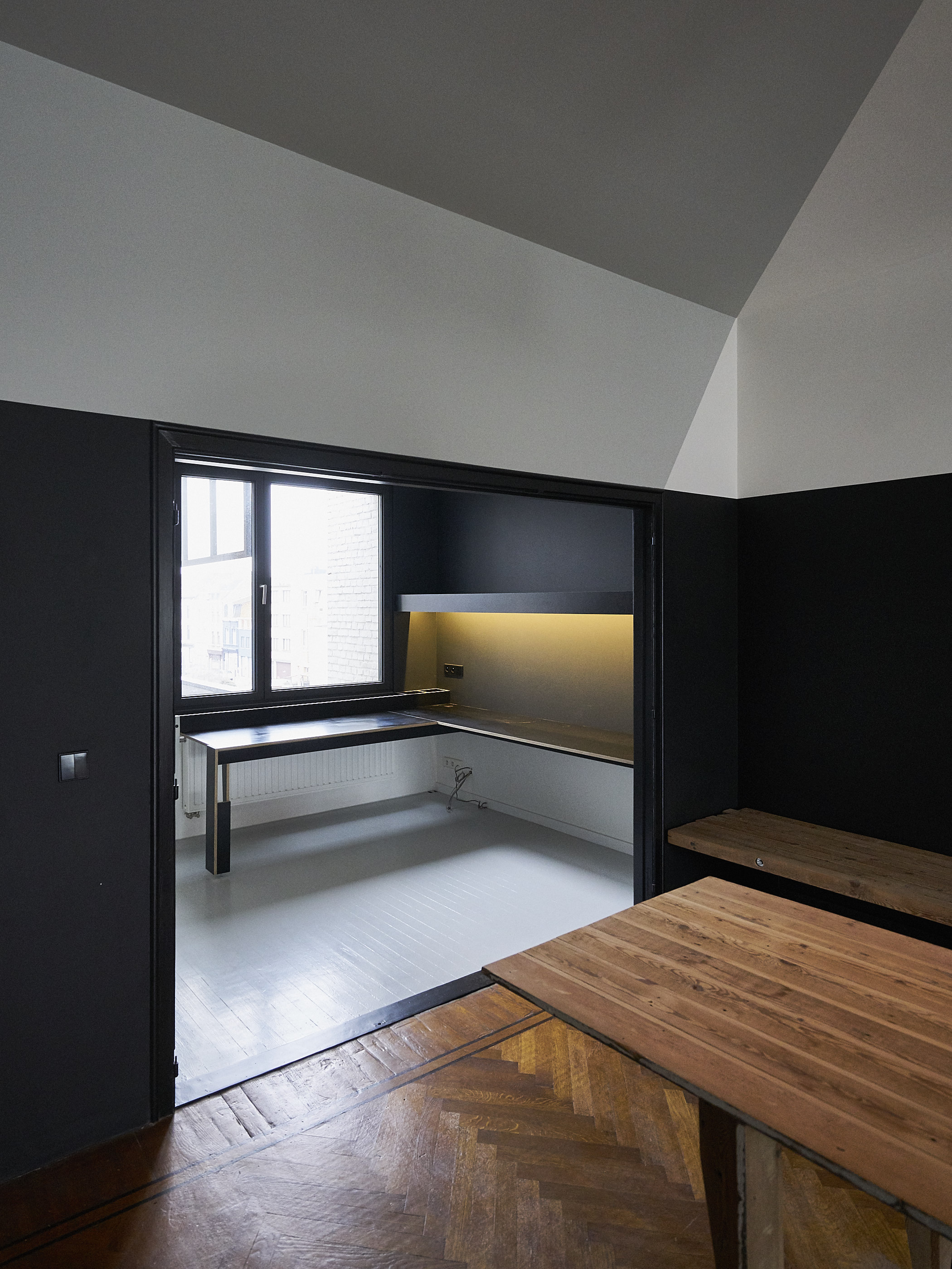
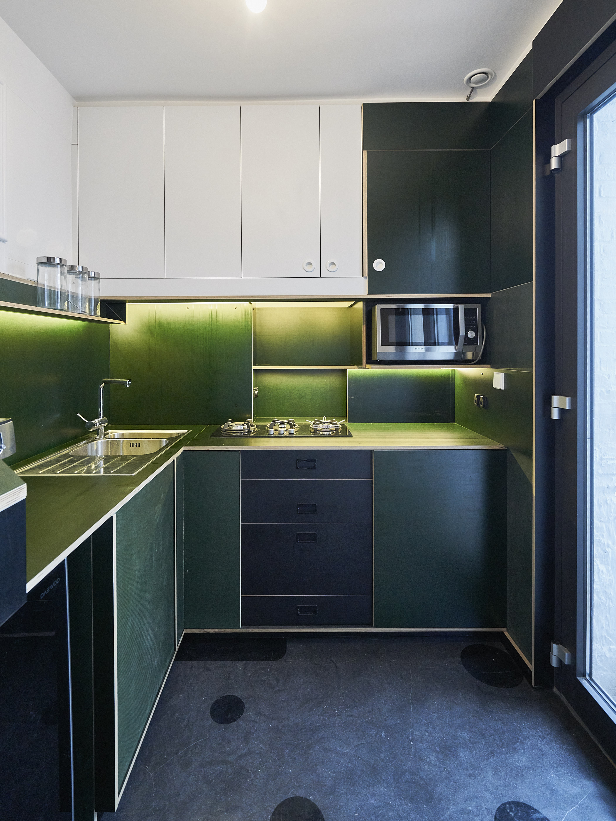
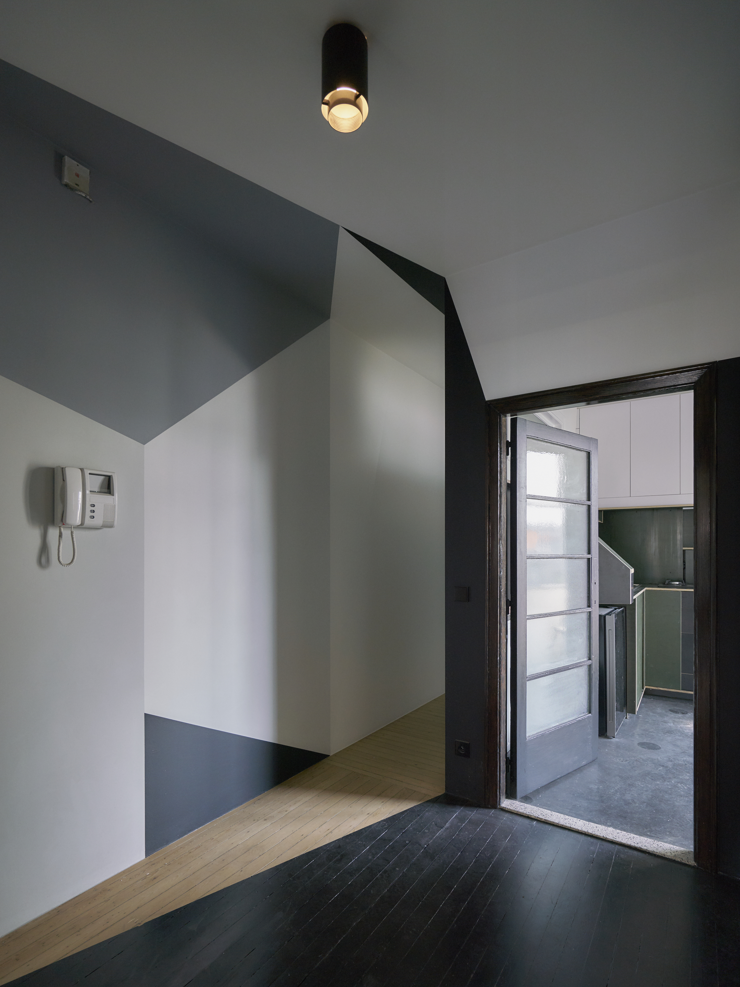
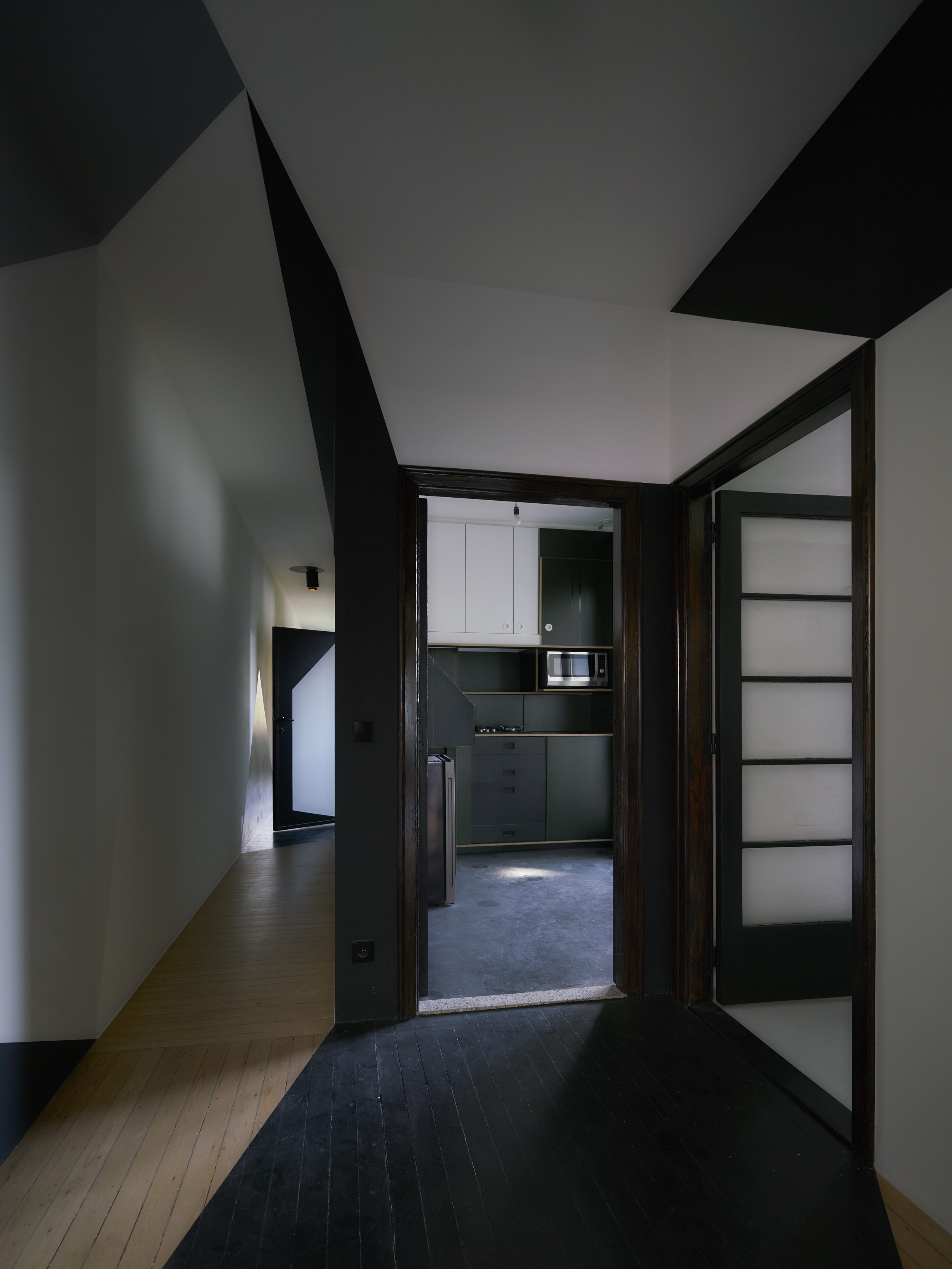
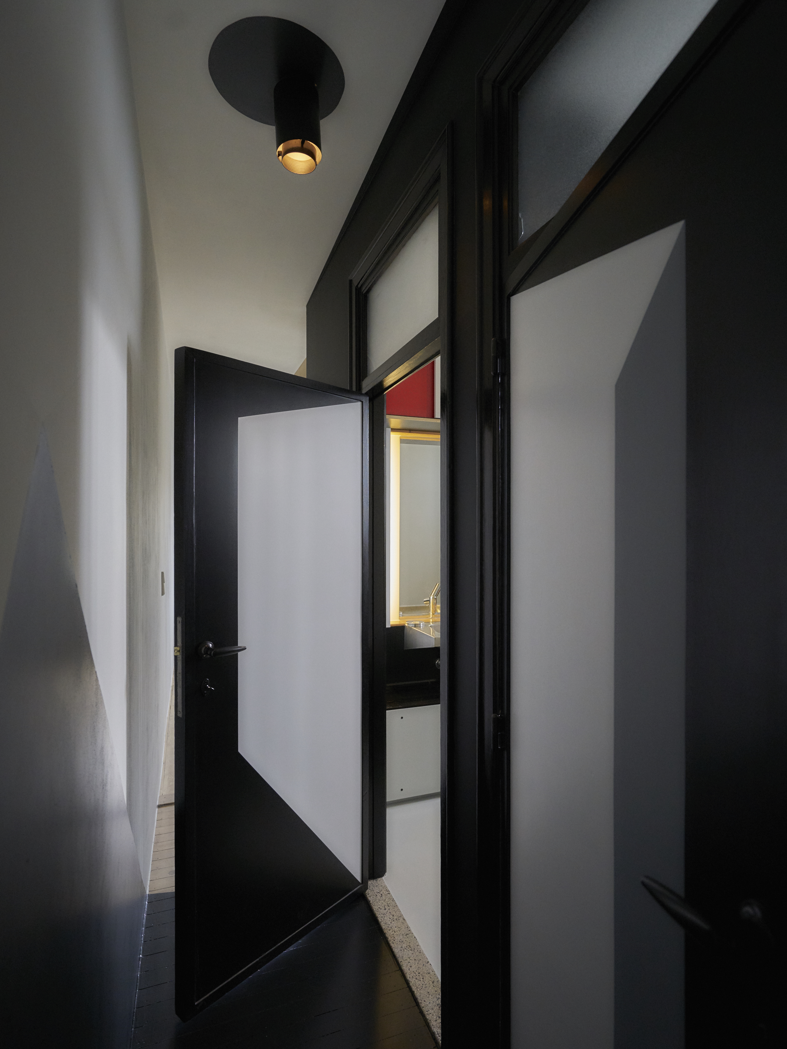
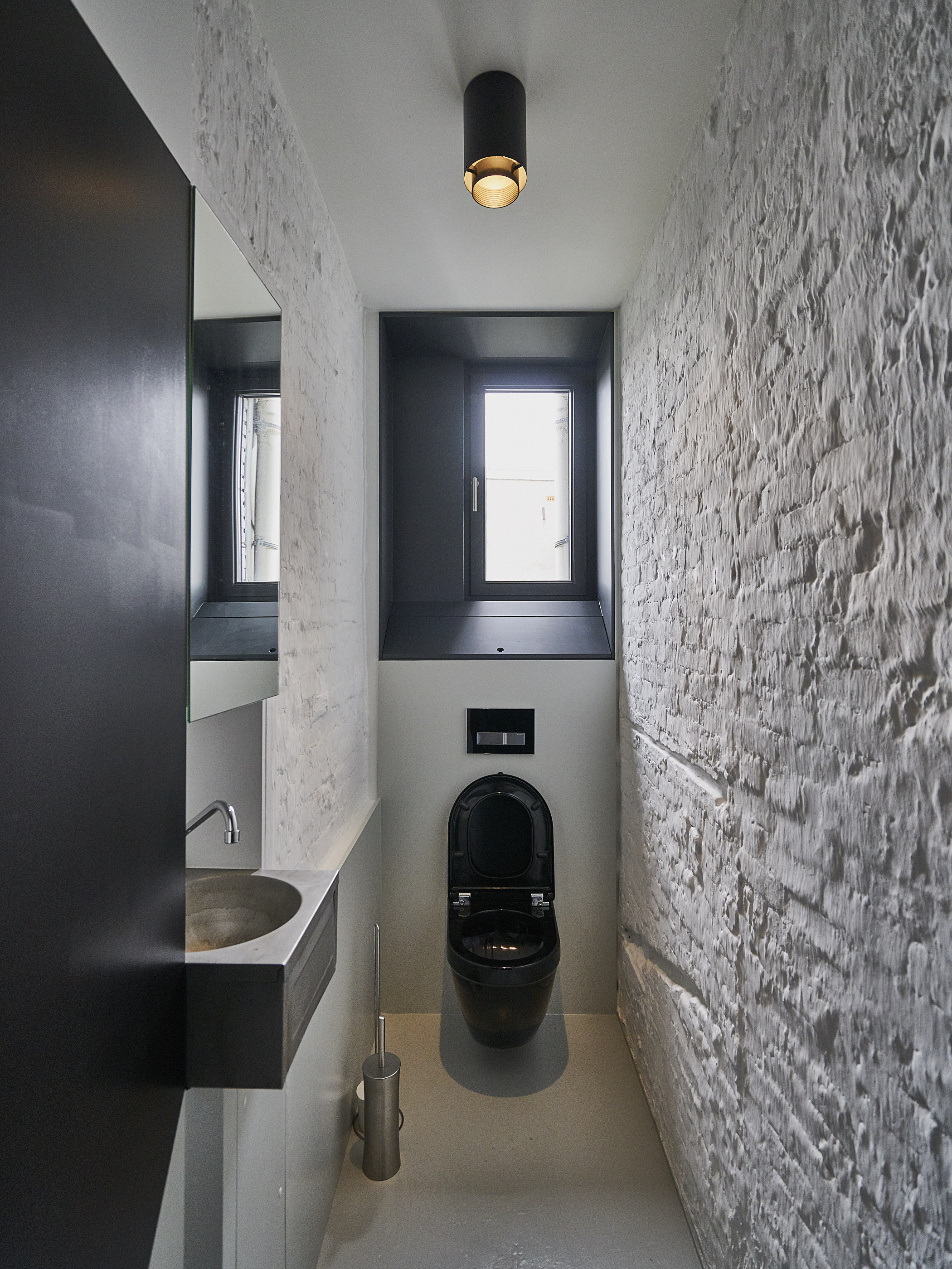
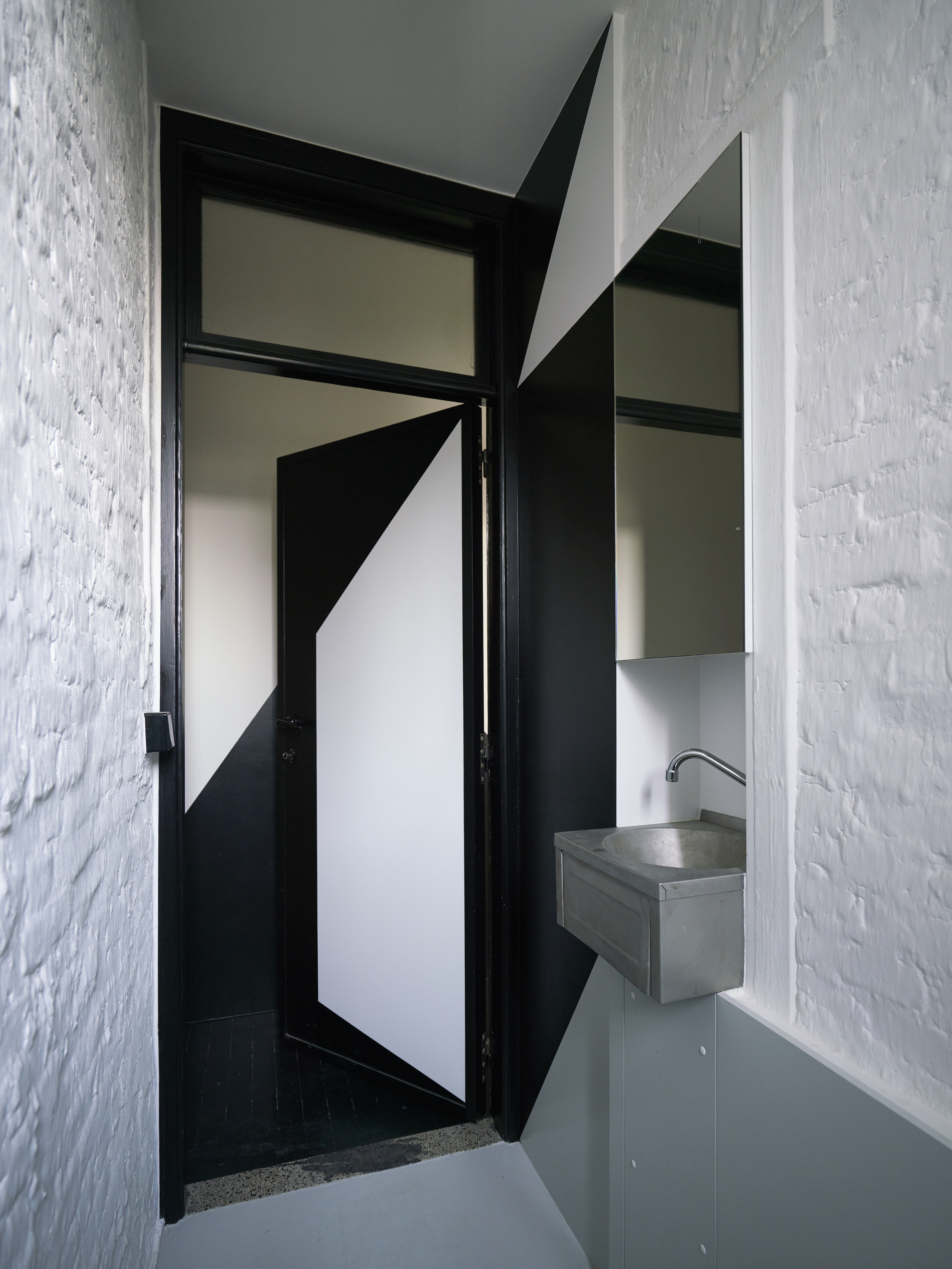
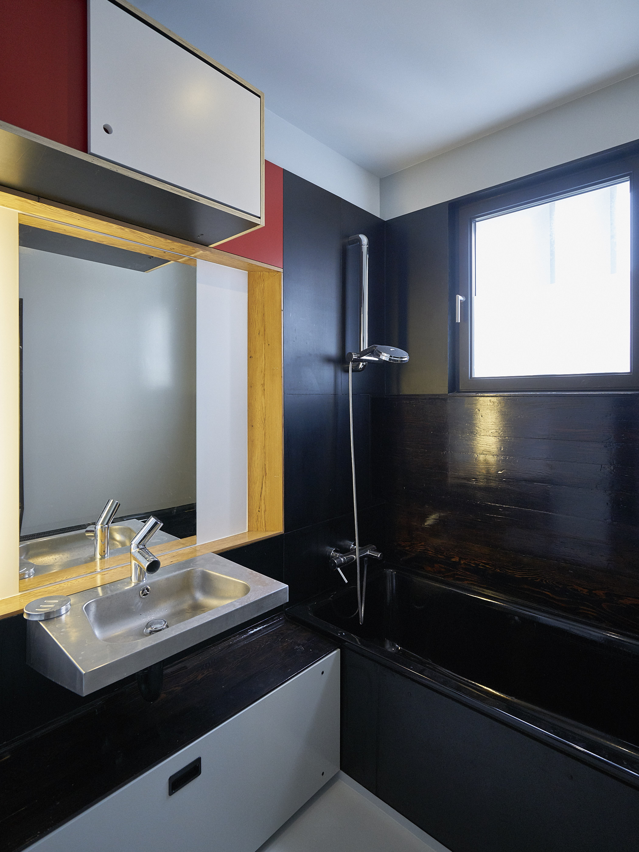
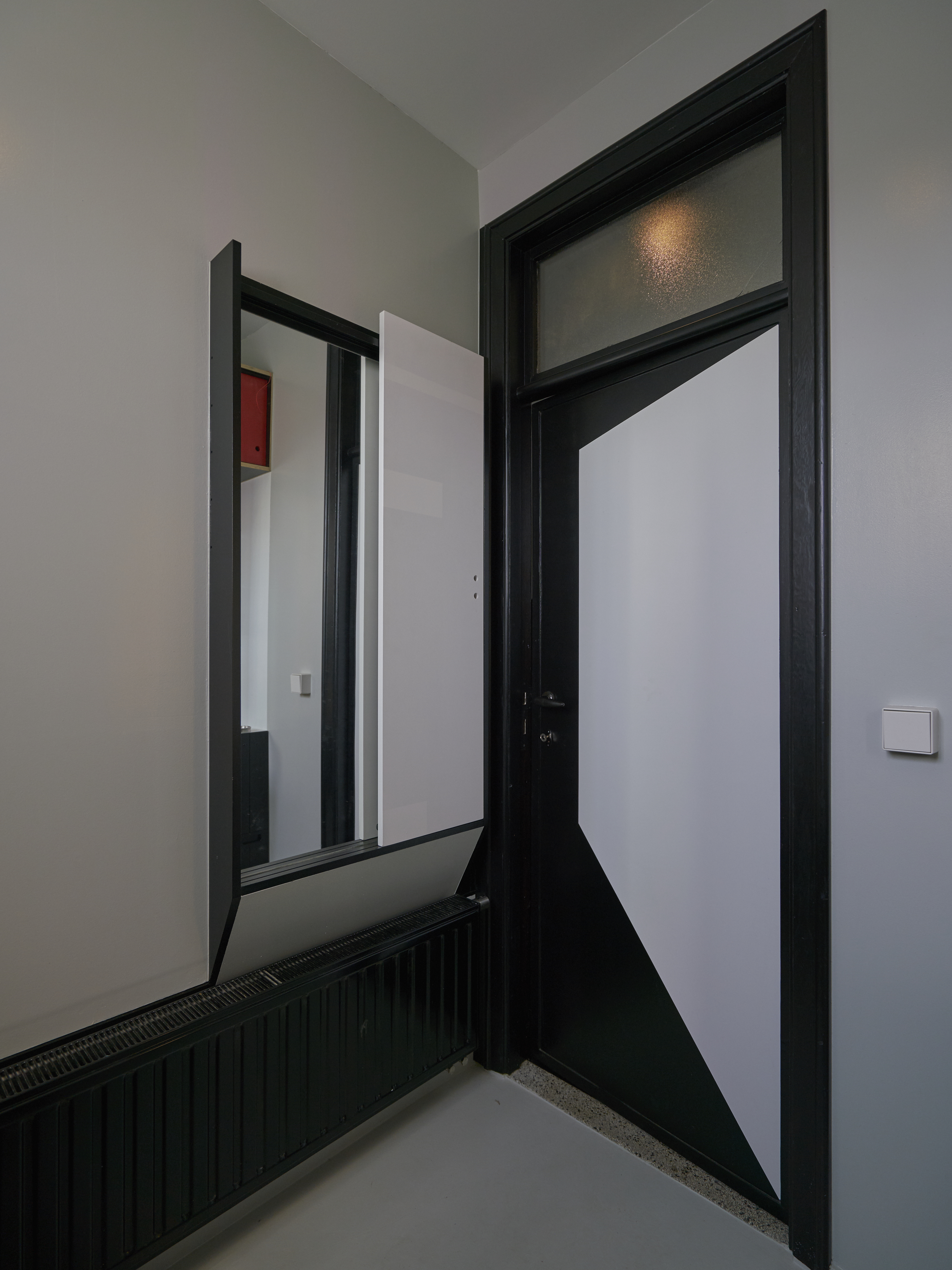
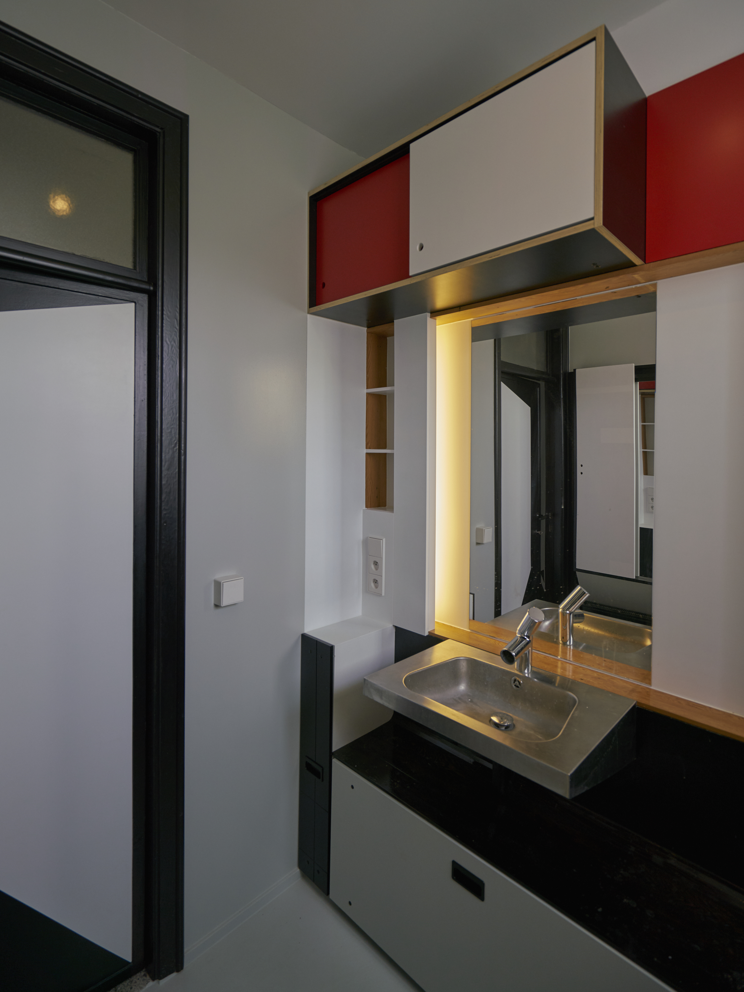
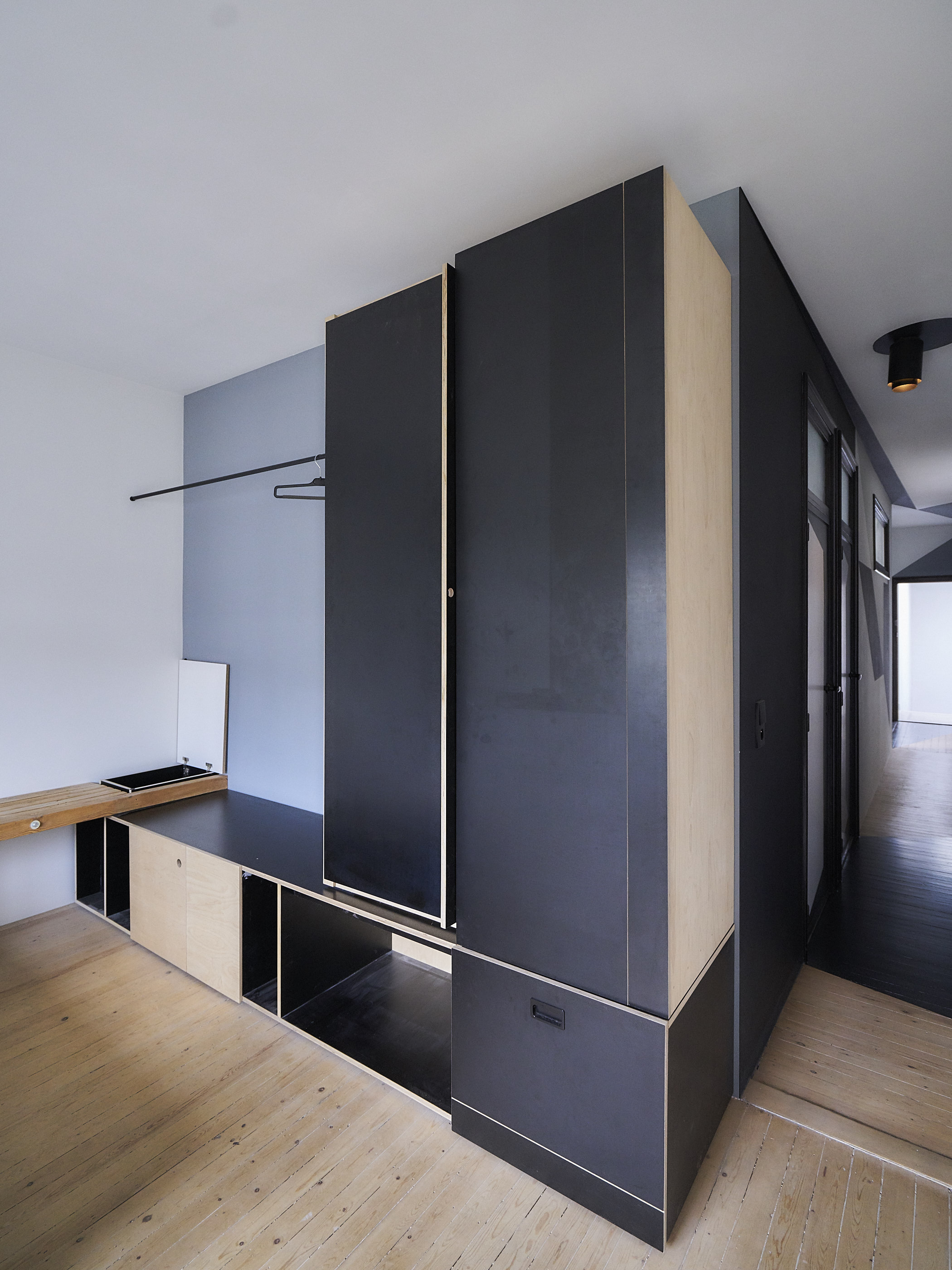
Renovation of 1930’s apartment, deconstructing the conventional spatial layout. Inspired by dazzle painting, the geometric wall patterns contradict or skew existing perspectives and plans. 

An old building is a palimpsest of alterations. This renovation avoids fixing the apartment in some new ideal or idealised state. The all-over patterning creates space for future, localised modifications. 


  • location: Antwerp, Belgium

  • year: 2013

  • architect: Hans Leo Maes / TypicalPlan

by using this website you agree to                
our terms of service / talk to us here