penning

FOUND SUBJECT (Tiled Compositions along a Catchwater Drain)

FOUND SUBJECT

(Tiled Compositions along a Catchwater Drain)

The exhibition “FOUND SUBJECT (Tiled Compositions along a Catchwater Drain)”, curated by TypicalPlan and WildArtofHK, ran from 28-30 March 2024 at a secret (undisclosed) location in Hong Kong. This coincided with the annual appearance of the Art Basel circus in the city.


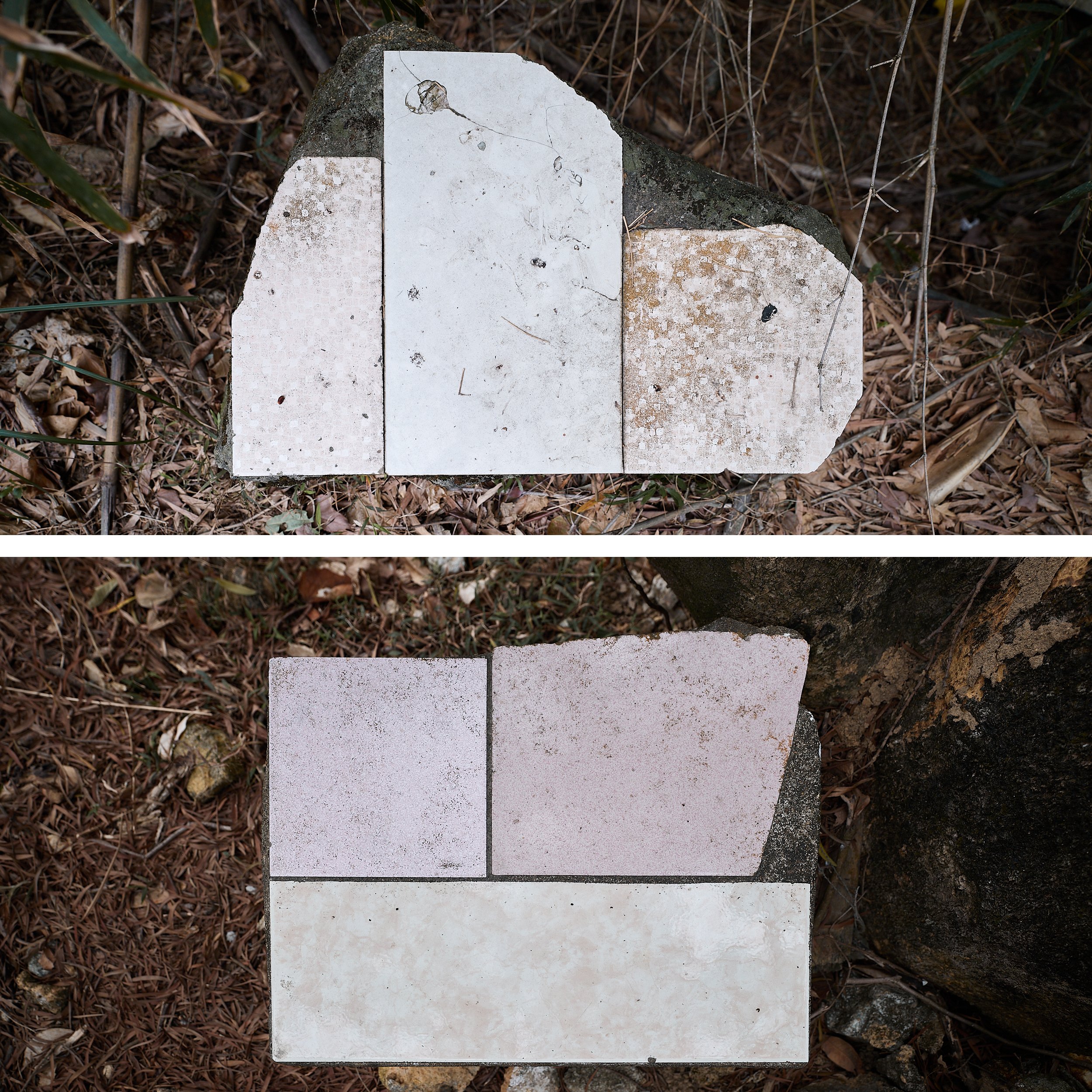
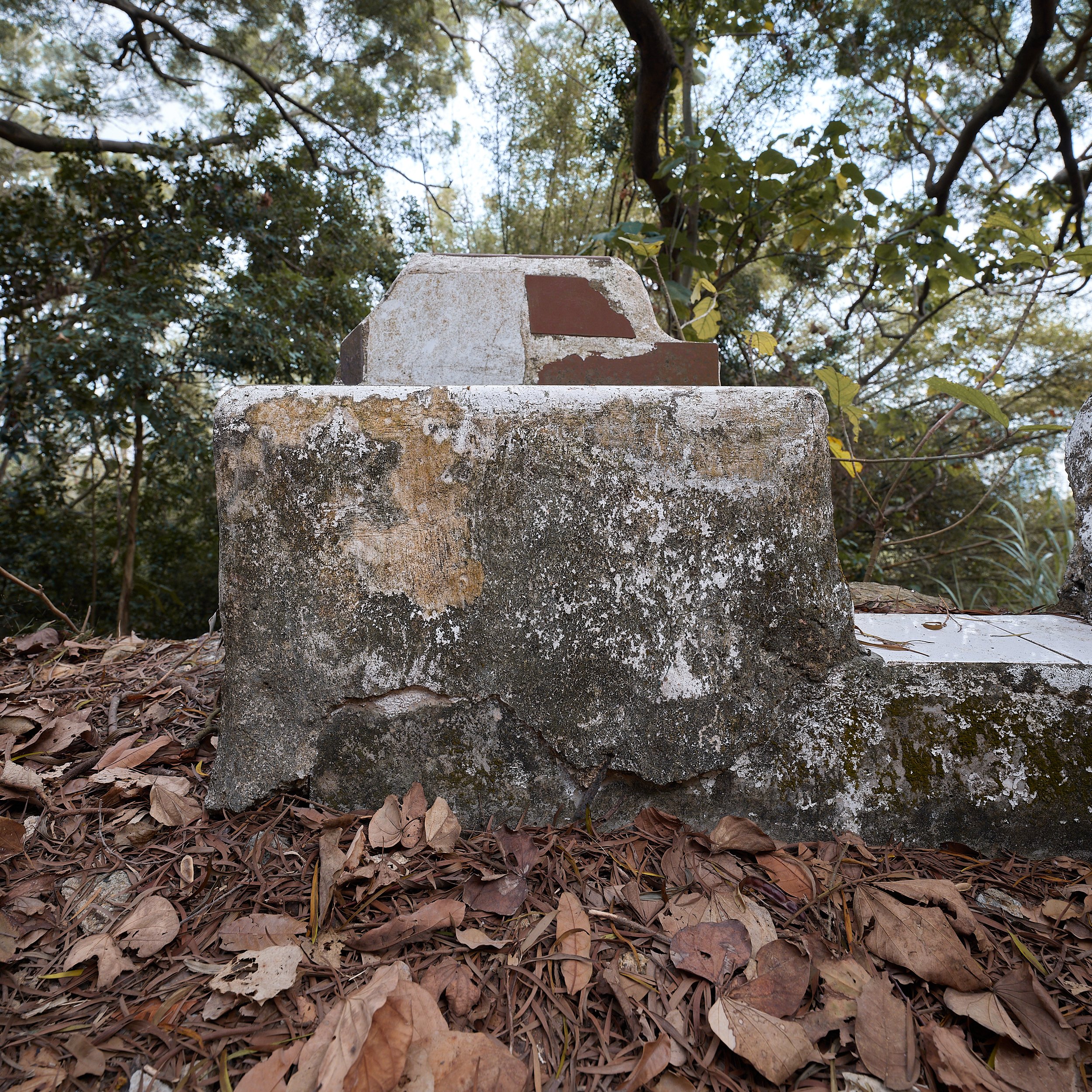
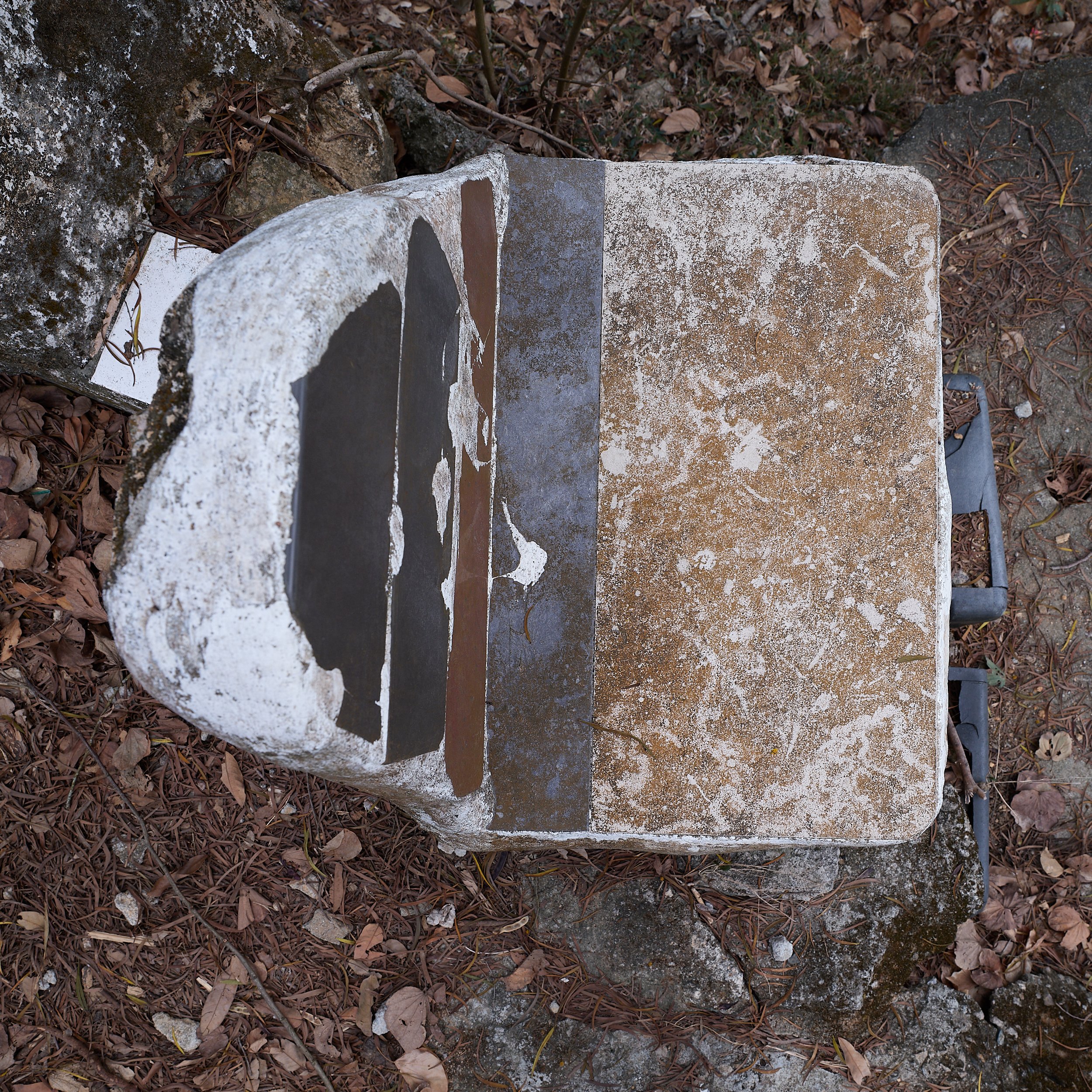
The exhibition featured the existing makeshift seats found alongside a catchwater, presumably made by residents of a nearby village. They are fashioned out of concrete, tiles and any other materials the carefree artisans could get their hands on. Despite their rather crude nature, some of them exude an unmistakable artistic quality.


(Besides some apparent embellishments, we are going to assume the makers were not too preoccupied with aesthetics. Otherwise this would just be an instance of Outsider Art we uncovered in the woods and this would rather undermine our argument below — every curation is inevitably a selective reading of reality.)


However, like Duchamp’s Fountain was not really about urinals, this exhibition is only marginally concerned with the aesthetic value of these undomesticated suprematist compositions. Rather, the exhibition “FOUND SUBJECT” seeks to use these odd objects as a gateway drug that leads us into a delirious meditation on the diminished role of the art-object within the art experience.

The art object: lost and found.

The invention of the “Objet Trouvé” (and the Conceptualism built on its foundations) still haunts our museums and galleries. Despite its name, the found object and its successor the readymade shifted the balance of power in art production and appreciation from the “made object” towards the “maker–subject”. In other words: from the artwork to the artist.

Duchamp’s copernican act of iconoclasm simultaneously banalised aesthetics and aestheticised banality (The Conspiracy of Art, Jean Baudrillard, p. 52). Within this flattened landscape, the self-evident nature of art as an exalted object has been lost. We need to rely on a life support system of museums, galleries and dedicated professionals to keep the illusion of art alive. In this context the figure of the artist has become essential. As the artworks themselves have become mute, they can only be understood through the prism of the artist’s intentions and motivations, personal histories and previous works.


As such the art object has turned into a mere representation or illustration of the artistic mind behind it. It has been relegated to the role of interface between the audience and the artist. The idea of the found object really started the era of the lost object: the disappearance of the artwork in favour of the artist.

Capitalism & Conceptualism.

The rise of conceptualism and the accompanying rise in stature of the artist have tracked the rise of capitalism. As a capitalist society we are in thrall to those who create value out of seemingly nothing. We worship the artists who turn the banal into meaning like we worship the investment banker, the bitcoin entrepreneur or the NFT-peddler. This strange alchemy speaks to the deep yearning in all of us who have been taught to live within the confines of the free market.


(The reproach that the art world is now driven by commerce is missing the point. The commerce IS the art. It is a symptom of the sublime stage of capitalism we are living in, where the object or commodity has become unimportant or invisible and only the creation of value is relevant, like in the casino-realities of the stockmarket or bitcoin trading.)


The artwork’s monetary value is not dependent on the significance of the object in itself but on the perceived market value of its maker; the object is just a symbolic representation of this value and so in itself irrelevant — often it languishes in a windowless art storage facility somewhere, like a gold bar in a vault. Investing in an artwork now resembles buying a company share in an artist: it has become a virtual, invisible object which only becomes actualised and visible in the moment of transaction.

Enchanted once again.

With the exhibition “FOUND SUBJECT” we re-centre the art object. By making an exhibition featuring existing objects whose authors remain unknown, we seek to prove that the world outside the global art market has more artistic merit than its self-appointed gatekeepers would want you to believe. If the idea of the found object put the spotlight on the artist-as-subject who magically transforms ordinary objects into valuable art, the exhibition “FOUND SUBJECT” aims to highlight how seemingly ordinary objects can still have a transformational impact on a subject, outside of museums, unbothered by artists.

As such it is a reversal of the principle of the found object that is given the kiss of life by the artist-subject; here it is the object that finds and animates the audience-subject, illuminating the viewer’s mind with explosive artistry. The object stops being a passive representation and regains the initiative. In this suddenly enchanted forest, the objects start speaking to us once again and the artists are nowhere to be seen. 

Excerpt from the invite to the exhibition.

This exhibition takes place at a secret location, contributing to the exclusive, high-profile nature of the event but also emphasising the fact that it is not about these specific objects as such. The exhibition only seeks to inspire the audience-as-subject to open its ears to the eloquence of ordinary objects and seek out poignant beauty in the ostensibly mundane reality.

The exhibition runs from 28 until 30 March, concurrently with Art Basel HK. It is to act as a tiny pinprick applied to the hot air balloon of the travelling art circus. As our exhibit is charging up our daily surroundings with potential artistic energy, one may find that it is simultaneously sucking all the hot air out of Art Basel and related events, following the principle of communicating vessels. Please contact the relevant organisers for refunds.

Opening event.

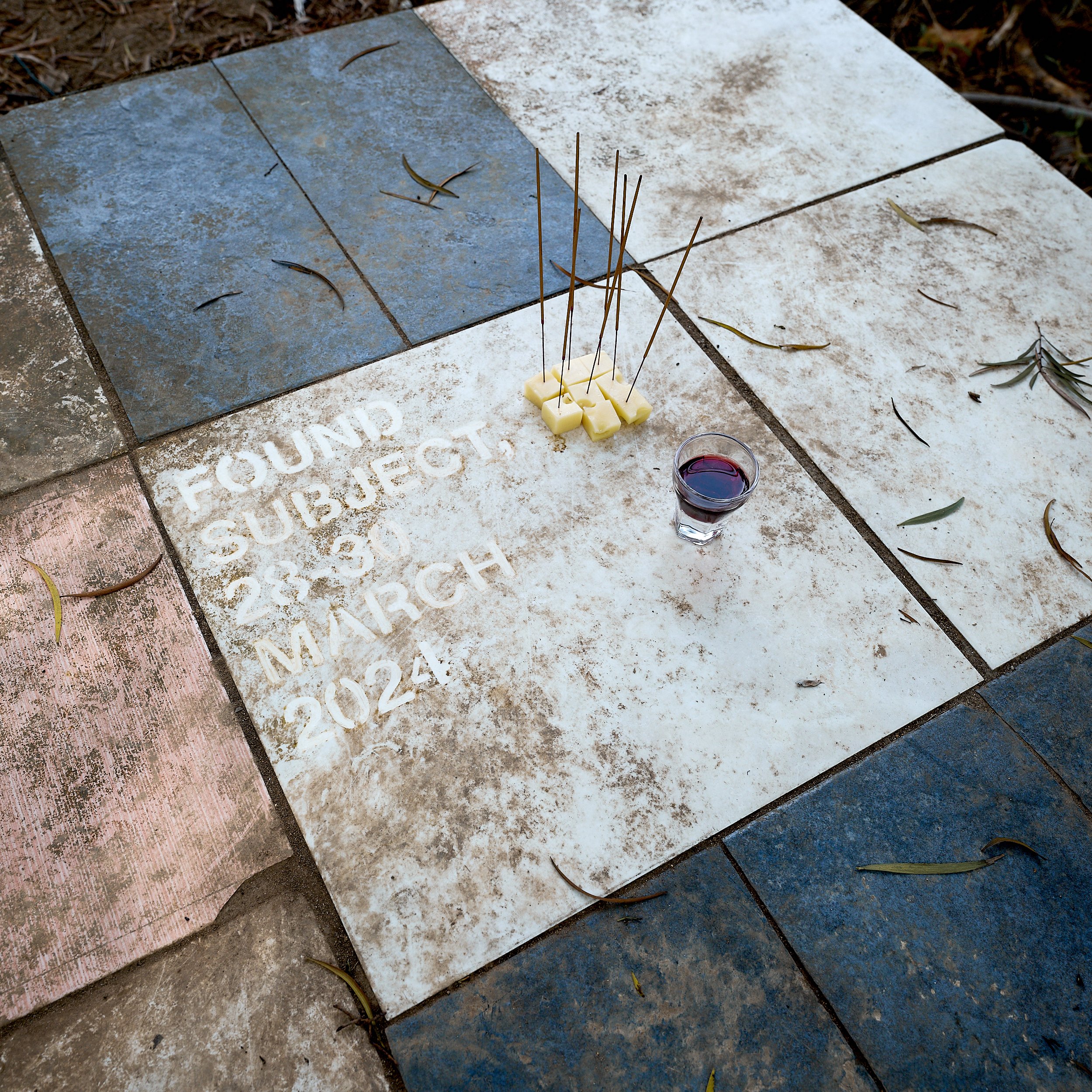
At the opening of the exhibition (attended by nobody) the basic paraphernalia indispensable to a successful art reception (cheese + wine) were transubstantiated into sacrificial offerings to whichever forest-dwelling deity is in charge of anointing artworks, eliminating the need for any middlemen in the form of the pesky art crowd with their shrill voices, perspiring foreheads and witless banter.

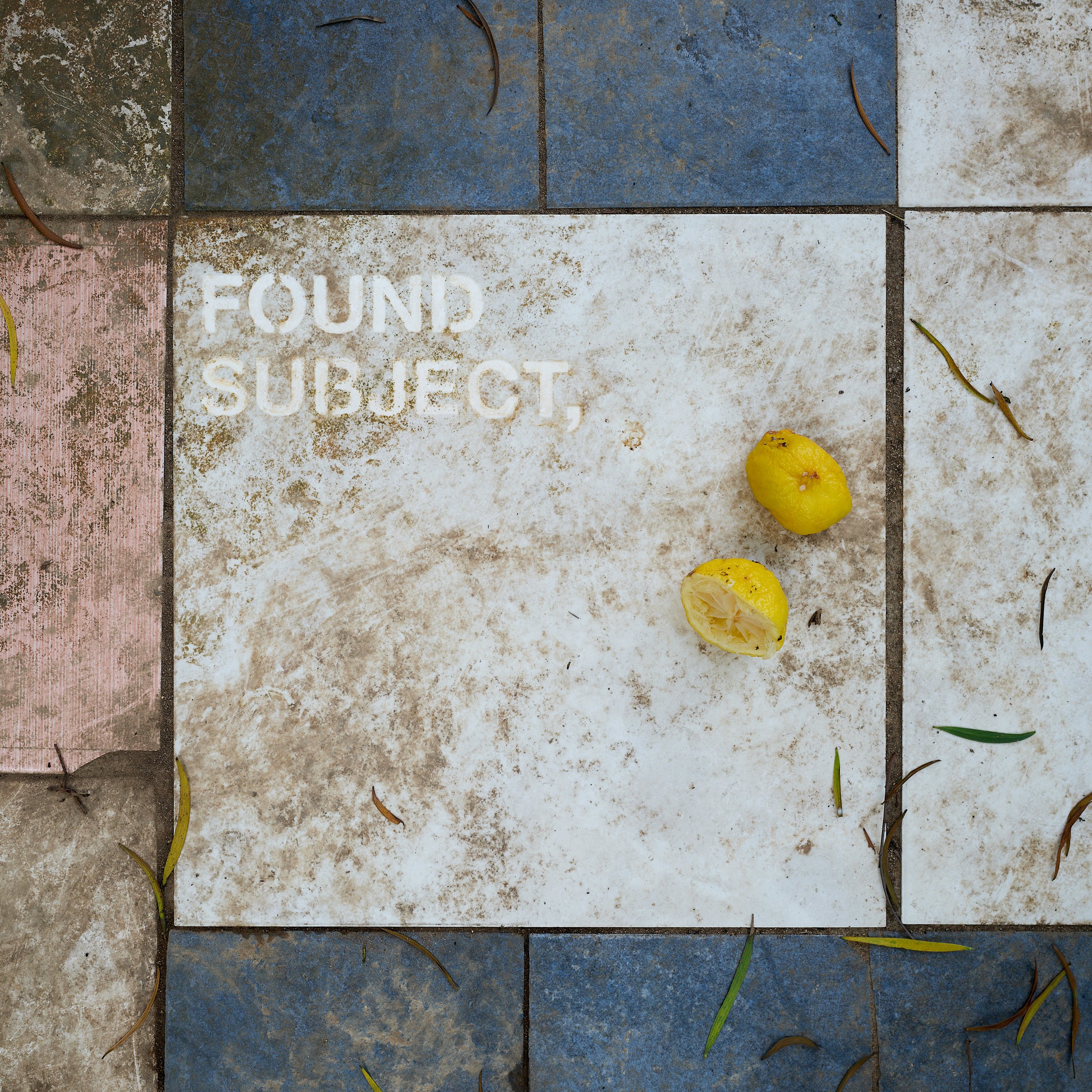
Simultaneously a sign marking the official opening of the event was revealed in situ. This sign was meticulously handcrafted through a process of what we call “negative stencilling”, a procedure that relies on locally wiping the grime off the existing tilework using a stencil template, cotton buds and lemon juice. As such this sign embodies the conceptual idea behind the exhibition “FOUND SUBJECT”: art potentially underlies all of reality and can be uncovered as long as we apply the mild acids of a sharp eye and a critical mind to it (yes, the curators still have a hangover from the reception and as such their metaphors do not quite hang together).


The Warm Embrace of Obsolescence

typicalplan = penning

about: THE WARM EMBRACE OF OBSOLESCENCE.

(A paranoid exploration of the port of Antwerp, where you are no longer needed)

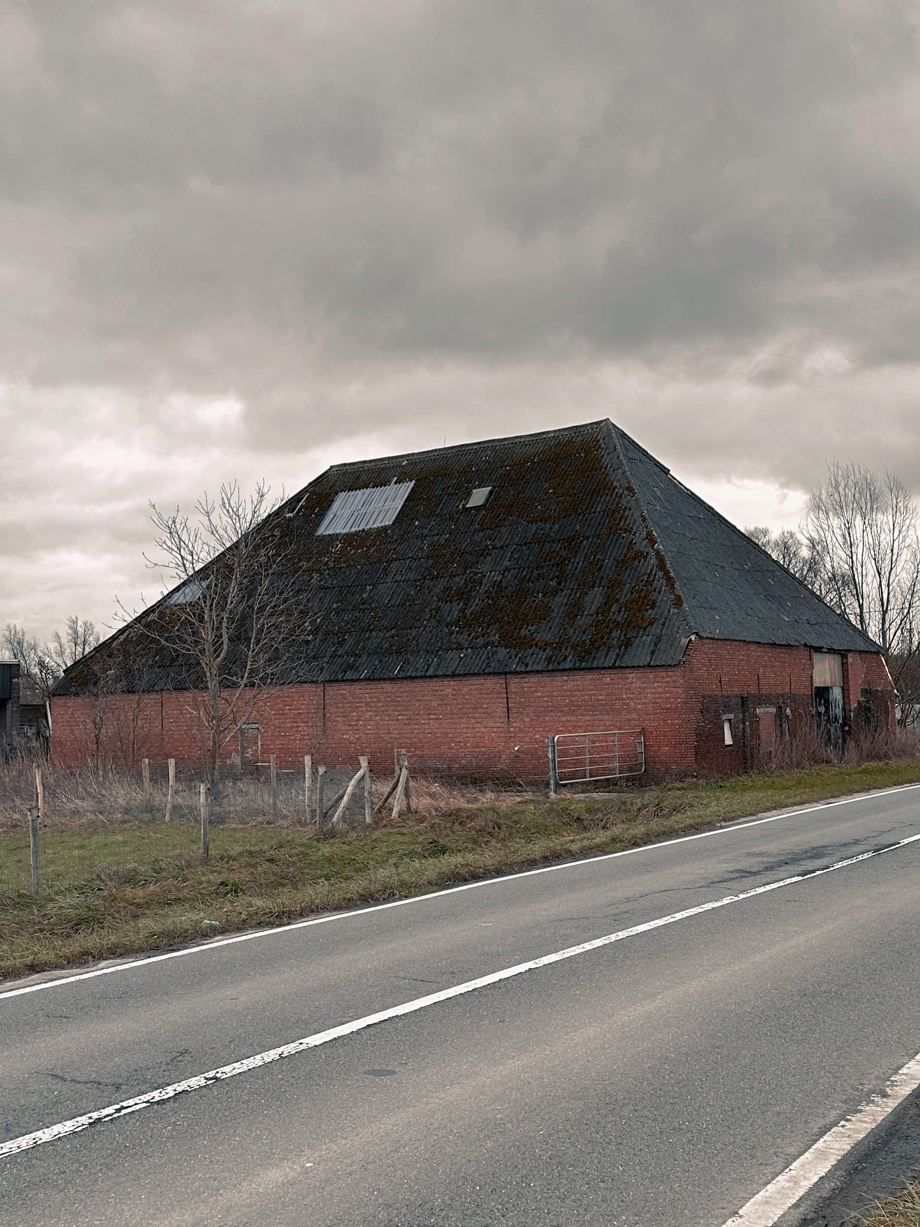
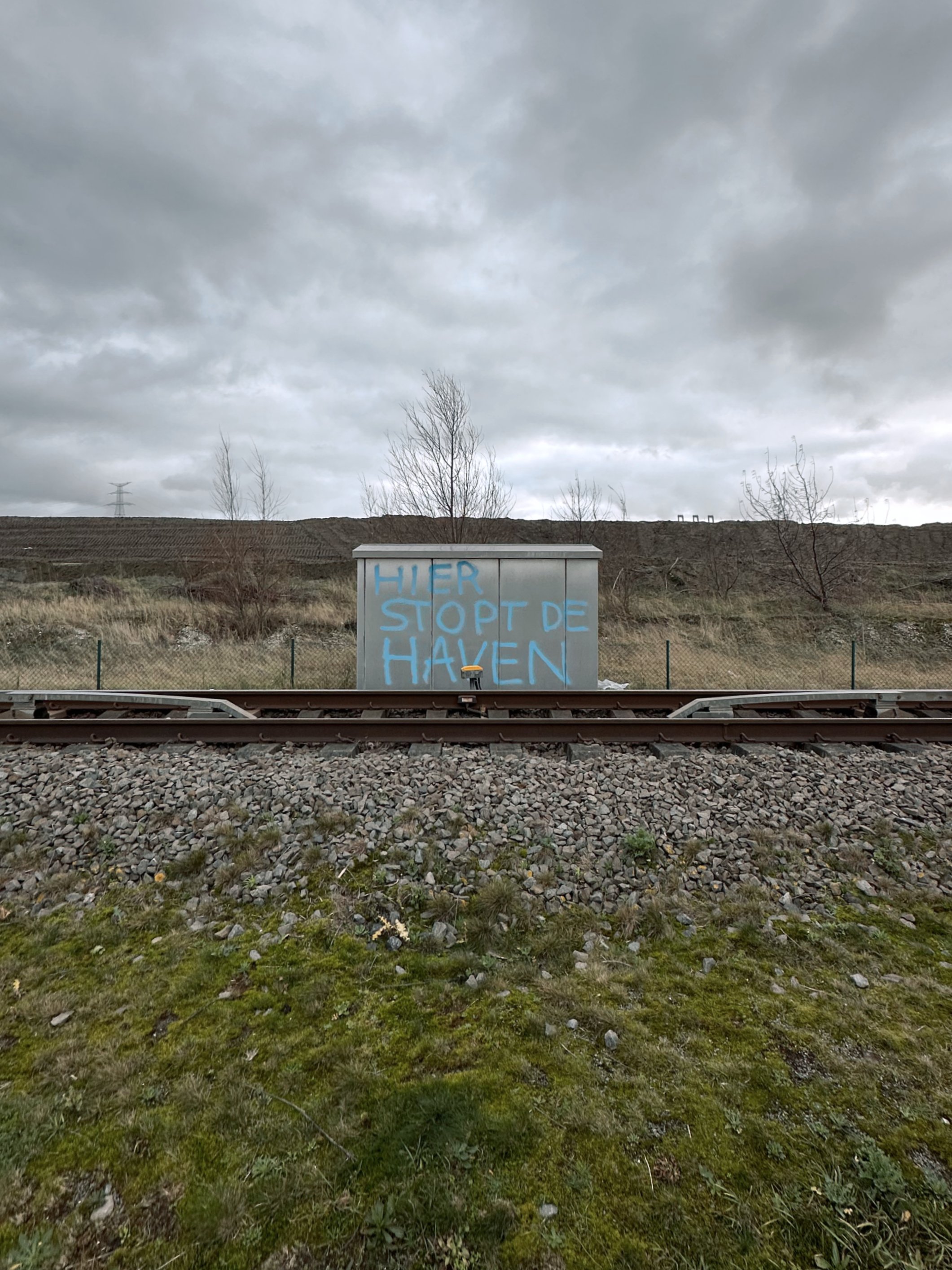
On a rare clear day just after Christmas I found myself cycling deep into the furthest reaches of the Antwerp harbour. In those last weeks of the year the days had been scarcely a few tonal shifts lighter than the nights, mustering not more than a few hours of sludgy grey slumber before collapsing back into nocturnal darkness. The year had run out of steam. So when the leaden skies finally split open to reveal a sliver of blue I took my chance, and — squinting against the sudden white light of the low winter sun — I navigated freshly laid roads in pursuit of a rare ibis that had been sighted.

The port of Antwerp is a vast, under-explored territory. An ever-widening vector of docks, locks and container terminals that is only held back by the hard stop of the Dutch border, it has geographically reduced the city itself to a static afterthought, a diminutive punctuation mark on the map. Yet, unlike the city, it hardly figures in the public imagination. It remains abstract, barely cohering into existence beyond newspaper articles about shipping volumes and trade imbalances. It is a foggy matrix of data that lacks narrative, its history buried under metres of dredging sludge.

This no-space of ruthless logic and searing efficiency has consistently exerted a strange pull on me. Since my teenage years I venture here to go birdwatching, seeking out the pockets of nature squeezed between the city’s last tower blocks and the harbour’s first petrochemical plants. My architectural master’s thesis project investigated the port expansion and the villages left ravaged in its wake. And years later, it was here that my passion for photography was sparked by the formal interplay of empty warehouses, gleaming refineries and scruffy wastelands.

Back when I visited in the nineties this was all scrubland and mud, where the low-lying agricultural lands had been recently covered with metres of sludge. Now I made my way past vast new infrastructures and factories, geometric mounds of landfill and fenced-off emptiness, barely a human in sight. As low dark clouds rolled in from Holland and I started to worry about where to shelter in this uninhabited flatness, I could not help but wonder what drew me to this inhospitable landscape time and again. What exactly was it within me that resonated so deeply with this outlandish desolation?

Not picturesque.

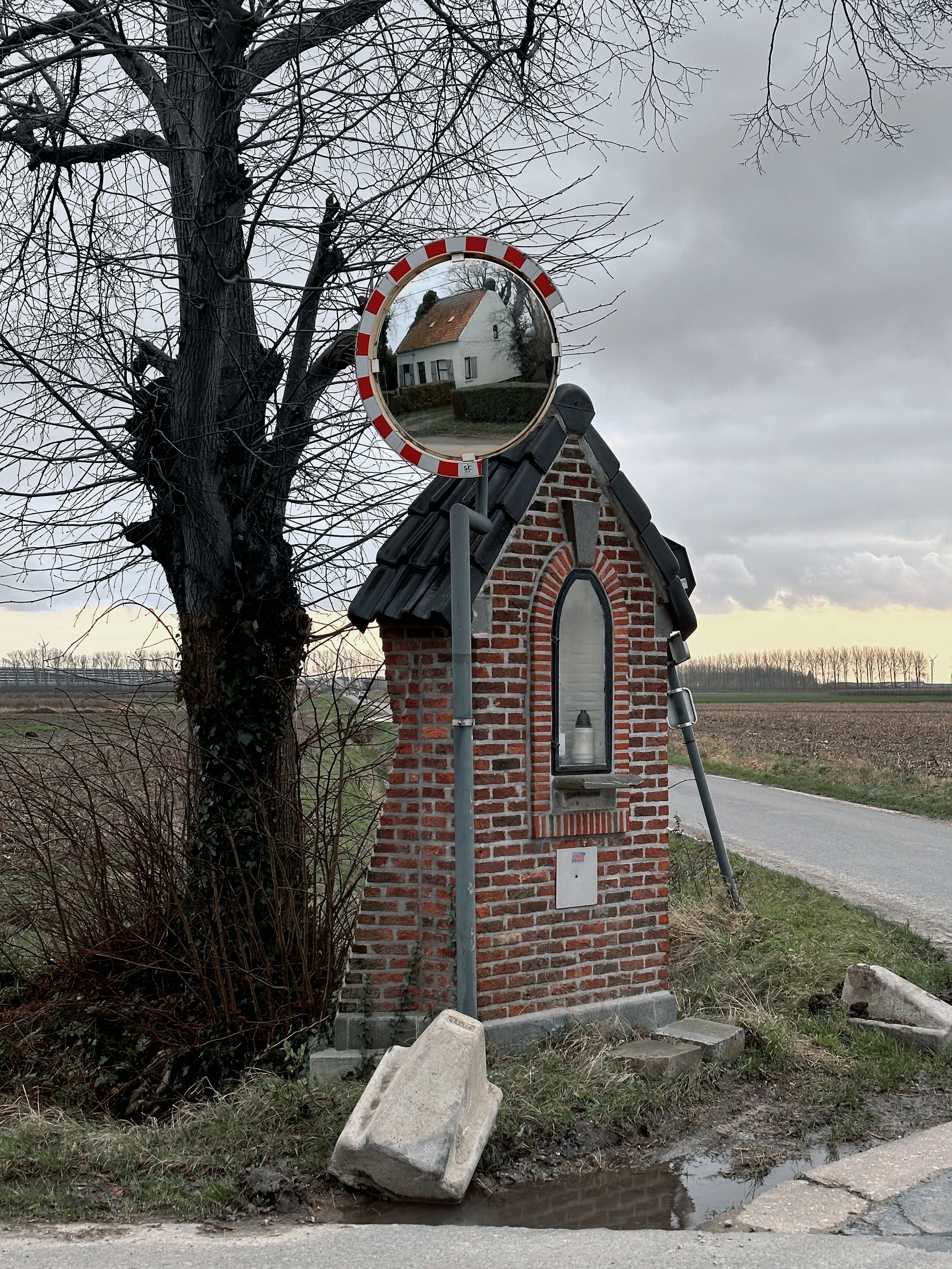
A conventional sense of the picturesque (whether beautiful or — more commonly in Belgium — ugly) may be found in the typical fragmented Flemish landscape: in the small scale of the parcelled up lots; the messy mosaic of houses, farms and factories; the medieval city centres with their cobbled streets and quaint facades; the suburbs with their ridiculous villas. It lies in the crooked detail and the uneasy juxtaposition.

The harbour environment appeals to a different aesthetic sensibility. It is a landscape we Belgians are rarely exposed to, generally lacking the grand gesture in both nature and city. Belgium does not contain soaring mountains and roaring waterfalls, we are denied the intoxicating sights of skyscraper districts or glitzy waterfronts. Our panoramas are patchworks of humane cosiness, comforting yet suffocating.

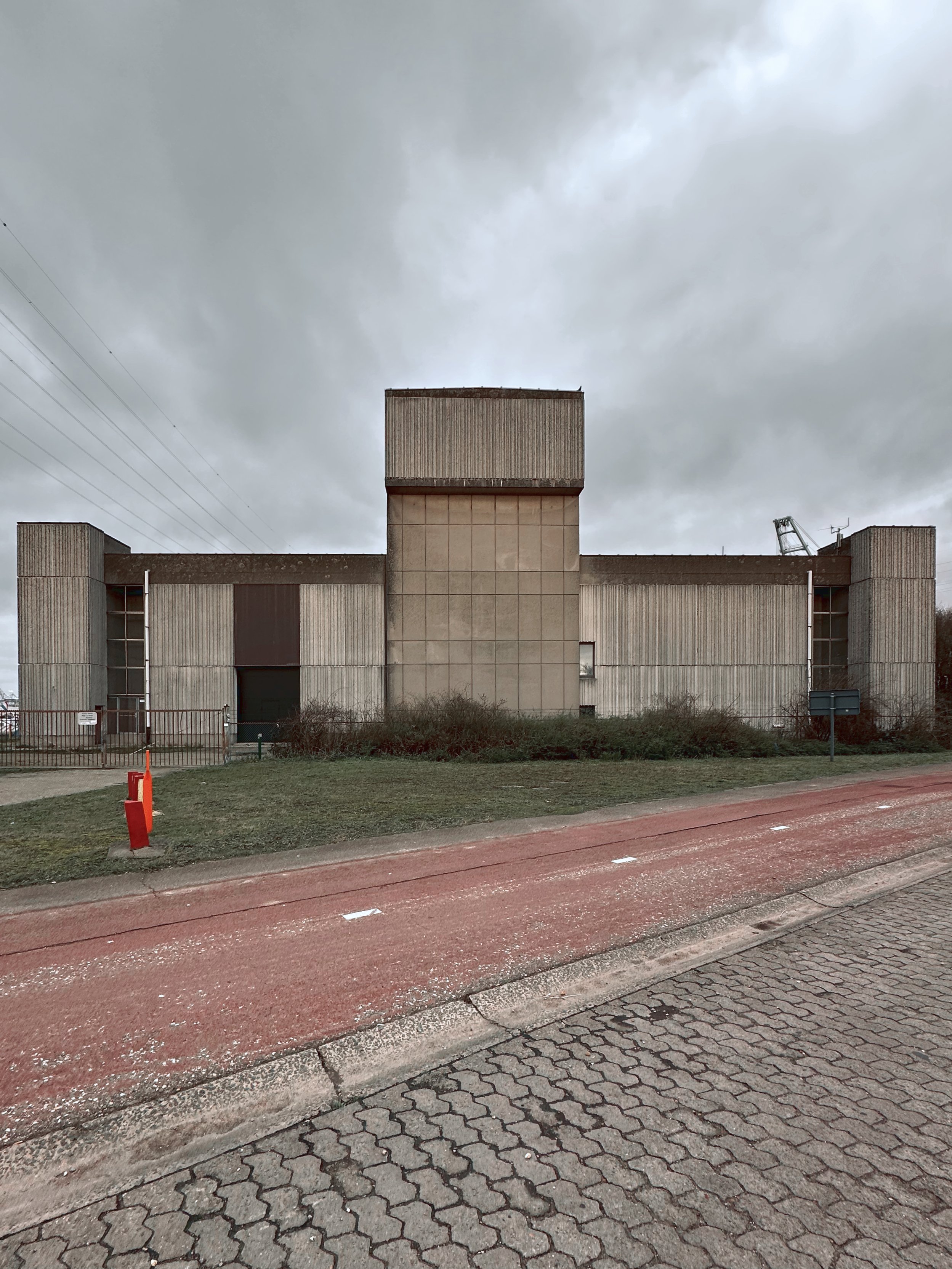
Although the port of Antwerp is undeniably conceived and built by people, the resulting environment has seemingly lifted the human figure out of the equation. This is a technocratic territory, shaped by industrial processes and logistical requirements on the one hand and an EU-decreed manufacturing of new, “wild” nature on the other hand. As a landscape that is geared towards animals and machines, it is both regressive and futuristic. Humanity has been squeezed out from both sides, by its evolutionary predecessors and successors. And oddly enough, rather than being the victims of some grand conspiracy, we humans have designed ourselves out of the picture.

Modernism going through the mechanical motions.

Fittingly this fresh bond between nature and machines is established on top of the erstwhile polder landscape. In an artificially accelerated process of sedimentation, the latter has been buried under metres of dredging sludge so as to make the absorbent land dry and ready for machine colonisation. Simultaneously some zones have been excavated, reflooded and transformed into nature reserves — as EU rules impose the creation of new nature as a compensation for the expanding harbour infrastructure.

The polders were a direct result of a rare equilibrium, a sort of armistice — or more, a symbiosis? — between nature and man. Through the use of ever more sophisticated tools, man moulded the landscape into a novel shape and created a previously non-existent environment, generating new conditions for nature to take hold. Now this intricate relationship has been upended, with technology increasingly taking the lead. The emergent paradigm of the harbour abandons the concept of landscape as an arranged form of cohabitation. The moderating sponge of the polder landscape has been replaced by wet-lands and dry-lands; a happy medium that had grown organically has been replaced by a blunt, drawing board–driven juxtaposition of extremes, a globalised logic imprinting itself on a singular locale.

This rigid segmentation reminds us of the more fundamentalist strains of modernist urbanism and makes us wonder: is this where modernism retreated to after it was chased out of the cities and the battlefields of post-war housing estates? Is it now nursing its wounds here in the former countryside, living out its unfulfilled fantasies: a landscape of geometric precision, unbothered by the quaint messiness of human lives?

The flat event horizon of the human death drive.

Along the edges of this new landscape, we find a post-apocalyptic condition that is not unlike the ones evoked in movies and other catastrophe-driven fantasies. Here are the doomed last fragments of polders, the scenic ruins of farmhouses overgrown with a nature taking back control, a picturesque wasteland full of melancholic references to a vanishing human race.

So far so familiar. Yet when we dive into the harbour zone itself we are presented with a post-post-apocalyptic environment that is not as readily decipherable. The world may be a stage, but here all actors have long left: there is no dramatic arc, no more story to tell. This is the scene of a clean cataclysm that was initiated by humans but is now unfolding in mechanical slow-motion following the clinical laws of ecosystems and algorithms, of nature and machines.

Instead of the picturesque beauty of the polders and their slow demise, the sterile precision of the harbour possesses a more sublime quality. It fills us with a certain dread — and a certain thrill. However, this is not the traditional version of the sublime that is caused by the confrontation with a formidable, incomprehensible otherness. We are not romantics overwhelmed by a nature unleashed, standing in awe of untamed wilderness. Nor is this sublime feeling generated by the theatrics of an alien invasion or robot uprising, an act of terrorism or climate change spinning out of control; in short, it also differs from the recurring (fictional or non-fictional) scenarios which represent the contemporary incarnations of the apocalyptic sublime as an external catastrophe visiting us.

This two-dimensional man-made landscape is sublime not because it is incomprehensibly opaque, but because it is terrifyingly transparent. The map and the territory have become indistinguishable. Our sublime paranoia about hidden machinations and unidentifiable threats has run out of steam, as if the fog in Caspar David Friedrich’s Wanderer painting has lifted and we finally see everything crystal clear. If the sublime effect always depended on smoke and mirrors, here it is just a window into a future we will not be part of; but occasionally we still catch a glimpse of our own ghostly reflection in the glass, as the creator who is now separated from his creation.

We cannot hide anymore behind the opaqueness of an inscrutable, possibly malign other. As it is we who have designed and created this inhuman landscape, we are forced to get to grips with a deliberately anti-human streak within ourselves, with our desire to self-exile, even self-annihilate.

This is our sublime realisation when we observe this landscape and catch our self-reflection. In our attempts to control our environment, to manage and exclude every external threat, we have created a landscape that also excludes any humanity. We have been chasing our own tail all along. And so finally here we are squaring off against our biggest, possibly only nemesis: ourselves.

Humanity as a bridge — or a purpose?

It was not long after my cycling trip that I was reminded of Nietzsche’s concept of “man as a bridge” while listening to a podcast discussing “Thus Spoke Zarathustra" — a book I had read (and scarcely understood) decades ago. We always see our surroundings through the prism of our own obsessions and preoccupations so, relentlessly over-interpreting this landscape like a fortuneteller poring at tealeaves, I convinced myself I had observed here the sure signs that man had been — or is about to be — overcome.


Pursuing this tenuous train of thought, we would have to conclude that man is not a bridge between animal and Übermensch (“overman”) as Nietzsche proposed, but between animal and machine. Because in our irrepressible Nietzschean desire to surpass ourselves, to not be bound by societal norms or ingrained habits and become a completely free agent, we may also have lost the essence of our humanity. Indeed this landscape posits the question, what if our greatest qualities as a human being are integral to our human (all too human) frailties?


Rather than man’s history being a linear, dialectic evolution from beast over man to overman (a slightly strange teleological flex for someone like Nietzsche in the first place?), there is no progression to be found here; just a return to a beastly machine logic. Humanity was only a brief interlude of complicated affections and affectations, a blip in the history of the universe.


Where futurologists and over-excited tech-bros dreamt of an exponential curve towards a singularity, we find our timeline to be more like a gaussian curve — and we have just begun the long slide down. Humanity will not end with a bang but a whimper. The only singularity that ever existed was our brain, a point of infinite creative density, that has now been scattered along the lines of worldwide neural networks in order to be harvested by machines and their mean intelligence of averages, statistics and common denominators.


We completed our role as a bridge and are retiring. Time is a loop and the future has fed back into the past. Technology has achieved the evidence of nature, nature has been exposed as just highly complicated technology and both will live out their senseless repetitive existences in eternal recurrence.

Be still my cold cold heart.

While I had determined in my mind (and probably in my mind only) that this harbour landscape prefigured the end of humanity (or at least signified a kind of abdication), I had not gotten much closer to explaining my fascination with it.


When relating to your surroundings you can look for your self, for a flicker of familiarity in the eyes of the other, for proof of your own existence as well as a shared humanity. This is the comfort of self-confirmation. But you can also seek out the eerie and unknown. You can scream into bottomless depths to hear the echoes fade away and rejoice in the inevitability of your own impending demise, the denial and loss of your ego.


The desire to transcend, to go beyond the limits of our own existence, beyond what makes us human, might paradoxically be what defines us as humans. And is not the ultimate consequence of this transgression the annihilation of the self and, by extension, the end of humanity? A human being unavoidably thinks about a human not-being.

Looking at humanity through the lens of our desire to survive and procreate delivers us no unique insights, as we share this in-built proclivity for proliferation with animals and machines. Feelings such as love are just the logical extensions of the irrational urge to propagate, a quantitative rather than a qualitative jump in evolution. (As such, it can be predicted that machines will at some point experience love — and animals already do, possibly.)


A specifically human trait on the other hand is the capacity (and inclination) to question this relentless drive for survival and reproduction. We are the only creatures rational enough to realise the nonsensical nature of being, to explore the outer fringes of existence and toy with the idea of non-existence. This is what makes us truly sentient and unique and sets us apart from other life forms, organic and inorganic.


So after I had peered for long enough at this unforgiving, depopulated landscape, what emerged was a justification ad absurdum for human existence. In the over-eager dark room of my head this sublime negative image was developed into an unlikely positive impression of the human condition — something that had always stayed tantalisingly out of reach when I tried to build up a logical argument in favour of life using ephemeral positive values such as community, love or creativity.


As I emerged from the harbour, I realised the paralysis in my face was not frostbite caused by the wind but sunburn — the numbness felt the same, but it was now impossible not to crack a smile.

Epilogue: the endgame.

Rushing to catch the boat back into town, cycling and sweating in the warm winter weather, I remembered the moment I rode into the harbour earlier that day. I had gotten off the river bus which was populated with darker-skinned people being ferried to the logistics centres and container terminals where they kept the wheels of the global markets grinding.

Riding past the ventilation shafts of the tunnel under the river, an extraordinarily loud bird sound stopped me in my tracks. I failed to locate the outsized bird producing this monstrous sound, until I realised it was emanating from a speaker. A little further two jackdaws picked through the grass, looking for food but also, I imagined, listening.

And I knew then: the machines and animals were now directly speaking to each other and, slowly but surely, the day was approaching when they would have absolutely no use for us anymore.


  • date: 12/2023-02/2024

  • author: Hans Leo Maes / TypicalPlan

  • photos & video: iPhone 14 Pro

Penning for you

typicalplan = penning

design-related TEXTS for YOU (so you don't have to).

TypicalPlan is now ready, willing and able to write your design-related texts, concepts and pitches in English or Dutch.

TypicalPlan brings 25 years of experience as a writing architect into play to unearth the unsuspected conceptual depths in your work. We go beyond mere copywriting to challenge, prod and reinvigorate your thinking and propel your design practice to new creative heights.

Alternatively and just as happily, we can simply write inspiring texts about you and your work for your website, social media and other communications :)

Contact us here for samples of our writing or to discuss your ideas and requirements.


About TypicalPlan / Hans Leo Maes

TypicalPlan / Hans Leo Maes has been writing about architecture and design since his student days in the late 1990’s.

Having worked for various architecture firms in Belgium and Asia, he has built up extensive knowledge of different design philosophies and cultures. His professional experience helped him gain a deep understanding of the challenges faced by architects and designers in the context of ever more stringent regulation, environmental catastrophe and out-of-control consumerism.

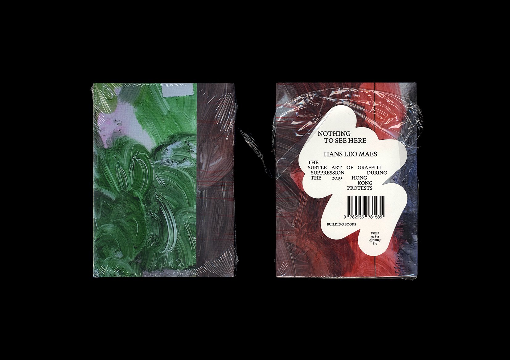
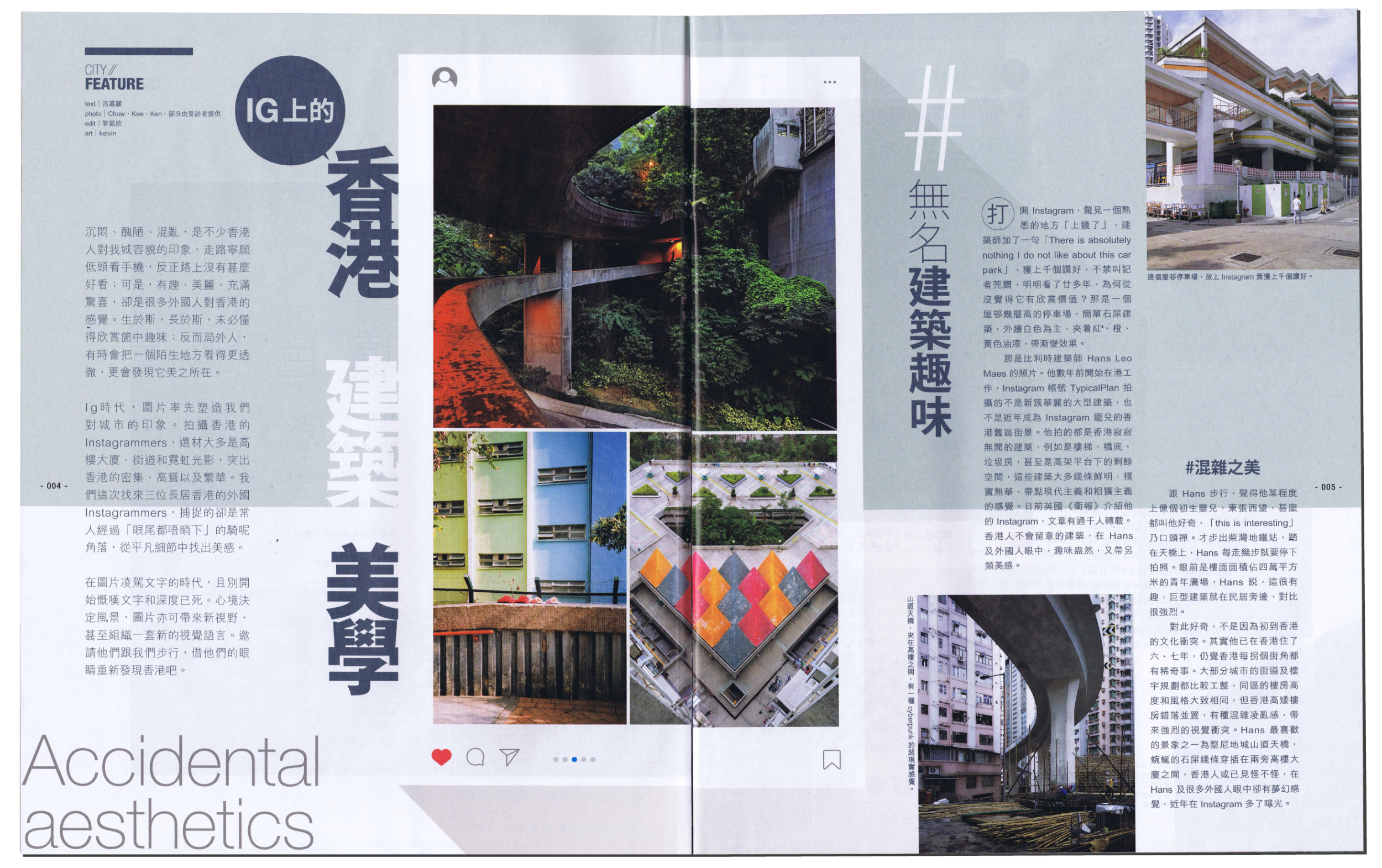
Over the years Hans has honed his writing skills working on design concepts and presentations for a wide variety of projects. Simultaneously he has continued to pen theoretical and philosophical musings about politics, culture and society. In 2021 this culminated in the publication of the book “Nothing To See Here” by Paris-based publishing house Building Books. The book — with photos and text by Hans Leo Maes / TypicalPlan —  documents the erasure of graffiti in Hong Kong.

Also in 2021 TypicalPlan started a long-term collaboration with one of Belgium’s most prominent and prolific architecture offices. Through close cooperation with the company’s founders and principals, Hans helped put into words the ambitions for their freshly minted design platform and formulate the design strategies crucial to achieving their vision.

Writing by Hans Leo Maes has further appeared in specialist design magazines such as the Modernist Magazine (UK) and Bauwelt (Germany).

Justaposition

typicalplan = producing + penning

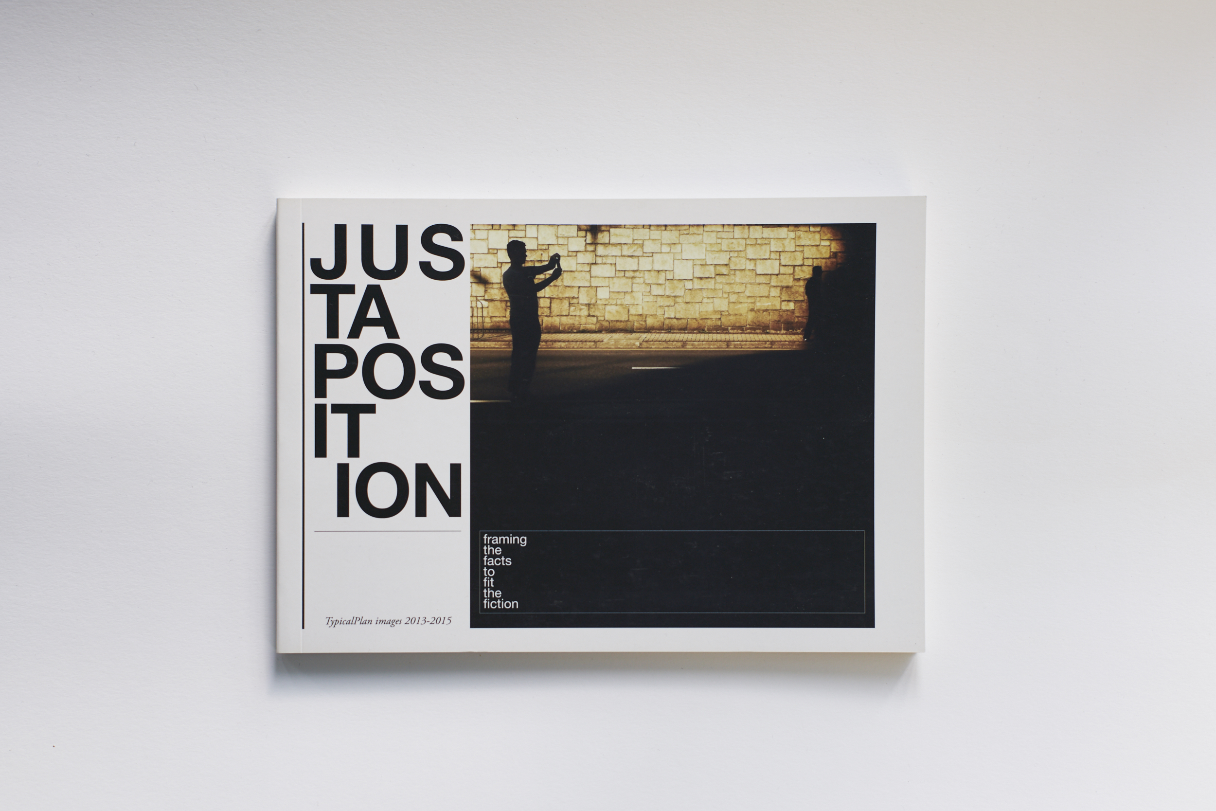
a book: JUSTAPOSITION.

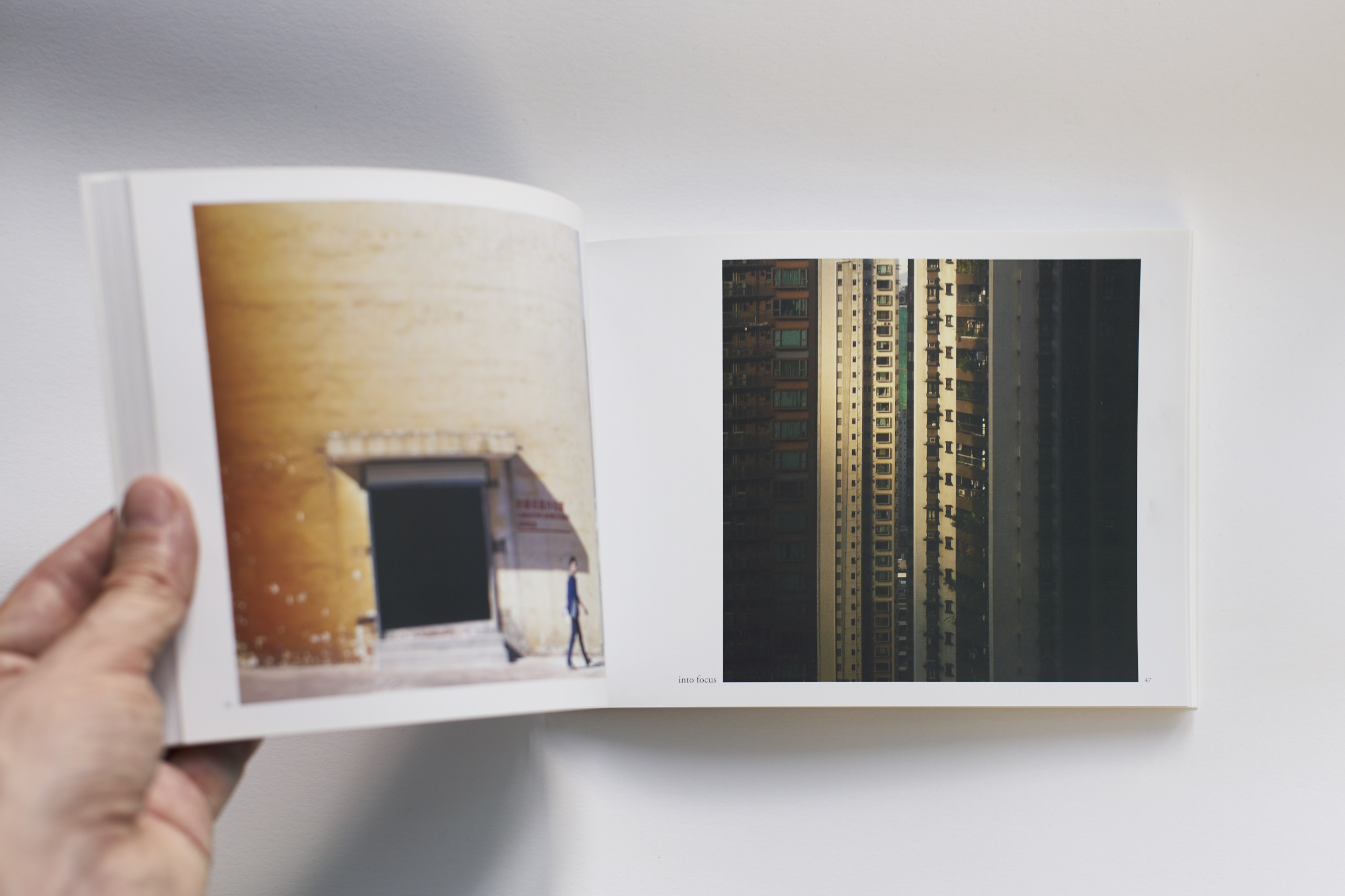
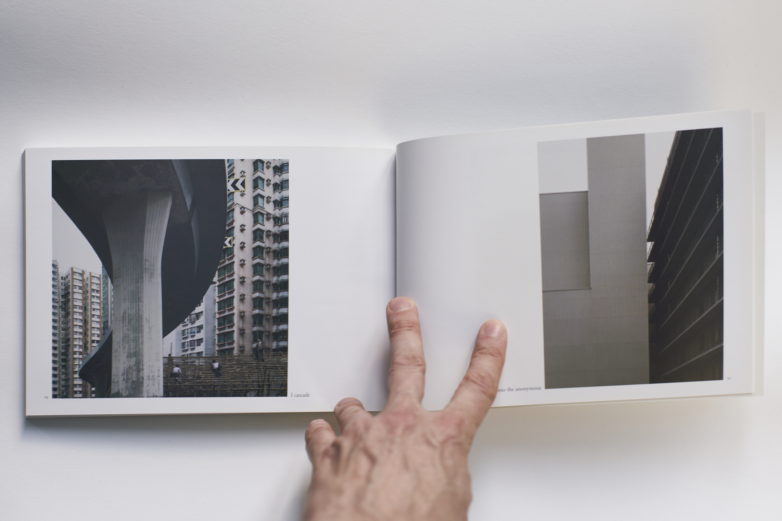
Justaposition is a collection of mobile photography previously posted on Instagram under the TypicalPlan username.

All photos were shot between 2013 and 2015 and edited ex-clusively on iPhone 3, 4 and 6 with following iPhone apps: Snapseed, Mirrorgram, Mextures, Darkroom, Perspective.

For this publication only limited reformatting was applied for printing purposes.


  • title: Justaposition. framing the facts to fit the fiction. TypicalPlan images 2013-2015

  • publisher: TypicalPlan Ltd.

  • ISBN: 978-988-14472-0-3

  • date: 12/2015, first limited edition of 300 signed and numbered copies

  • details: soft cover, 100 pages

Hong Kong's Heretic Heritage

typicalplan = penning

about: HONG KONG'S HERETIC HERITAGE.

Argument for a Pungent Architecture.

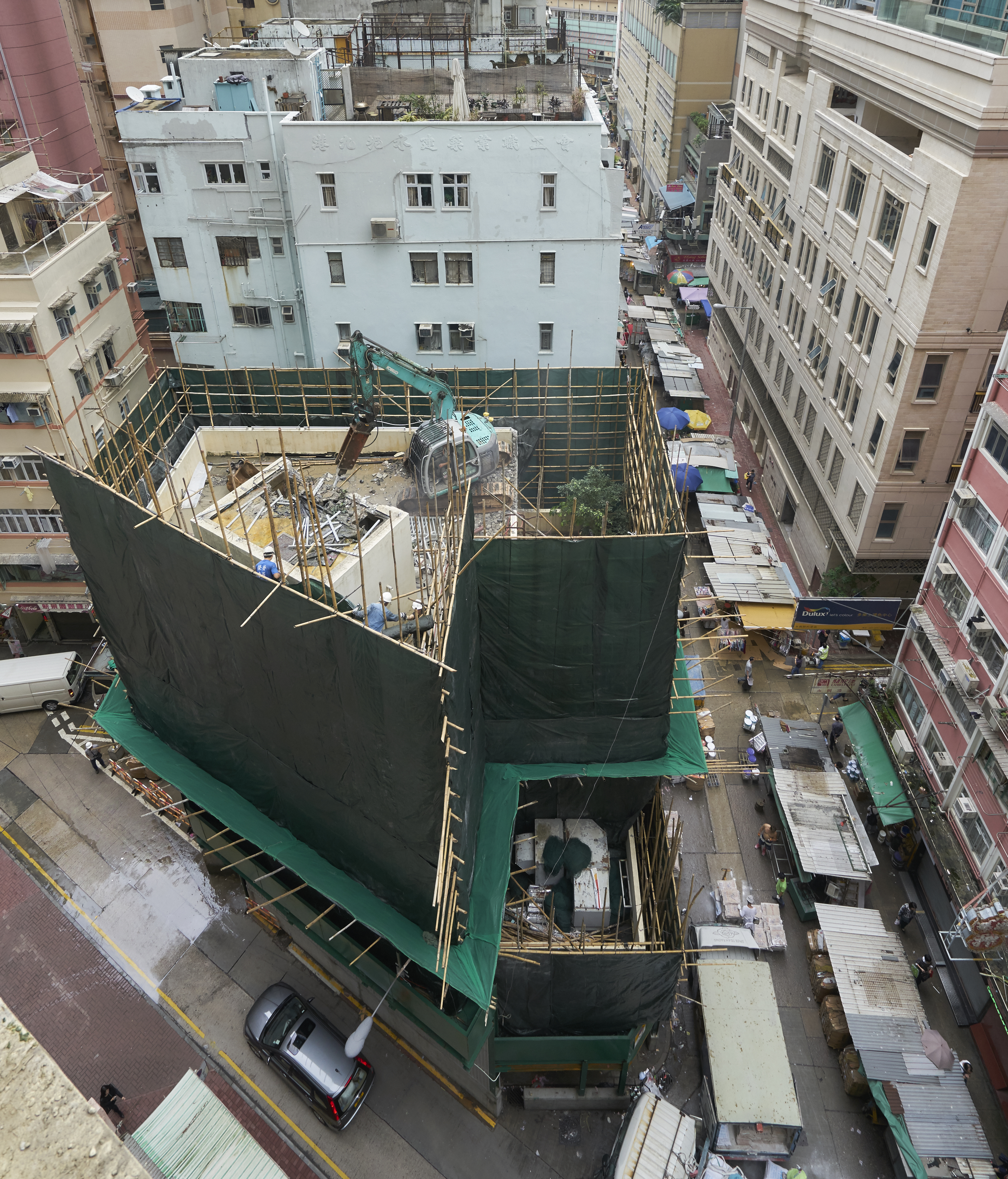
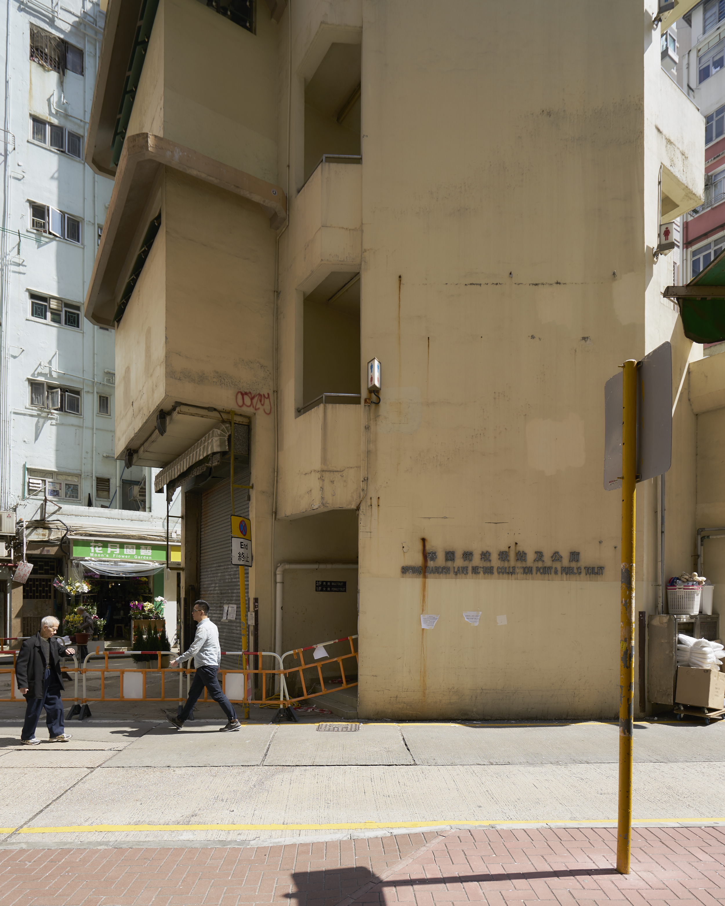
Located in the densely populated Wan Chai district, Spring Garden Lane is one of Hong Kong’s oldest streets. Where once stood picturesque colonnaded shophouses containing brothels, now a jumble of mismatched high-rises are lining the narrow lane. At the halfway point the road widens to accommodate a small freestanding building that is currently being torn down. So far, so predictable: the dry beat of the jackhammer is an ever-present part of the city’s relentlessly cacophonous soundtrack. Hugged tightly by bamboo scaffolding and tarpaulin, the building’s silhouette now stands as a forensic tent at a crime scene. Behind this veil the structure is being pulverised back to the triangular piece of land it was standing on.

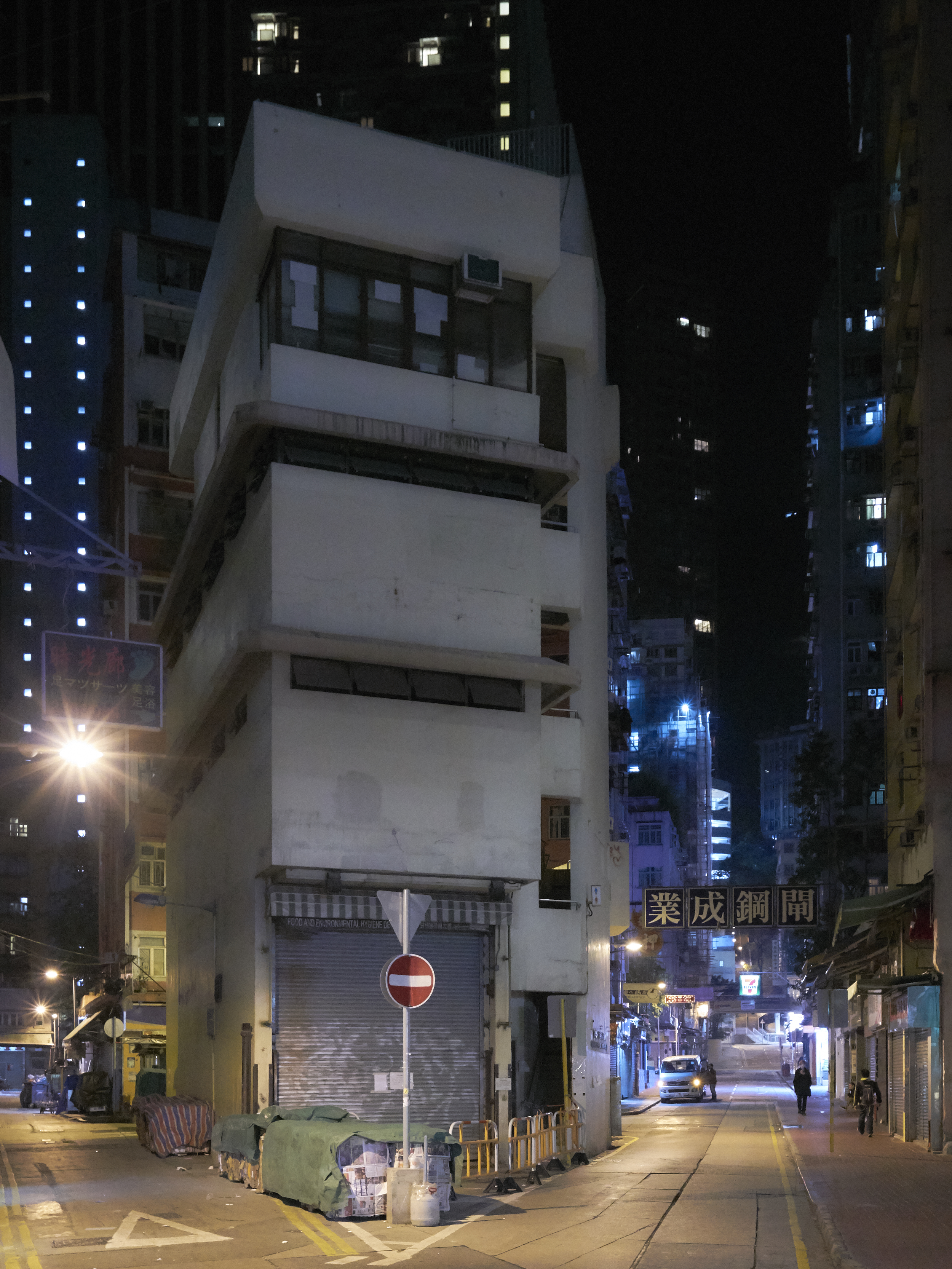
The haphazard shape of this leftover plot must have served as a catalyst for the building’s sculptural appearance. In contrast to the boxy building extrusions all around, its asymmetrical volume revealed different aspects of its character as you navigated the surrounding streets and glimpsed it from different directions.

Hemmed in at all sides, only pedestrians approaching from the north were afforded a long distance view. There commuters emerge from the subway trains, buses and trams whose routes trace the historical contours of the pre-reclamation coastline.

The building faced the endless streams of people head-on, sitting confidently at an angle to the narrow street, prying it open to claim its space. On the ground floor: a large gate for trucks to enter —a gaping void which emphasised the mass above. Rising up only four storeys, here it visually punched above its height.

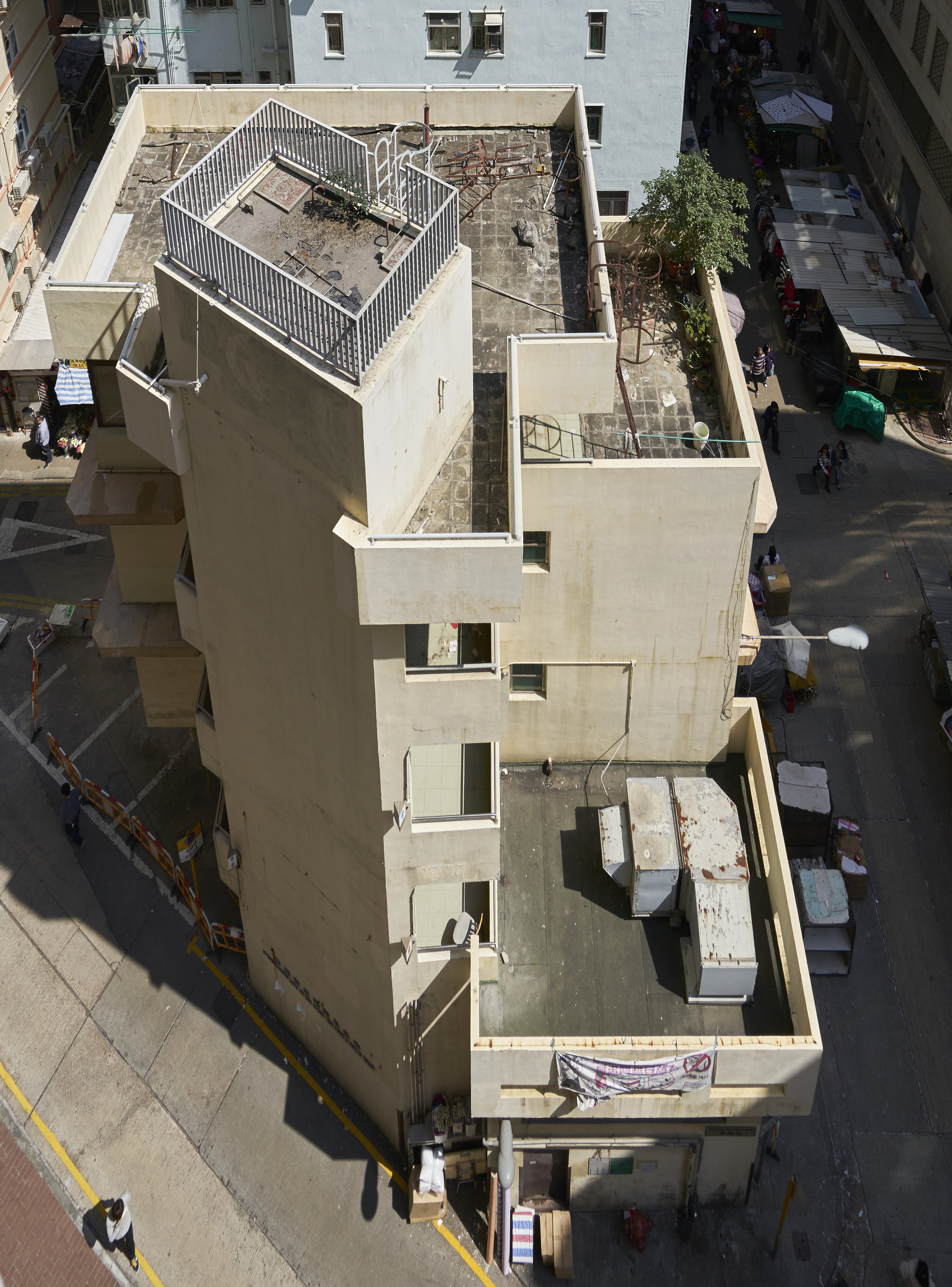
At the opposite side the building volume stepped down in terraced platforms towards a street lined with market stalls. Slot windows horizontally sliced up the solid wall connecting these two very different facades. They were capped with chamfered concrete ridges, shielding against rain and sunshine. Wrapping around the corners, they provided a continuity and horizontal articulation across elevations.

Finally, the verticality of the public staircase tied the different floors together; extending above the main volume, it completed the composition on a suitably high note. The general impression was of a pleasingly scaled building, playful and inviting. The angular site had been translated into a mini-tower which provided a contrarian focal point within this high-density environment.

This was a utilitarian building housing the most mundane of functions. The high-ceilinged ground floor accommodated a refuse collection room. The neighbourhood’s thrash, gathered by garbage collectors on handcarts, was compacted there before being loaded onto garbage trucks. Above this were two levels of public toilets, open 24/7, not for the faint of heart. At the top was a cosy staff office with outdoor terrace for cleaning staff. From there the roof was accessible by steel ladder. In an alternate universe this could have been the perfect space for a lush roof garden, a visual relief for the thousands of neighbouring high-rise dwellers.

A truly public building, its borders seemed nebulous, the area around it always teeming with activity. Refuse spilled over from the holding area inside. Large bales of compressed cardboard were sitting on the pavement waiting for collection. Nearby shops stacked their wares against its façade for storage and display. Come Sunday, domestic helpers would be filling huge cardboard boxes with cheap goods to be shipped to family abroad. Elderly locals were playing boisterous games of Chinese checkers in its shadow.

During operation times the ground floor refuse room had its gates in opposing walls opened and the ground floor became part of the streetscape. It was easy to reach the imposing compacting machines or come and throw your thrash in one of the containers; just the stench kept people at bay.

The building’s functions have now been displaced and buried deep in the bowels of a nearby new development called the Avenue. Designed in a pastiche historical style, it is as if Hong Kong is trying to recreate the grandeur of history minus the inconvenient colonial memories —having demolished virtually every trace of its neo-classical heritage. At street level there is a mix of chain stores and fake rusticated facades concealing service spaces. They form the obligatory podium interface between the ground plane and the overpriced jigsaw of standardised apartment plans above. Built to resemble a kind of renaissance fortress, there are no porous borders to this building, no grey zones, just security guards and a general animosity towards the neighbourhood it is located in.

All this is in stark contrast with the disappearing refuse collection point. Here was a building that grew out of its surroundings, a veritable extension of the street. It responded to its intricate context with a restrained expressionist virtuosity. Celebrating its pungent functions right in the centre of the action, this building was a contradiction made concrete: a functionalist folly.

Picking through the rubble of this modestly ambitious structure should give us pause to think about the future of the Hong Kong streetscape. As the vanilla-scented fumes of commerce are seeping out of the air-conditioned shopping centres into the streets, the dirt, grime and controlled chaos that are so inextricably linked to the Hong Kong experience are gradually being vacuumed away.

Simultaneously the government seems to be shedding its role as purveyor of public facilities, shifting its responsibility to private developers. Some of Hong Kong’s most interesting architecture consists of government-funded buildings providing vital services to a burgeoning population in the second half of the 20th century. In a cityscape that was increasingly dominated by cookie cutter tower blocks aimed at nothing but generating revenue, they provided a measure of architectural ambition. They often combined very disparate functions under one roof while displaying a sense of light-touch, pragmatic modernism; in Hong Kong it is still not unusual to see wet markets, public baths, libraries and sports courts collated into a hybrid complex known as a municipal services building. These buildings as well as their smaller cousins —like the refuse collection/restroom combo discussed here— became buzzing hubs of activity, sitting prominently within the commerce-driven bustle of the surrounding city.

Saying goodbye to the philosophy of locating these facilities at the heart of public life and reducing them to add-ons to commercial developments has big consequences for the character of Hong Kong’s streets. While the changing fabric of society undoubtedly demands a reconsideration of its urban tissue, one wonders what it means when we start hiding all undesirable functions —and the people associated with them— from view.

The idiosyncratic energy of Hong Kong is very much tied up with relentless confrontation, with the forced collision of competing interests.

20190715_DSC5131.jpg

The limited amount of public space sets the scene for continuous negotiations —by definition it is open to multiple uses and interpretations. When those tensions are “resolved” within privately owned masterplanned environments like the Avenue, where all vagueness has been engineered and policed away, a certain freedom is necessarily lost.

Should Hong Kong not leave the sterile illusion of perfect harmony and re-imagined history to countries that do it so much better, the Singapores and Dubais of this world? Can we bring Hong Kong into the 21st century while preserving the sense of adventure and surprise —shock even— that make it such a joy to explore this city, time and time again? 


  • year: original text 2016 / redacted in 2021

  • author: Hans Leo Maes / TypicalPlan

Hong Kong Homeliness

typicalplan = penning

about: HONG KONG HOMELINESS.

Far from the modernist ideal of the rationally planned highrise city, much of Hong Kong is like a medieval town on steroids. A lack of planning has conspired with extreme geography to produce this idiosyncratic urban landscape. Narrow streets are contorted in three dimensions and lined with disproportionally high buildings. Towering facades link up to line the streets with continuous walls of concrete and glass.

Not here any of the rules or regulations to mitigate density, no podium schemes or setback requirements. No rationalist measures to organise the city, no grids or apparent grand organising principles. Hong Kong is where extreme urbanity meets wild nature. Not just in the juxtaposition of the city with the mountain landscape, but also in the uncontrolled organic way the city has developed. This is the prototypical urban jungle. 

In Hong Kong the modernist virtues of cleanliness, daylight and spaciousness have been replaced by a much more nebulous commodity, not usually associated with a metropolis: homeliness. This is an unexpected by-product of a festering building frenzy that has hemmed in and precisely defined all open urban space.


Homeliness 1: Verticality.

Montane Mansions Monster building Hong Kong

The abundance of built mass gives public space an enclosed quality lacking in the ideal cities envisioned by modernism. The sheer verticality, out of proportion with the cramped public space at ground level, shrinks the scale of the latter down to that of a reassuring interior. A lack of sunlight and distant perspectives add to the feeling of claustrophobic intimacy. Life pushes into the tiniest alleyway or service corridor. An inescapable but ultimately reassuring sense of community springs eternal in this pressure cooker of a city.

Homeliness 2: Randomness.

Montane Mansions Hong Kong Facade

Hong Kong has developed into the ultimate utilitarian city, a purely functional expression of capital flows and investment.

Liberated from the restrictions of taste and quasi-unfettered by town planning guidelines, the haphazard collage of clumsy architectures results in an endlessly fascinating cityscape. On the scale of the individual building, the bland facades are customised ad libitum: a blank canvas for a patchwork of AC units, window layouts and corrugated metal canopies. Old apartments sport outgrowths wherever feasible; commercial spaces are emblazoned with signs and adverts in every shape and size.

Hong Kong is chaos, and like an overstuffed boudoir either its claustrophobia repels you or its nonthreatening informality embraces you in a way you would not expect in the densest city in the world.

Homeliness 3: Overflow.

Hong Kong Laundry

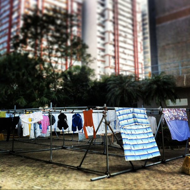
The cramped living conditions prevalent in Hong Kong are widely publicised and bemoaned. Its consequences reverberate far beyond the private sphere as domestic activities spill over into public space. Senior citizens are raucously gambling in a covered square, a kitchen aide is slicing fish on an upturned bucket in a side alley, hundreds of Filipina maids are picnicking underneath the HSBC headquarters on their day off. 

When you hardly have a living room to speak off, the whole city becomes your lounge. 

Homely No More.

Hong Kong Facade design

Nowadays new property developments in Hong Kong are doing away with all that unsightly business. Rational planning has stepped in to safeguard public interest. Greenery is provided, roads widened, buildings kept at reasonable distances. Pastel-tinted elevation patterns visually break down the overwhelming building masses. Newly enforced laws govern add-on structures and other visible modifications to buildings.

There is a drive to humanise the spatial experience of Hong Kong, to take a step back from the overwhelming surroundings. But one has to wonder whether in the process we are not losing the unique feeling of a sheltered life which nestles in the cracks of bigness, in the reassuring shadows of what is too big to fathom.

Literature:
Geopolitics of Home: Public Domesticity in Hong Kong and London, Katherine Brickell


  • year: 2013

  • author: Hans Leo Maes / TypicalPlan

by using this website you agree to                
our terms of service / talk to us here