density

Penning for you

typicalplan = penning

design-related TEXTS for YOU (so you don't have to).

TypicalPlan is now ready, willing and able to write your design-related texts, concepts and pitches in English or Dutch.

TypicalPlan brings 25 years of experience as a writing architect into play to unearth the unsuspected conceptual depths in your work. We go beyond mere copywriting to challenge, prod and reinvigorate your thinking and propel your design practice to new creative heights.

Alternatively and just as happily, we can simply write inspiring texts about you and your work for your website, social media and other communications :)

Contact us here for samples of our writing or to discuss your ideas and requirements.


About TypicalPlan / Hans Leo Maes

TypicalPlan / Hans Leo Maes has been writing about architecture and design since his student days in the late 1990’s.

Having worked for various architecture firms in Belgium and Asia, he has built up extensive knowledge of different design philosophies and cultures. His professional experience helped him gain a deep understanding of the challenges faced by architects and designers in the context of ever more stringent regulation, environmental catastrophe and out-of-control consumerism.

Over the years Hans has honed his writing skills working on design concepts and presentations for a wide variety of projects. Simultaneously he has continued to pen theoretical and philosophical musings about politics, culture and society. In 2021 this culminated in the publication of the book “Nothing To See Here” by Paris-based publishing house Building Books. The book — with photos and text by Hans Leo Maes / TypicalPlan —  documents the erasure of graffiti in Hong Kong.

Also in 2021 TypicalPlan started a long-term collaboration with one of Belgium’s most prominent and prolific architecture offices. Through close cooperation with the company’s founders and principals, Hans helped put into words the ambitions for their freshly minted design platform and formulate the design strategies crucial to achieving their vision.

Writing by Hans Leo Maes has further appeared in specialist design magazines such as the Modernist Magazine (UK) and Bauwelt (Germany).

Hong Kong's Heretic Heritage

typicalplan = penning

about: HONG KONG'S HERETIC HERITAGE.

Argument for a Pungent Architecture.

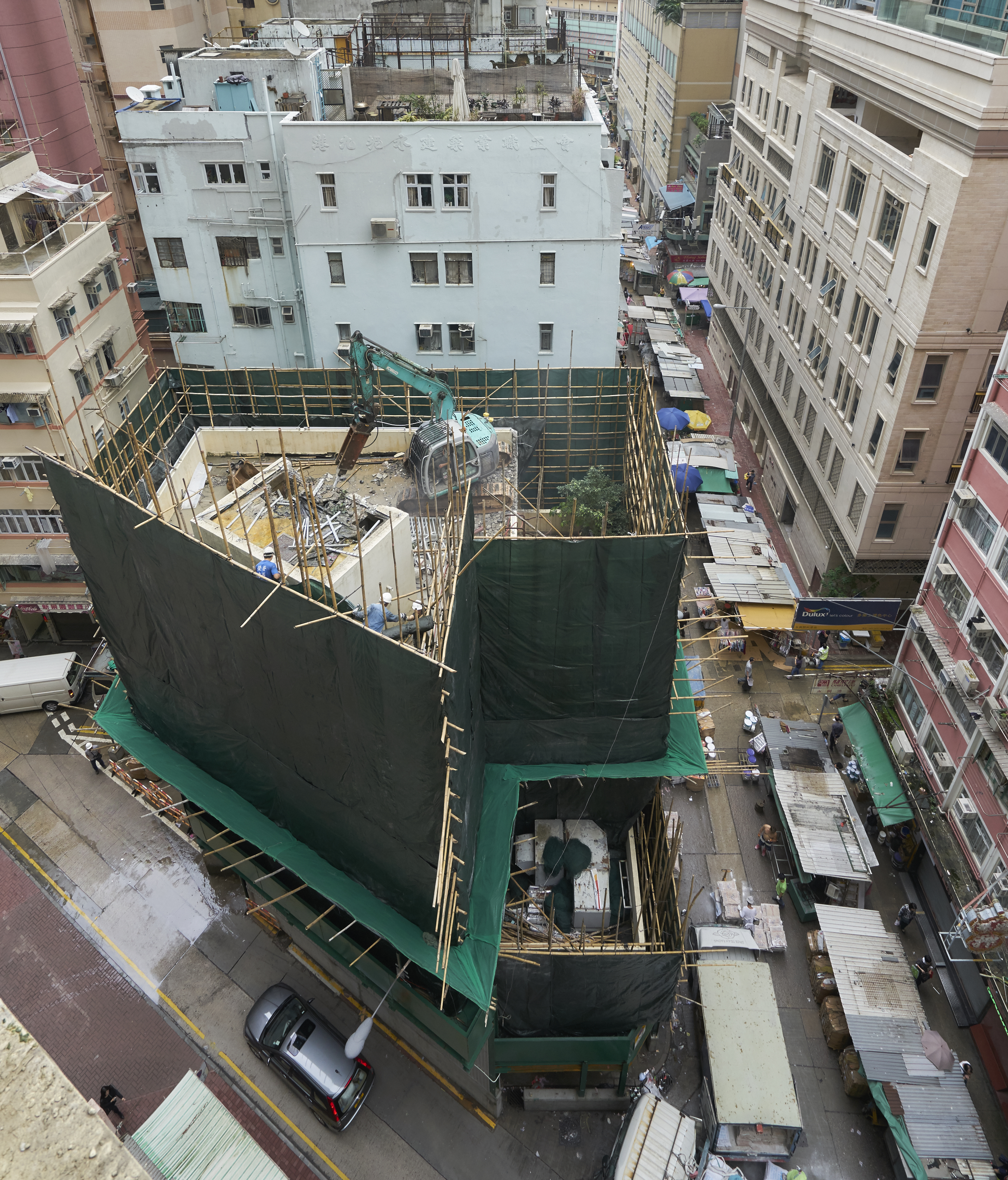
Located in the densely populated Wan Chai district, Spring Garden Lane is one of Hong Kong’s oldest streets. Where once stood picturesque colonnaded shophouses containing brothels, now a jumble of mismatched high-rises are lining the narrow lane. At the halfway point the road widens to accommodate a small freestanding building that is currently being torn down. So far, so predictable: the dry beat of the jackhammer is an ever-present part of the city’s relentlessly cacophonous soundtrack. Hugged tightly by bamboo scaffolding and tarpaulin, the building’s silhouette now stands as a forensic tent at a crime scene. Behind this veil the structure is being pulverised back to the triangular piece of land it was standing on.

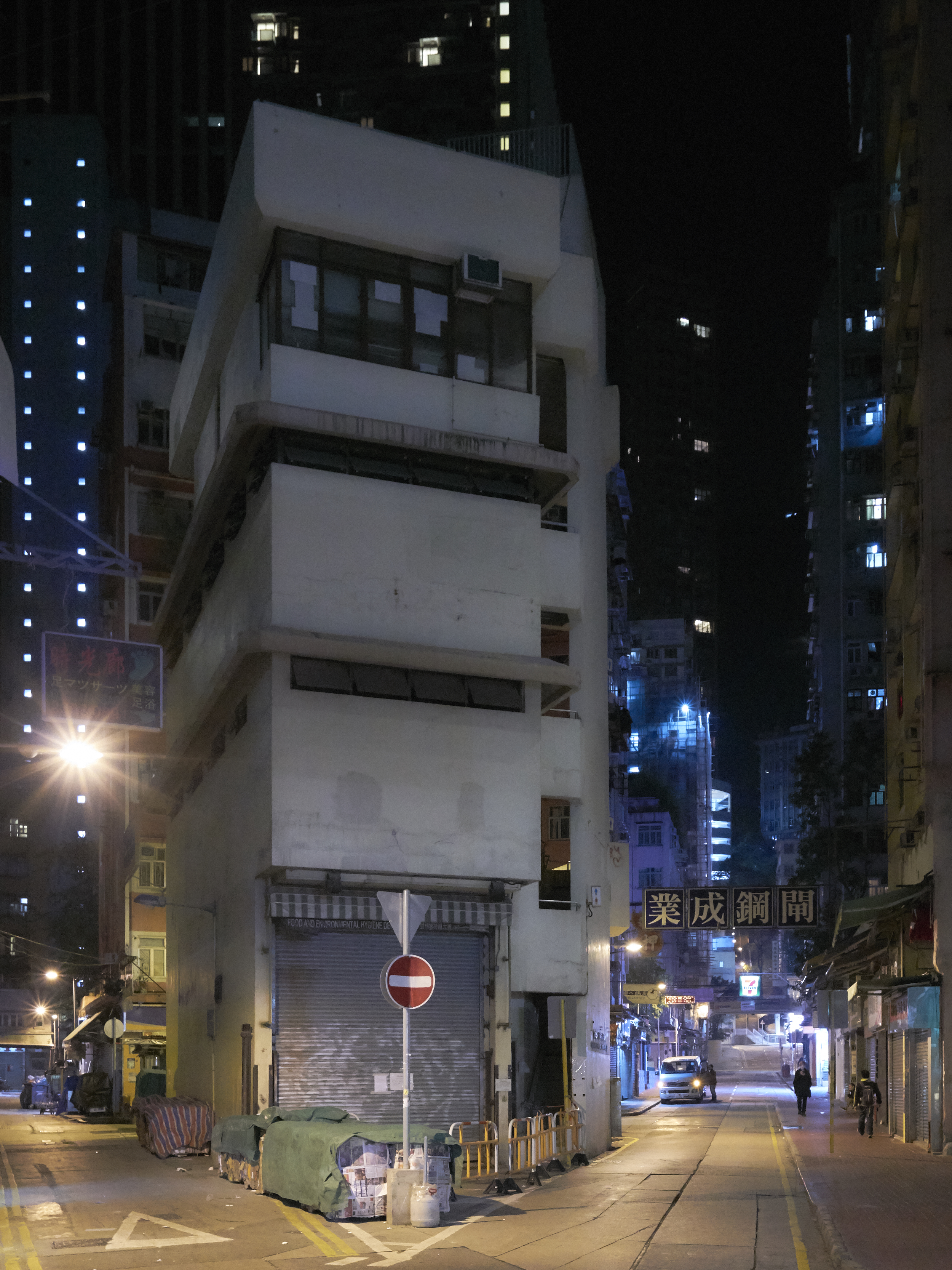
The haphazard shape of this leftover plot must have served as a catalyst for the building’s sculptural appearance. In contrast to the boxy building extrusions all around, its asymmetrical volume revealed different aspects of its character as you navigated the surrounding streets and glimpsed it from different directions.

Hemmed in at all sides, only pedestrians approaching from the north were afforded a long distance view. There commuters emerge from the subway trains, buses and trams whose routes trace the historical contours of the pre-reclamation coastline.

The building faced the endless streams of people head-on, sitting confidently at an angle to the narrow street, prying it open to claim its space. On the ground floor: a large gate for trucks to enter —a gaping void which emphasised the mass above. Rising up only four storeys, here it visually punched above its height.

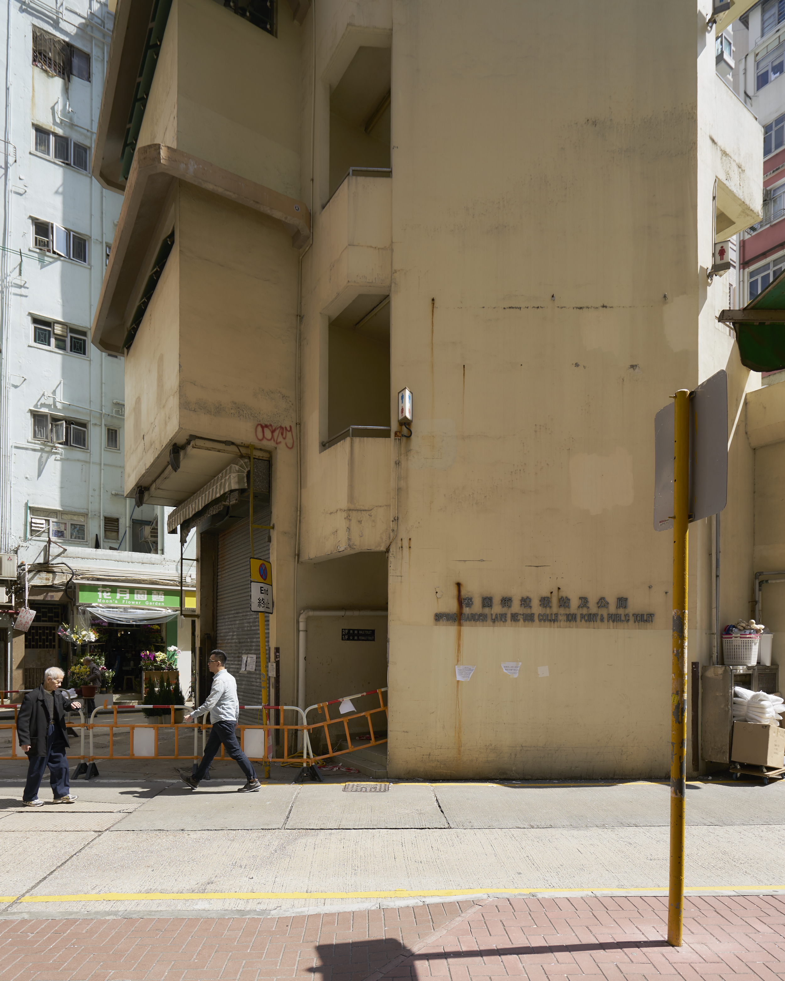
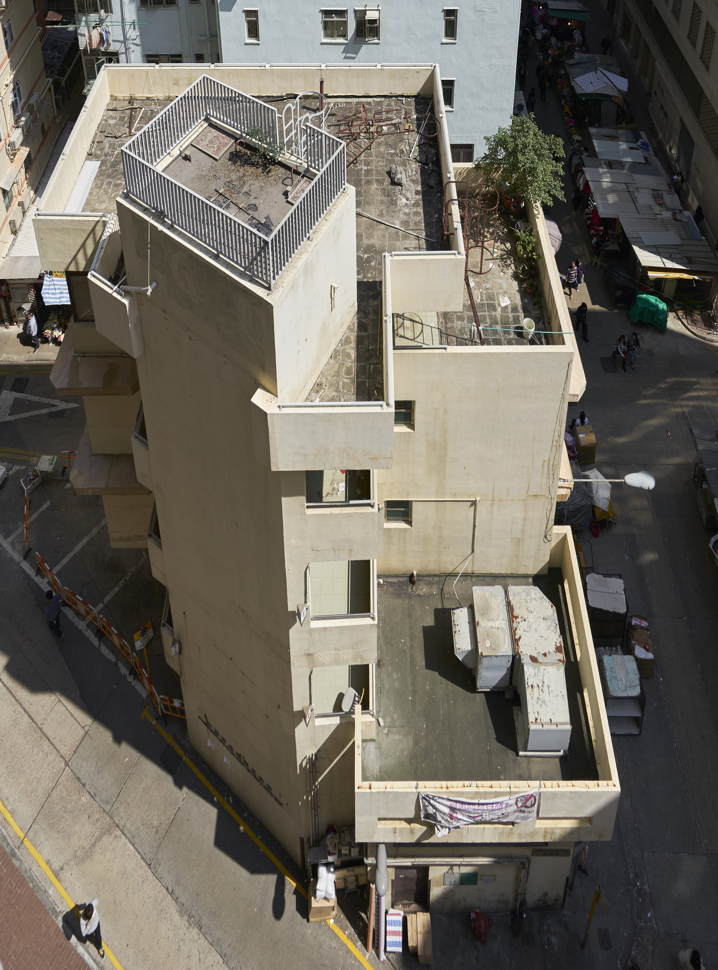
At the opposite side the building volume stepped down in terraced platforms towards a street lined with market stalls. Slot windows horizontally sliced up the solid wall connecting these two very different facades. They were capped with chamfered concrete ridges, shielding against rain and sunshine. Wrapping around the corners, they provided a continuity and horizontal articulation across elevations.

Finally, the verticality of the public staircase tied the different floors together; extending above the main volume, it completed the composition on a suitably high note. The general impression was of a pleasingly scaled building, playful and inviting. The angular site had been translated into a mini-tower which provided a contrarian focal point within this high-density environment.

This was a utilitarian building housing the most mundane of functions. The high-ceilinged ground floor accommodated a refuse collection room. The neighbourhood’s thrash, gathered by garbage collectors on handcarts, was compacted there before being loaded onto garbage trucks. Above this were two levels of public toilets, open 24/7, not for the faint of heart. At the top was a cosy staff office with outdoor terrace for cleaning staff. From there the roof was accessible by steel ladder. In an alternate universe this could have been the perfect space for a lush roof garden, a visual relief for the thousands of neighbouring high-rise dwellers.

A truly public building, its borders seemed nebulous, the area around it always teeming with activity. Refuse spilled over from the holding area inside. Large bales of compressed cardboard were sitting on the pavement waiting for collection. Nearby shops stacked their wares against its façade for storage and display. Come Sunday, domestic helpers would be filling huge cardboard boxes with cheap goods to be shipped to family abroad. Elderly locals were playing boisterous games of Chinese checkers in its shadow.

During operation times the ground floor refuse room had its gates in opposing walls opened and the ground floor became part of the streetscape. It was easy to reach the imposing compacting machines or come and throw your thrash in one of the containers; just the stench kept people at bay.

The building’s functions have now been displaced and buried deep in the bowels of a nearby new development called the Avenue. Designed in a pastiche historical style, it is as if Hong Kong is trying to recreate the grandeur of history minus the inconvenient colonial memories —having demolished virtually every trace of its neo-classical heritage. At street level there is a mix of chain stores and fake rusticated facades concealing service spaces. They form the obligatory podium interface between the ground plane and the overpriced jigsaw of standardised apartment plans above. Built to resemble a kind of renaissance fortress, there are no porous borders to this building, no grey zones, just security guards and a general animosity towards the neighbourhood it is located in.

All this is in stark contrast with the disappearing refuse collection point. Here was a building that grew out of its surroundings, a veritable extension of the street. It responded to its intricate context with a restrained expressionist virtuosity. Celebrating its pungent functions right in the centre of the action, this building was a contradiction made concrete: a functionalist folly.

Picking through the rubble of this modestly ambitious structure should give us pause to think about the future of the Hong Kong streetscape. As the vanilla-scented fumes of commerce are seeping out of the air-conditioned shopping centres into the streets, the dirt, grime and controlled chaos that are so inextricably linked to the Hong Kong experience are gradually being vacuumed away.

Simultaneously the government seems to be shedding its role as purveyor of public facilities, shifting its responsibility to private developers. Some of Hong Kong’s most interesting architecture consists of government-funded buildings providing vital services to a burgeoning population in the second half of the 20th century. In a cityscape that was increasingly dominated by cookie cutter tower blocks aimed at nothing but generating revenue, they provided a measure of architectural ambition. They often combined very disparate functions under one roof while displaying a sense of light-touch, pragmatic modernism; in Hong Kong it is still not unusual to see wet markets, public baths, libraries and sports courts collated into a hybrid complex known as a municipal services building. These buildings as well as their smaller cousins —like the refuse collection/restroom combo discussed here— became buzzing hubs of activity, sitting prominently within the commerce-driven bustle of the surrounding city.

Saying goodbye to the philosophy of locating these facilities at the heart of public life and reducing them to add-ons to commercial developments has big consequences for the character of Hong Kong’s streets. While the changing fabric of society undoubtedly demands a reconsideration of its urban tissue, one wonders what it means when we start hiding all undesirable functions —and the people associated with them— from view.

The idiosyncratic energy of Hong Kong is very much tied up with relentless confrontation, with the forced collision of competing interests.

20190715_DSC5131.jpg

The limited amount of public space sets the scene for continuous negotiations —by definition it is open to multiple uses and interpretations. When those tensions are “resolved” within privately owned masterplanned environments like the Avenue, where all vagueness has been engineered and policed away, a certain freedom is necessarily lost.

Should Hong Kong not leave the sterile illusion of perfect harmony and re-imagined history to countries that do it so much better, the Singapores and Dubais of this world? Can we bring Hong Kong into the 21st century while preserving the sense of adventure and surprise —shock even— that make it such a joy to explore this city, time and time again? 


  • year: original text 2016 / redacted in 2021

  • author: Hans Leo Maes / TypicalPlan

Hong Kong Homeliness

typicalplan = penning

about: HONG KONG HOMELINESS.

Far from the modernist ideal of the rationally planned highrise city, much of Hong Kong is like a medieval town on steroids. A lack of planning has conspired with extreme geography to produce this idiosyncratic urban landscape. Narrow streets are contorted in three dimensions and lined with disproportionally high buildings. Towering facades link up to line the streets with continuous walls of concrete and glass.

Not here any of the rules or regulations to mitigate density, no podium schemes or setback requirements. No rationalist measures to organise the city, no grids or apparent grand organising principles. Hong Kong is where extreme urbanity meets wild nature. Not just in the juxtaposition of the city with the mountain landscape, but also in the uncontrolled organic way the city has developed. This is the prototypical urban jungle. 

In Hong Kong the modernist virtues of cleanliness, daylight and spaciousness have been replaced by a much more nebulous commodity, not usually associated with a metropolis: homeliness. This is an unexpected by-product of a festering building frenzy that has hemmed in and precisely defined all open urban space.


Homeliness 1: Verticality.

Montane Mansions Monster building Hong Kong

The abundance of built mass gives public space an enclosed quality lacking in the ideal cities envisioned by modernism. The sheer verticality, out of proportion with the cramped public space at ground level, shrinks the scale of the latter down to that of a reassuring interior. A lack of sunlight and distant perspectives add to the feeling of claustrophobic intimacy. Life pushes into the tiniest alleyway or service corridor. An inescapable but ultimately reassuring sense of community springs eternal in this pressure cooker of a city.

Homeliness 2: Randomness.

Montane Mansions Hong Kong Facade

Hong Kong has developed into the ultimate utilitarian city, a purely functional expression of capital flows and investment.

Liberated from the restrictions of taste and quasi-unfettered by town planning guidelines, the haphazard collage of clumsy architectures results in an endlessly fascinating cityscape. On the scale of the individual building, the bland facades are customised ad libitum: a blank canvas for a patchwork of AC units, window layouts and corrugated metal canopies. Old apartments sport outgrowths wherever feasible; commercial spaces are emblazoned with signs and adverts in every shape and size.

Hong Kong is chaos, and like an overstuffed boudoir either its claustrophobia repels you or its nonthreatening informality embraces you in a way you would not expect in the densest city in the world.

Homeliness 3: Overflow.

Hong Kong Laundry

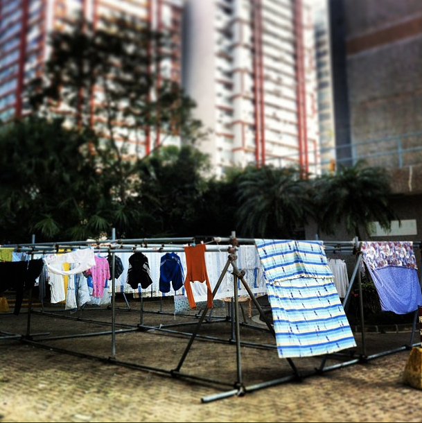
The cramped living conditions prevalent in Hong Kong are widely publicised and bemoaned. Its consequences reverberate far beyond the private sphere as domestic activities spill over into public space. Senior citizens are raucously gambling in a covered square, a kitchen aide is slicing fish on an upturned bucket in a side alley, hundreds of Filipina maids are picnicking underneath the HSBC headquarters on their day off. 

When you hardly have a living room to speak off, the whole city becomes your lounge. 

Homely No More.

Hong Kong Facade design

Nowadays new property developments in Hong Kong are doing away with all that unsightly business. Rational planning has stepped in to safeguard public interest. Greenery is provided, roads widened, buildings kept at reasonable distances. Pastel-tinted elevation patterns visually break down the overwhelming building masses. Newly enforced laws govern add-on structures and other visible modifications to buildings.

There is a drive to humanise the spatial experience of Hong Kong, to take a step back from the overwhelming surroundings. But one has to wonder whether in the process we are not losing the unique feeling of a sheltered life which nestles in the cracks of bigness, in the reassuring shadows of what is too big to fathom.

Literature:
Geopolitics of Home: Public Domesticity in Hong Kong and London, Katherine Brickell


  • year: 2013

  • author: Hans Leo Maes / TypicalPlan

by using this website you agree to                
our terms of service / talk to us here